the Creative Commons Attribution 4.0 License.
the Creative Commons Attribution 4.0 License.
 | 29 Apr 2021
Communicating uncertainties in spatial predictions of grain micronutrient concentration
Christopher Chagumaira
Joseph G. Chimungu
Dawd Gashu
Patson C. Nalivata
Martin R. Broadley
Alice E. Milne
R. Murray Lark
The concentration of micronutrients in staple crops varies spatially. Quantitative information about this can help in designing efficient interventions to address micronutrient deficiency. Concentration of a micronutrient in a staple crop can be mapped from limited samples, but the resulting statistical predictions are uncertain. Decision makers must understand this uncertainty to make robust use of spatial information, but this is a challenge due to the difficulties in communicating quantitative concepts to a general audience. We proposed strategies to communicate uncertain information and present a systematic evaluation and comparison in the form of maps. We proposed testing five methods to communicate the uncertainty about the conditional mean grain concentration of an essential micronutrient, selenium (Se). Evaluation of the communication methods was done through a questionnaire by eliciting stakeholder opinions about the usefulness of the methods of communicating uncertainty. We found significant differences in how participants responded to the different methods. In particular, there was a preference for methods based on the probability that concentrations are below or above a nutritionally significant threshold compared with general measures of uncertainty such as the prediction interval. There was no evidence that methods which used pictographs or calibrated verbal phrases to support the interpretation of probabilities made a different impression than probability alone, as judged from the responses to interpretative questions, although these approaches were ranked most highly when participants were asked to put the methods in order of preference.
- Article
(1540 KB) - Full-text XML
-
Supplement
(10585 KB) - BibTeX
- EndNote


Micronutrient deficiencies are an important issue in developing countries such as Ethiopia and Malawi. Deficiencies in micronutrients underlie many non-communicable diseases. For example, deficiencies in selenium (Se) can cause thyroid dysfunction, suppressed immune response and increase disease progression and mortality rates, especially in people with already compromised immunity (Fairweather-Tait et al., 2011; Rayman, 2012; Winther et al., 2020).
Micronutrients are largely derived from dietary sources, and there is evidence of a suboptimal intake of Se below recommended levels in Ethiopia and Malawi (Gashu et al., 2020; Ligowe et al., 2020a). Interventions to improve the dietary intake of Se are possible. These include agronomic biofortification, food diversification and fortification (Broadley et al., 2010; Chilimba et al., 2011; Joy et al., 2019; Ligowe et al., 2020b).
Micronutrient deficiencies and the factors that cause them vary spatially (Phiri et al., 2019, 2020; Belay et al., 2020; Gashu et al., 2020). For example, the intake of Se in Ethiopia and Malawi is linked to soil type and other factors (Chilimba et al., 2011; Hurst et al., 2013; Joy et al., 2015). Belay et al. (2020) showed that the risk of Se deficiency is widespread and spatially dependent across Ethiopia. So, spatial information (e.g. on grain micronutrients) can be used to design more efficient interventions to address this micronutrient deficiency.
Soil and crops cannot be sampled everywhere and measurements can only be made directly at a few locations. Using statistical models, interpolations at unsampled locations can be made, but the predictions are uncertain. Predictions are subject to uncertainty because of spatial variability resulting from multiple factors operating at different scales (Lark et al., 2014a). In addition to environmental factors (geology and climate), there is also uncertainty due to measurement error, in the analysis of material, and sampling error, in the field where a single crop or soil sample is collected. When using spatial information, it is important to report this uncertainty and make sure that decision makers understand it in order to make informed decisions.
In geostatistical prediction, the uncertainty of a predicted value is quantified directly by the kriging variance, the mean squared error of the prediction. The prediction is a linear combination of the data, sometimes after a nonlinear transformation, which is optimal in the sense of minimising the kriging variance, given a variogram function which models the spatial dependence of the variable of interest. The kriging variance depends on the spatial distribution of observations. The kriging prediction and variance can be regarded as parameters of a prediction distribution at an unsampled site of interest, which represents our uncertain knowledge about the value of the variable there (conditional on our data and the variogram model). If we assume that the prediction errors are normally distributed, then we can find the interval bounded by the 0.025 and 0.975 quantiles of the prediction distribution as a 95 % prediction interval, which expresses our uncertainty about the true value. It is, therefore, possible to represent the uncertainty in a map of micronutrient concentrations in grain by a corresponding map, which shows the kriging variance, or by the upper and lower bounds of the prediction interval, which can also be mapped.
Other approaches can be taken to communicate the uncertainty in a prediction when the prediction is to be interpreted relative to some threshold value of the mapped variable (e.g. a threshold concentration below which typical intake of grain does not provide adequate intake of a nutrient). While the predicted value may lie above the threshold because the prediction is uncertain, it is possible that the true value is actually below the threshold. This probability, conditional on the data and on the geostatistical model, can be obtained in various ways. A common geostatistical approach is to use indicator kriging (e.g. Webster and Oliver, 2007).
The quantification of uncertainty is generally straightforward, but the communication of this uncertainty to a range of users of information is less so. As Milne et al. (2015) found, the success of a method to present uncertainty may depend on the subject matter and on the background of the interpreter. The probability that the true value lies below a threshold might not be easily interpreted by the policy maker or manager who needs to make a decision based on a map. Probability is often not easily interpreted by a range of end-users of information (Spiegelhalter et al., 2011), and for this reason, in addition to the “raw” probability, verbal interpretations of probability based on “calibrated phrases” (e.g. “unlikely”) have been proposed, e.g. the Intergovernmental Panel for Climate Change (IPCC) scale (Mastrandrea et al., 2010). Pictographs may also be used to communicate probabilities by enabling the interpreter to visualise them as proportions (e.g. Spiegelhalter et al., 2011).
Statistical predictions can be used to support decision-making to identify areas of sufficiency or insufficiency. A simple decision model could be based on a threshold value of a variable, with the aim that the user should act if the variable of interest falls below or exceeds the threshold. In our study, we chose a threshold of 38 µg kg−1, based on the assumption that a mean daily intake of 330 g of grain flour should provide a third of the daily estimated average requirement (EAR) of Se for an adult woman. The EAR is a commonly used measure of intake when assessing nutritional status and planning intervention.
In this study, we propose methods for communicating uncertainty in mapped concentrations of micronutrients in grain, using Se as a case study. These methods are based on the kriging variance or on the probability that concentration falls below a nutritionally significant threshold. Maps using these methods, and based on real data collected in Ethiopia and Malawi, were presented to panels of stakeholders in those countries, and their experience of using the maps and their evaluation of the different methods were recorded using questionnaires.
This study was conducted in Ethiopia and Malawi. Ethiopia is located in the horn of Africa (9.1450∘ N, 40.4897∘ E), while Malawi is in southern Africa (13.2543∘ S; 34.3015∘ E). Primarily, these are research sites for the GeoNutrition project (http://www.geonutrition.com/, last access: 3 July 2020) to inform strategies on addressing micronutrient deficiencies commonly referred to as “hidden hunger”. We proposed testing five methods to communicate the uncertainty about predictions of Se concentration in grain (see Sect. 2.1).
In order to determine how best to communicate the uncertainty in our predictions, we recruited participants to evaluate our five candidate methods at two workshops held in Lilongwe, Malawi (November 2019), and Addis Ababa, Ethiopia (January 2020). Each method was presented on a poster, with the same format, consisting of (1) predicted nutrient concentration in map form and (2) a map communicating the uncertainty about the predictions. Examples of the posters are shown in Figs. S1–S5 in the Supplement. Formal evaluations were done through a structured questionnaire that participants completed during the workshops. Ethical approval to conduct this study was granted by the University of Nottingham School of Sociology and Social Policy Research Ethics Committees (BIO-1920-004 for Malawi and BIO-1920-007 for Ethiopia).
2.1 Test methods
2.1.1 Statistical modelling and spatial prediction of grain Se concentration
Field sampling in Amhara, Ethiopia, was previously conducted to support the spatial prediction of Se concentration in grain crops, including the staple crops teff (Eragrostis tef (Zucc.) Trotter) and wheat (Triticum aestivum L; Gashu et al., 2020). The sample frame was defined with reference to the Africa Soil Information Service map of croplands in Amhara region (AfSIS, 2015) so that all sample sites were expected to have a crop or to be near a cropped site. The sample points were selected to give good spatial spread across the sample frame and to be spatially balanced. This procedure was implemented in the BalancedSampling library for the R platform (R Core Team, 2020; Grafström and Lisic, 2016). A total of 25 additional sample sites, closely paired with one of those selected as described above, were added to the sample design to support the estimation of the parameters of the spatial linear mixed model (Gashu et al., 2020). In total, 455 sampling points were obtained, including 136 and 113 locations where teff and wheat were sampled, respectively. The sample support for these data consisted of a bulk grain sample formed from aliquots collected from grain samples within a single field, as described by Gashu et al. (2020). The predictions, and quantifications of uncertainty, therefore relate to grain nutrient concentrations at individual field scale. This is appropriate when considering possible health implications for smallholder and subsistence producers.
In Malawi, the objective of field sampling was to support the spatial prediction of Se concentration in maize (Zea mays L), the staple crop. The location of sample points were obtained with the spcosa package for the R platform (Walvoort et al., 2010). This finds sample points which give good spatial coverage of a sample domain and can incorporate the location of fixed prior points. We had 820 prior points from the 2015–2016 micronutrient survey of Malawi (Phiri et al., 2019) and added a further 890 spatial coverage points with spcosa. Of these 1710 sites, 190 were selected at random for a duplicate “close pair” sample to support spatial modelling, with 10 % of the total samples following Lark and Marchant (2018).
We first undertook an exploratory data analysis using simple summary statistics and plots, notably quantile–quantile (QQ) plots, to check whether we needed to transform the data to make the assumption of normality reasonable. In order to check for any spatial trends, we plotted classified post plots which show the spatial location of data and use symbols to indicate quantiles. We found no evidence of the spatial trend in the Malawi data. The data were very skewed, and we transformed them to logarithms to make the assumption of normality plausible. However, for the Amhara data set, we observed a spatial trend. Exploratory analysis indicated that a linear trend model in the spatial coordinates accounted for this, and the exploration of the residuals from the trend indicated that a transformation to logarithm was necessary.
After the exploratory data analysis, we used ordinary kriging to obtain the kriging prediction and kriging variance of grain Se concentration in the Malawi data set for every prediction location on the transformed (log) units. However, for the Amhara data, we used universal kriging, which also makes predictions at unsampled locations, x0, by a weighted linear combination of available sample data designed to minimise prediction error whilst filtering the trend (Webster and Oliver, 2007). The variance parameters for both Amhara and Malawi data sets were estimated by the residual maximum likelihood (Diggle and Ribeiro, 2010) with the likfit procedure for the R platform.
The kriging predictions were on the log scale and need to be back-transformed for ease of interpretation. For such strongly skewed variables, while an unbiased back-transformation is available, it has been proposed by Pawlowsky-Glahn and Olea (2004) that the median, rather than the mean, of the conditional distribution on the original scale of measurement is obtained by back-transformation (i.e. by simple exponentiation of the kriging prediction). We followed this proposal, and so we refer to our predicted values as the conditional median rather than the conditional mean. The back-transformation of the limits of the prediction interval is straightforward.
We used indicator kriging to obtain the conditional probability that grain Se concentration at the unsampled location exceeds the threshold value, 38 µg kg−1. Indicator kriging predictions are made by ordinary kriging of an indicator variable created by a transformation of the data on a variable of interest, z, to an indicator variable, w, given a threshold value of interest, zT. The indicator variable at location x takes the value 0 if z(x)≤zT and 1 otherwise. The estimate of the indicator variable at some location x0 can be interpreted as the conditional probability that z(x0)≤zT (Webster and Oliver, 2007). While exceedance probabilities could be computed on the assumption of normally distributed errors, we chose to use the widely applied nonparametric method, i.e. indicator kriging, which requires no such assumption.
2.1.2 Kriging variance
In statistical predictions, some unknown quantity (e.g. grain Se concentration at a location) has a prediction distribution conditional on the data and a statistical model. The kriging variance at an unsampled location, x0, is defined as follows:
where the random variable Z(x0) is predicted by , a kriging prediction. We noted above that the kriging prediction and variance can be regarded as parameters of a prediction distribution at an unsampled site of interest. The dispersion of this distribution reflects our uncertainty about the true value of the variable there, which is, therefore, quantified by the kriging variance. The kriging variance is evaluated at each unsampled site and so can be displayed as a map alongside the map of predictions.
The map of kriging variance is a summary of the uncertainty about our predictions in the study area and shows areas that need further sampling to resolve uncertainty for decision-making. In ordinary kriging, the kriging variance has smaller values near the sample locations and so reflects the distribution of sampling points. For universal kriging, the kriging variance is smallest near the sample location where the values of covariates are close to their respective mean. Because the kriging variance is a direct output of kriging algorithms, it is common to see it mapped alongside kriging predictions and referred to as a measure of local prediction uncertainty (e.g. Holmes et al., 2007; Goovaerts, 2014; Hatvani et al., 2021). However, the interpretation of the kriging variance may be challenging, particularly for a non-specialist user of spatial information. One could take its square root and present it as a kriging standard error with the same units as the target variable. However, the interpretation of the raw standard error can clearly be helped by rescaling it to a prediction interval, and we considered this option in the next section.
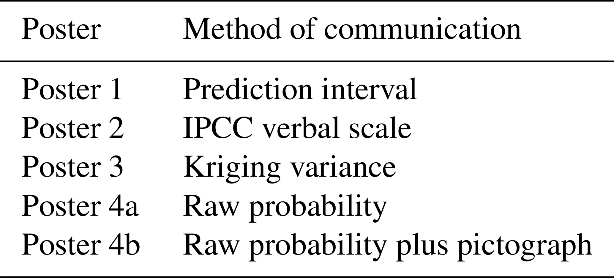
The interpretation of the kriging variance is particularly difficult in the case of a variable which must be transformed prior to analysis. The kriging variance cannot be back-transformed to the original units (except for simple kriging). In this setting then, the kriging variance can serve as little more than a general “uncertainty index”, indicating in general where uncertainty is large and where it is small. However, such generalised indices have been developed for 3-D geological information to serve the needs of engineering stakeholders (e.g Lelliott et al., 2009; Lark et al., 2014b). For this reason, and because of the long-standing use of kriging variance as an uncertainty measure (see above), we included it as a measure of uncertainty in this experiment. One poster showed a map of the conditional median of Se concentration in grain (Sect. 2.1.1) with a map of kriging variance on the transformed units (see Table 1; Fig. S3).
Table 1The designated poster number for each method of communicating uncertain information.
2.1.3 Prediction intervals
We computed cross-validation predictions from our geostatistical model and exploratory analysis of the kriging errors, , and showed that these can be regarded as a normal random variable. Because the kriging predictor is unbiased, the mean of the errors is zero, and their standard deviation is equal to kriging standard deviation σK(x0). On this basis, we computed a 95 % prediction interval at each prediction location as . One poster showed a map of the conditional median of Se concentration in grain plus the lower and upper bounds of the 95 % prediction intervals mapped separately to communicate the uncertainty (see Table 1; Fig S1).
2.1.4 Conditional probability
Using indicator kriging allowed us to quantify uncertainty of the prediction in terms of the probability that the true value exceeds or lies below the threshold. This is a conditional probability, which is conditional on the data and indicator variogram. The probability provides a basis for decisions on interventions, given the threshold value. For example, if the conditional probability that grain Se is below the threshold is very large, then a decision might be made to promote an intervention such as dietary supplementation or agronomic biofortification.
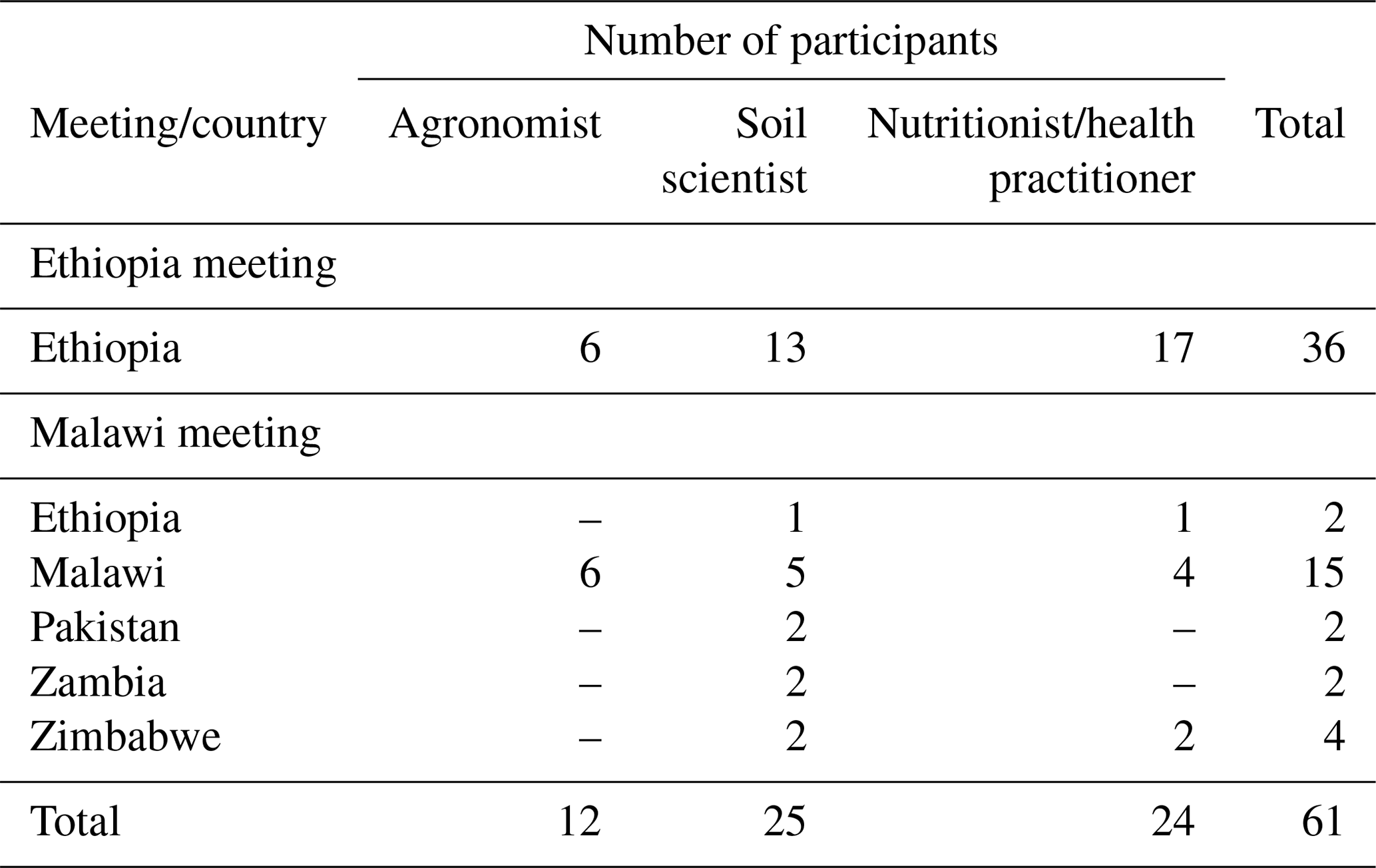
Table 2The composition of participants during the meetings in Ethiopia and Malawi.
Probability can be presented in a number of different ways – at the first instance, on a raw probability scale, from 0 to 1 or 0 % to 100 %. However, raw probabilities are not very useful to non-specialists as they are often misinterpreted (Spiegelhalter et al., 2011). Given this shortfall, the IPCC (Mastrandrea et al., 2010) introduced a verbal scale for communicating probabilistic information from uncertain results using calibrated verbal phrases. For example, an event with probability < 1 % will be described as “exceptionally unlikely” and an event with probability in the interval 90 %–99 % is described as “very likely”. However, the scale is not always interpreted consistently among different individuals. Budescu et al. (2009) observed a tendency for a “regressive” interpretation in which large or small probabilities are interpreted as being close to 50 %. Therefore, we followed Lark et al. (2014a) in supplementing the calibrated verbal phrases with the definition of the probability range.
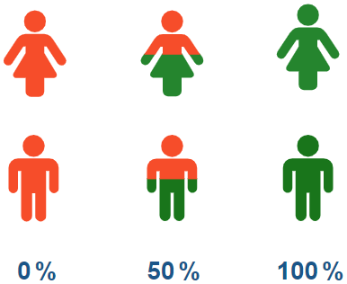
Graphics, such as pictographs, can be used to report the probability of an event exceeding a threshold. Graphics can be tailored to the target audience and can help those with low numeracy. Zikmund et al. (2008) showed that pictographs significantly improved people's understanding of disease risks compared with other graphics. However, Spiegelhalter et al. (2011) suggested that graphics such as pictographs can be misinterpreted, particularly by people with low numeracy. Therefore, in this study, we proposed to combine raw probabilities and graphics to communicate uncertainty to address these setbacks. In the exercise, we did it by showing the probability map and the pictograph for locations of interest. We used pictographs to report the probability of grain Se concentration exceeding the threshold value, as shown in Fig. 1.
Therefore, we presented three posters, each showing a map of the conditional median of Se concentration in grain (Sect. 2.1.1.), plus probability, and presenting the (1) raw probability scale (see Fig. S4), (2) IPCC verbal scale (see Fig. S2) and (3) raw probability scale plus pictographs (see Fig. S5) to communicate the uncertainty (see Table 1).
2.2 Format of the exercise
We wanted to elicit stakeholder opinions about the usefulness of the communication methods presented as posters described in Sect. 2.1. We invited participants working in the following sectors: agriculture, nutrition and health, non-governmental organisations (NGOs), and universities and government departments from Ethiopia, Malawi and other areas in the wider GeoNutrition project sites. In Ethiopia, through a contact person in the GeoNutrition project, we recruited participants who fitted in the above criterion, and these were mainly local professionals. In Malawi, through contact persons at the Lilongwe University of Agriculture and Natural Resources, we invited participants who fitted the above criterion. Many of the participants were already engaged with the GeoNutrition project. In total, we had 61 participants, with 36 at the Ethiopia meeting and 25 at the Malawi meeting (see Table 2). We asked our participants to assign themselves into one of the three professional groups, i.e. (1) “agronomist”, (2) “nutritionist/health practitioner” and (3) “soil scientist”. We then asked them to record their level of mathematical education and level of use of statistics or mathematics in their job role.
Table 3The list of questions used to elicit stakeholder opinions about the usefulness of the communication methods presented as posters in the workshops in Ethiopia and Malawi.
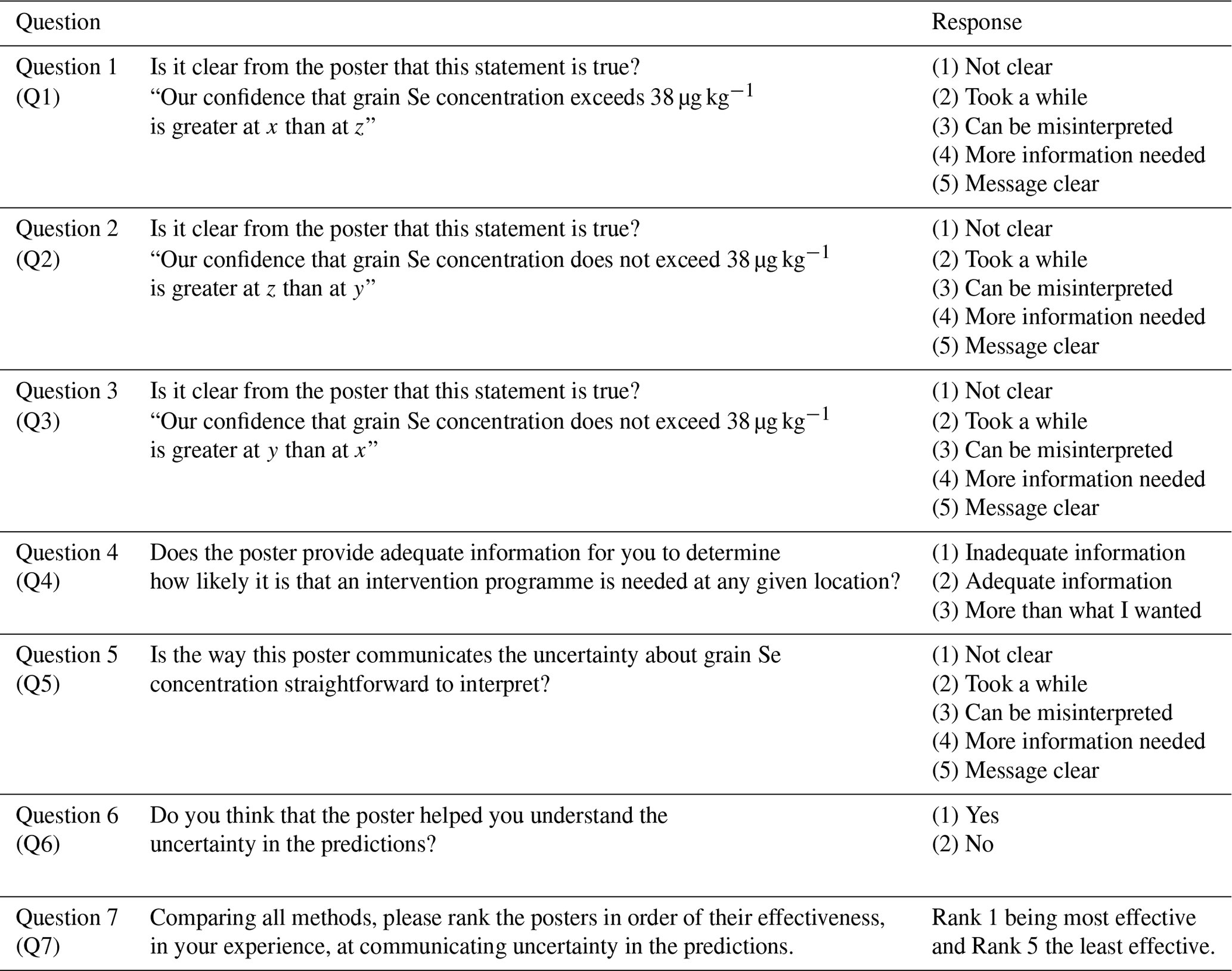
Evaluation of communication methods was done through a questionnaire, as shown in Table 3, but without putting the participants in a situation where they felt they were being tested on their mathematical skills and understanding. The first part of the questionnaire was an interpretative task (questions 1–3, i.e. Q1–Q3). We presented the participants with true statements about the confidence in the information presented on the maps at different locations (x, y and z). We asked whether the communication of uncertainty was clear. Then, we had the decision-focused task, Q4, in which we asked whether each poster (prediction plus uncertainty) provided adequate information to support a given decision. We then had reflective tasks Q5 and Q6. In Q5, we asked whether in each case the uncertainty about grain Se concentration was straightforward to interpret. We asked if the method of communication helped them understand uncertainty in the predictions in Q6. At the end of the questionnaire, we wanted the participants to assess the methods (Q7) by ranking the posters in order of their effectiveness at communicating uncertainty in the predictions.
In each workshop, we started out with an introductory talk to explain the objectives of the exercise. During the talk, we also explained the structure of the questionnaire and how we expected the participants to complete it. After being handed the questionnaires, the participants were directed into a room with the five methods displayed on A0-sized posters. Participants visited each poster in a randomised order to avoid any bias resulting from the carry-over effects from one poster to another when the individual responses were pooled for analysis. For example, if participants found a particular method easier to interpret, this might help them understand the next poster that they examined. Participants were not allowed to speak to one another when they were completing their questionnaires to avoid bias. When completing the last two questions on the questionnaire, participants were allowed to revisit the posters without following the randomised order to revise their answers. A non-specialist facilitator was stationed at the poster, to check that participants were on the correct pages on the colour-coded questionnaire, to check that all questions were completed and to help with any problems (e.g. translating language).
2.3 Data analysis
We presented our results for Q1 to Q6 as contingency tables, where the selected responses in the rows (of which there are nr) and the columns (of which there are nc) are the posters (i.e. methods of communication), separated either between the location of the meeting (Ethiopia or Malawi) or between professional group (agronomist, soil scientist or nutritionist/health practitioner) of the respondent. Analysis of the contingency table allowed us to test the null hypothesis of the random association of the responses with the factor in columns (i.e. that the proportion of participants indicating a particular response to the question is independent of the poster which they are considering). The description of how we partitioned contingency tables to evaluate whether there were differences between the location of the meeting and professional groups is given in the Appendix.
The null hypothesis for a contingency table is equivalent to an additive log-linear model of the table under which the expected number of responses in cell [i,j], ei,j, is the product of the row and column totals (ni and nj) divided by the total number of responses, N. An alternative log-linear model, the so-called “saturated” model for the table, has an extra term which allows an interaction between the rows and columns of the table, such that the proportions of different responses may differ among all the posters.
The evidence for the saturated model, as a better model for the data than the additive model, is provided by the likelihood ratio statistic or the deviance for the two models, L, where, in the following:
and oi,j are the number of observed responses in cell [i,j]. Under the null hypothesis of random association between the rows and columns of the table, L has an approximate χ2 distribution, with degrees of freedom (Christensen, 1997; Lawal, 2014). We fitted the log-linear models using the loglm function from the MASS package in the R platform (Venables and Ripley, 2002).
Our primary interest is whether there are differences in the responses recorded by our participants depending on the method of communicating uncertainty. However, it was first necessary to consider whether there was evidence for differences in the responses between the two sets of respondents at different locations. Such differences might arise because of differences in the composition of the groups (Table 2), differences between the examples presented (a map from the Amhara region in Ethiopia and a map of Malawi), differences between the contexts (in Ethiopia, many were local professionals recruited for the exercise; in Malawi, many of the participants were already engaged with the GeoNutrition project) and the possibility of unconscious changes in how the second meeting, in Ethiopia, was conducted (adapting from the experience of conducting the exercise in Malawi). Because our participants were drawn from different professional groups, we thought this would affect their responses, and if this was the case, then this would also be of interest because it would suggest that people from different professional backgrounds find some methods better than others.
For this reason, we first tested whether there were differences in the overall responses between the locations of the meetings, using a contingency table in which the responses to different posters by people from different professional groups are pooled within the two meeting locations. This gave us a five (responses) by two (locations) contingency table, with 4 degrees of freedom for each poster (Q1–Q3 and Q5), or a three (responses) by two (locations) contingency table, with 2 degrees of freedom (Q4), or a two (responses) by two (locations) contingency table, with 1 degree of freedom (Q6). We next tested whether there were differences in the overall responses between the different professional groups, using a contingency table in which the responses to different posters were pooled within each of those groups.
For some questions, there were differences in the responses between the location of the meeting. But for no questions was there any evidence to reject the null hypothesis of random association between responses and the professional group of the participants. We, therefore, proceeded to consider a set of prior hypotheses about differences in the responses between posters and the methods which they employed to communicate uncertain information, based either on a partition of the separate subtables for each location (where the locations differed) or of a table in which the responses from the different locations were pooled.
The first hypothesis which we considered is that participants would respond differently to a threshold-based approach to uncertainty (in which the poster presents the probability that the Se concentration in grain at an unsampled site falls below or above a threshold – posters 2, 4a and 4b) than they would to a general measure of uncertainty (the kriging variance, poster 3, or the prediction interval for the prediction, poster 1). We call this hypothesis H1, and the evidence against the corresponding null hypothesis, H, was evaluated by the deviance in the subtable for which the responses to posters 2, 4a and 4b were pooled in one column (threshold based) and the responses to posters 1 and 3 were pooled in a second.
The second hypothesis that we considered, H2, was that the respondents' views on the posters that used kriging variance would differ from their views on the posters that used prediction intervals. The evidence against the corresponding null hypothesis, H, was tested by the subtable comprising the responses to poster 1 in one column and the responses to poster 3 in a second.
Table 4Analysis of Q1 according to the location of the meeting, professional group and methods that the latter tested on separate location subtables.

Note: each row of this table presents a test of a null hypothesis of random association between the rows and columns of a contingency table, but the four highlighted here correspond to the prior hypotheses about differences among posters which are of primary interest. The asterisk (*) indicates the probability of obtaining a deviance statistic this large or larger if the null hypothesis of random association of the rows and columns of the table holds.
The deviances for the tables testing null hypotheses H and H are two components of the deviance for the overall table (whether this is pooled over several locations or a subtable for one location). The remaining deviance component is for a subtable with all the separate responses to threshold-based methods. This can be partitioned into two further components, which address our two remaining hypotheses.
The first of these, hypothesis H3, was that respondents would have different opinions about poster 4a (raw probability values) than the posters (4b and 2) in which guides to the interpretation of the probability are given (pictographs or a partition of the probability into intervals corresponding to the calibrated phrases of the IPCC scheme). The null hypothesis, H, is tested by the deviance of a table in which one column comprises responses to poster 4a and the second contains pooled responses to posters 4b and 2.
The final hypothesis, H4, was that respondents would have different opinions on the poster which used the calibrated phrases of IPCC (poster 2) and the rather different approach of poster 4b, with pictographs imposed on a map of probabilities.
The approaches above were applied for Q1 to Q6.
We tabulated the responses for Q7, with ranks as the rows and posters as the columns. Participants were asked to rank the preferred poster first, but we reversed this for the analysis, giving a rank of 5 to the most preferred poster and of 1 to the least. We considered only those responses in which a complete ranking was provided by the respondent. The mean rank was calculated for each poster, and this was done over all respondents and then separately for locations and for professional groups.
For a set of rankings of k items, under a null hypothesis of random ranking, the expected mean rank for each item is . The evidence against this null hypothesis can be measured by the following statistic:
where is the mean rank of the ith item, and a total of n rankings comprise the data. Under the null hypothesis, this statistic is distributed as χ2(k−1) (Marden, 1995).
At the Ethiopia meeting, we had fewer participants (64 %) who had studied mathematics and statistics up to degree level and above than at the Malawi meeting (88 %; see Fig. S9). We had more participants using statistics or mathematics regularly in their job at the Malawi meeting (52 %) than at the Ethiopian meeting (18 %). Most of the participants at the Ethiopian meeting (58 %) occasionally use mathematics or statistics in their jobs. There were more soil scientists (48 %) at the meeting in Malawi than agronomists and nutritionists/health practitioners. While, in Ethiopia, there were more nutritionists/health practitioners (47 %) compared to the other professional groups.
Table 5Analysis of Q2 according to the location of the meeting, professional group and methods that the latter tested on separate location subtables.
Note: each row of this table presents a test of a null hypothesis of random association between the rows and columns of a contingency table, but the four highlighted here correspond to the prior hypotheses about differences among posters which are of primary interest. The asterisk (*) indicates the probability of obtaining a deviance statistic this large or larger if the null hypothesis of random association of the rows and columns of the table holds.
Table 6Analysis of Q3 according to the location of the meeting, professional group and methods that the latter tested on separate location subtables.
Note: each row of this table presents a test of a null hypothesis of random association between the rows and columns of a contingency table, but the four highlighted here correspond to the prior hypotheses about differences among posters which are of primary interest. The asterisk (*) indicates the probability of obtaining a deviance statistic this large or larger if the null hypothesis of random association of the rows and columns of the table holds.
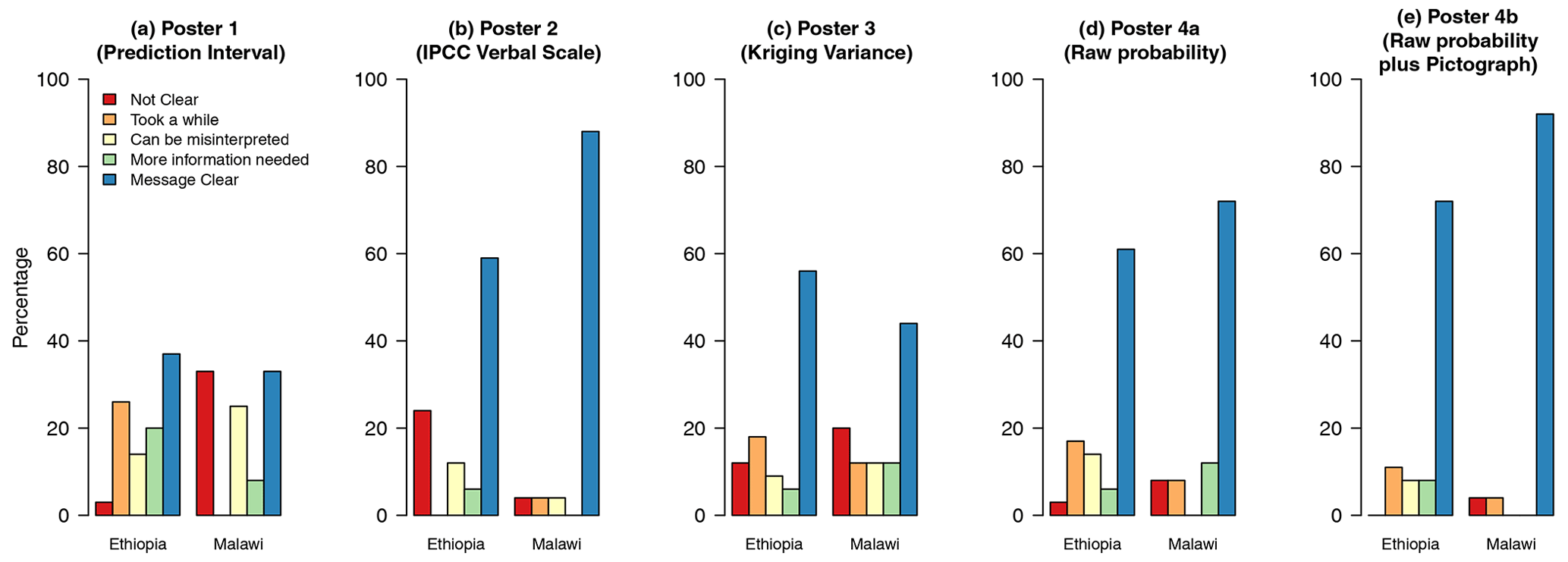
Figure 2Bar charts showing how participants when pooled within the location of the meeting responded to the interpretive task (Q1).
3.1 Interpretative tasks
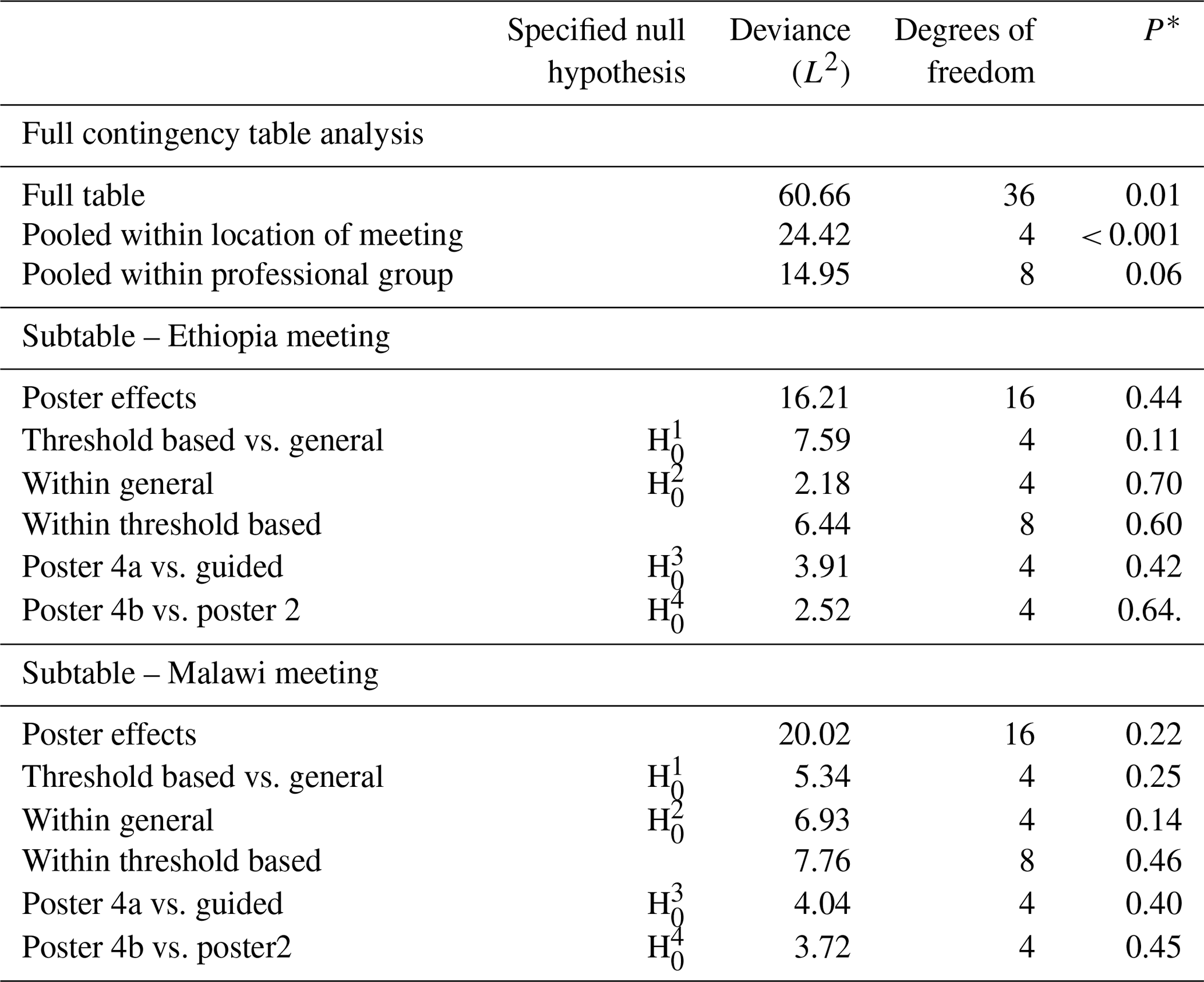
The full tables for responses over both locations and all posters to Q1 are shown in Table A1 in the Appendix. The responses pooled for both meeting locations are shown in Table A2. There is strong evidence for differences among the columns of the full table (P<0.001) and strong evidence (P<0.001) against the null hypothesis of random association between posters and responses pooled within locations and responses (Table 4). However, there was no evidence to reject the null hypothesis of random association between posters and responses pooled within professional groups. On this basis, further analysis of responses to posters was based on the separate subtables for the Ethiopia and Malawi meeting locations. Similar results were obtained for Q2 and Q3, as shown in Tables 5 and 6, respectively.
Table 7Analysis of Q4 according to the location of the meeting, professional group and methods that the latter tested on separate location subtables.
Note: each row of this table presents a test of a null hypothesis of random association between the rows and columns of a contingency table, but the four highlighted here correspond to the prior hypotheses about differences among posters which are of primary interest. The asterisk (*) indicates the probability of obtaining a deviance statistic this large or larger if the null hypothesis of random association of the rows and columns of the table holds.
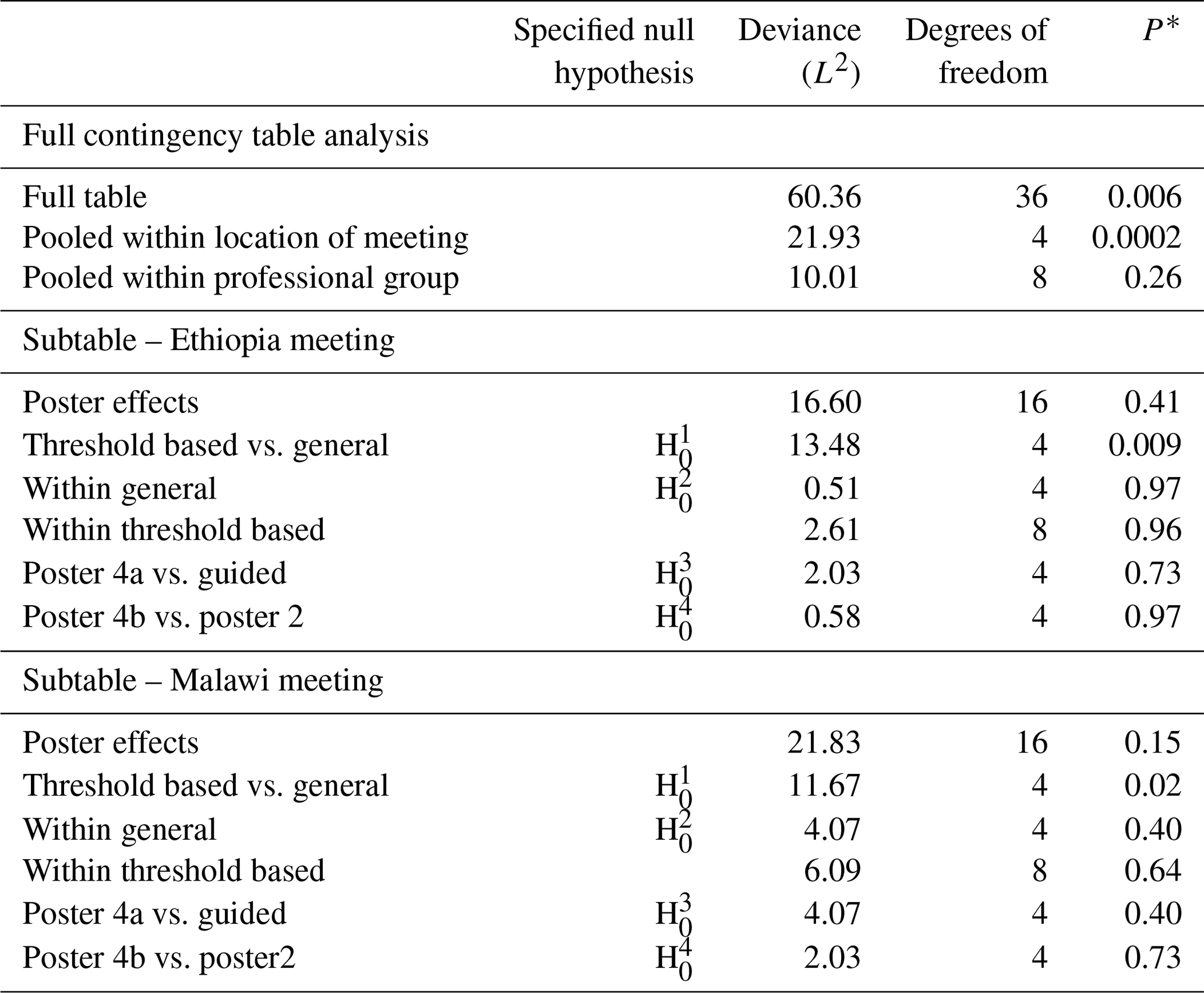
For Q2, while there is evidence for a difference in responses between the two meeting locations, there is no evidence, either for the responses from Ethiopia or from Malawi, to reject the null hypothesis for any of the focussed questions about differences between posters (see Table 5). For Q3, however, there is evidence for a difference in the responses for the threshold-based methods and the general methods in the responses from Ethiopia (P=0.009) and from Malawi (P=0.02; see Table 6).
Figure 2 shows the responses to Q1 for the separate posters for each subtable. Threshold-based methods were found to be clearer by a larger proportion of the participants. In both countries, there was a marked difference between poster 1 (prediction intervals) and the rest, with a much smaller proportion of respondents selecting the response “message clear”. In Malawi, a large proportion of respondents selected “not clear” as their response for this poster. The figures which summarise responses for Q2 and Q3 are shown in the Supplement (Figs. S10 and S11).
3.2 Decision-focused task
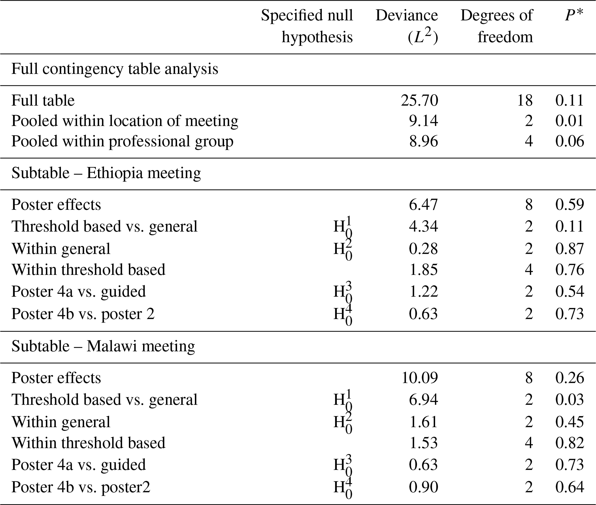
There was no evidence for differences among the columns of the full table (P=0.11) and strong evidence (P=0.01) against the null hypothesis of random association between posters and responses pooled within locations and responses for Q4 (Table 7). However, there was no evidence to reject the null hypothesis of random association between posters and responses pooled within professional groups. Therefore, further analysis of responses to posters was based on the separate subtables for the Ethiopia and Malawi meeting locations.
For Q4, we have no evidence to reject the null hypothesis of the random association between poster and response for any of our set of four focussed hypotheses in Ethiopia. In Malawi, however, there is evidence (P=0.03) to reject the and not the other focussed hypotheses.
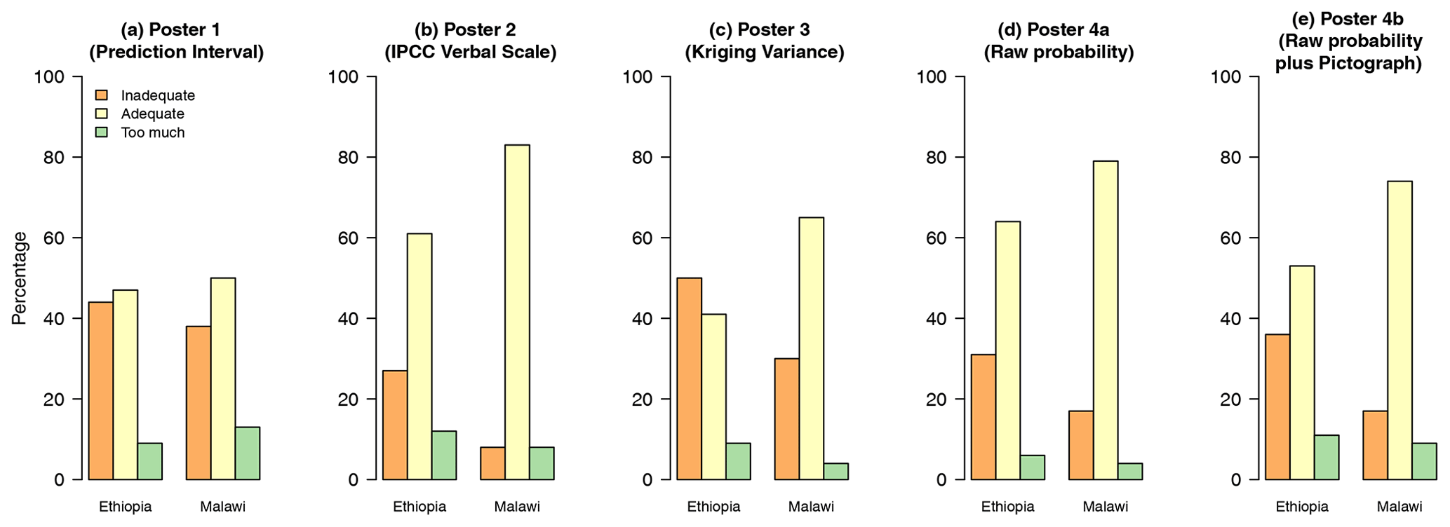
Figure 3Bar charts showing how participants, when pooled according to the location of the meeting, responded to whether a method provided adequate information or not (Q4).
Figure 3 shows the responses to Q4 for the separate posters for each subtable graphically. The larger proportion of the participants found threshold-based methods to provide adequate information for decision-making. In Ethiopia, poster 3 (kriging variance) was different from all other posters, with a large proportion of respondents selecting “inadequate information”.
Table 8Analysis of Q5 according to the location of meeting, professional group and methods that the latter tested on pooled counts over Ethiopia and Malawi.

Note: each row of this table presents a test of a null hypothesis of random association between the rows and columns of a contingency table, but the four highlighted here correspond to the prior hypotheses about differences among posters which are of primary interest. The asterisk (*) indicates the probability of obtaining a deviance statistic this large or larger if the null hypothesis of random association of the rows and columns of the table holds.
Table 9Analysis of Q6 according to the location of the meeting, professional group and methods that the latter tested on pooled counts over Ethiopia and Malawi.
Note: each row of this table presents a test of a null hypothesis of random association between the rows and columns of a contingency table, but the four highlighted here correspond to the prior hypotheses about differences among posters which are of primary interest. The asterisk (*) indicates the probability of obtaining a deviance statistic this large or larger if the null hypothesis of random association of the rows and columns of the table holds.
3.3 Reflective task
There is no evidence for differences among the columns of the full table (P=0.26) for Q5 (Table 8). Also, there is no evidence (P=0.63) against the null hypothesis of the random association between posters and responses pooled within locations. Table 9 shows that there is strong evidence for differences among the columns of the full table (P=0.001) for Q6. However, the evidence is marginal (P=0.05) against the null hypothesis of random association between posters and responses pooled within locations and responses. However, there was no evidence to reject the null hypothesis of random association between posters and responses pooled within professional groups for both Q5 and Q6. On this basis, further analysis of responses to posters was based on pooled counts for the Ethiopia and Malawi meetings. The responses for Q5 are shown in Table A3.
As shown in Table 8, we have evidence (P=0.02) to reject the null hypothesis of contrasting the threshold-based methods with the general uncertainty measures for Q5. For Q6, there is evidence for a difference in the responses for the threshold-based methods and the general methods (P< 0.001). However, we have no evidence for the second, third and fourth focussed hypotheses in both Q5 and Q6.
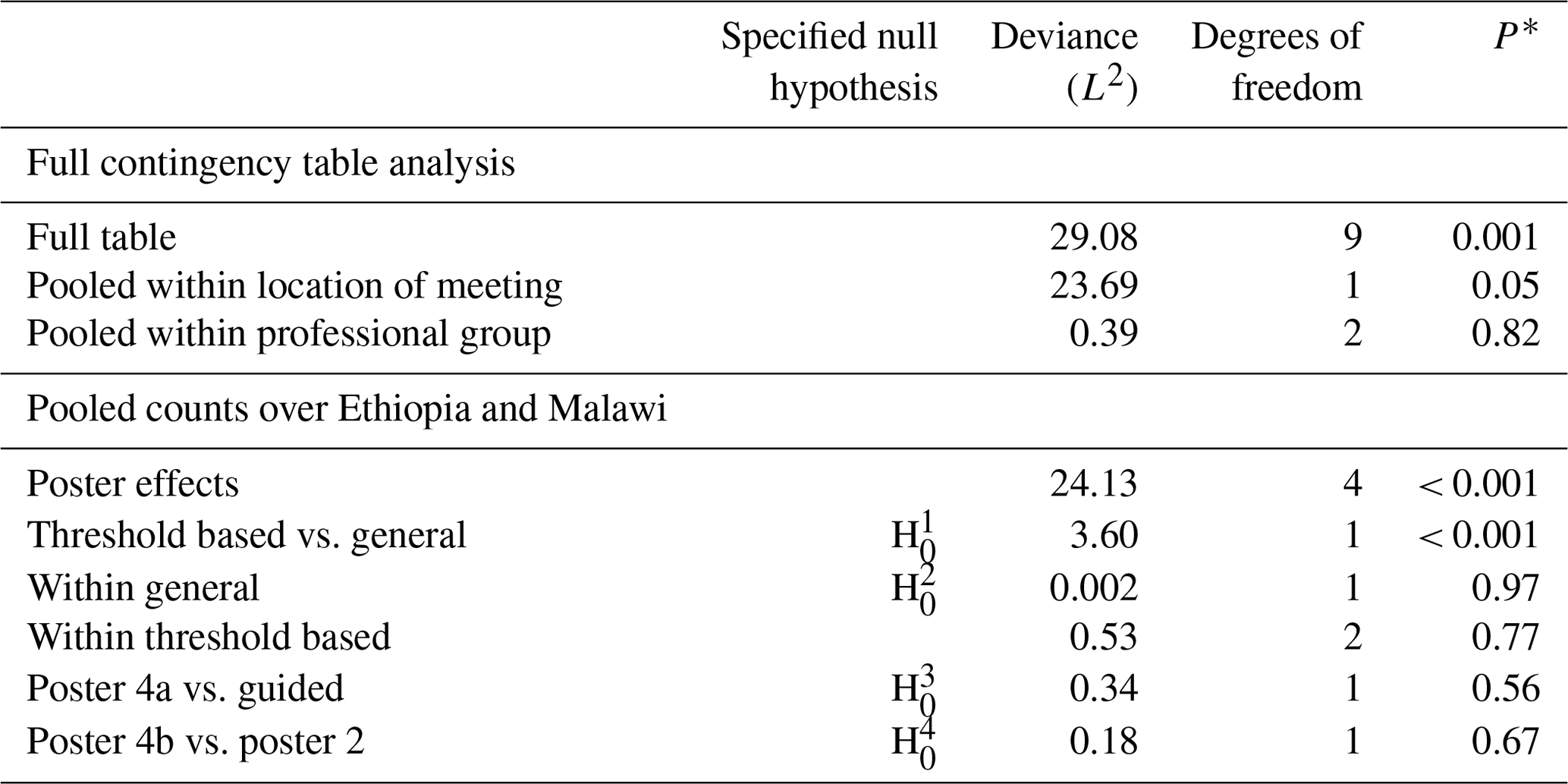
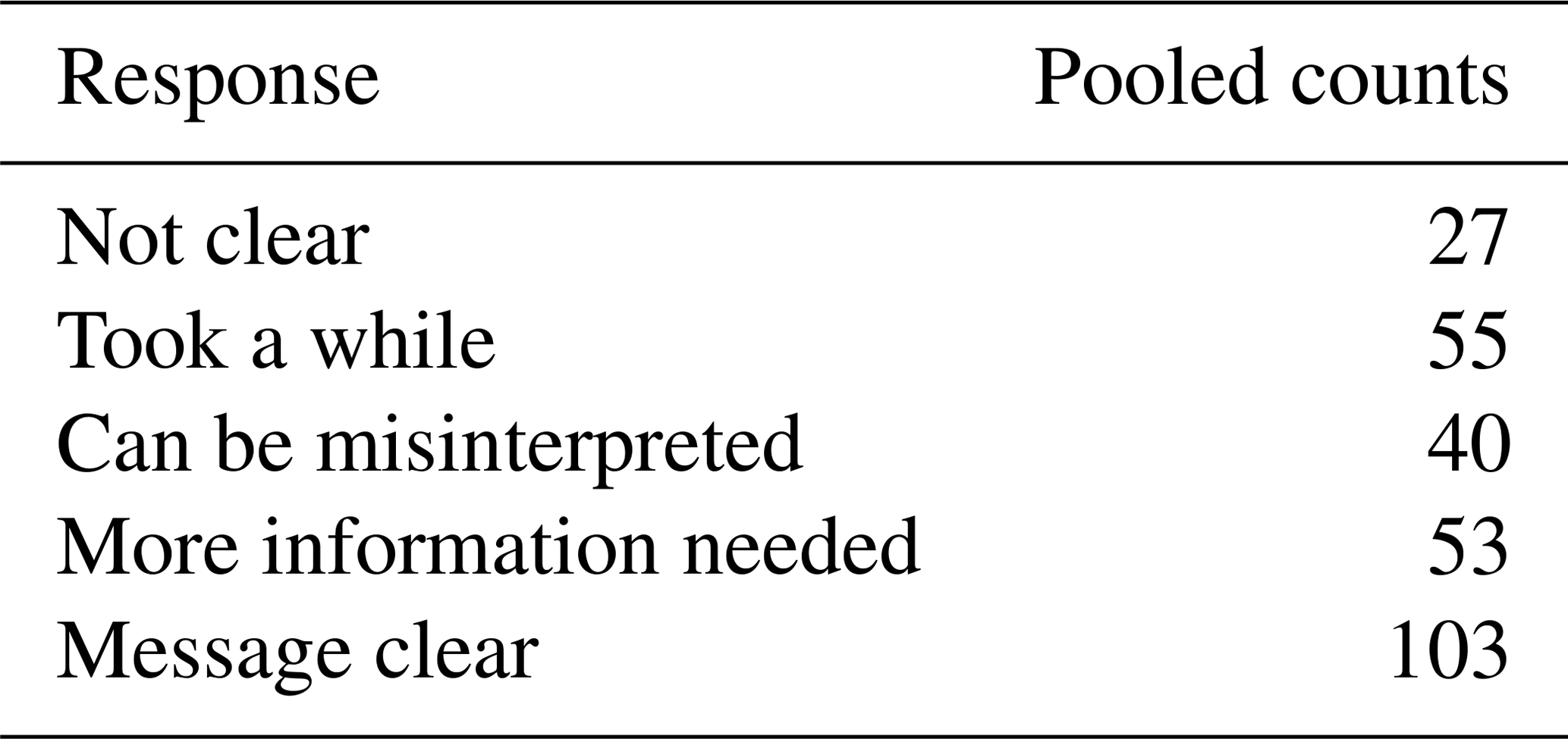
Figure 4 shows the responses to Q5 for the separate posters for pooled counts graphically. We can see that there is a greater proportion of respondents selecting the response “message clear” for threshold-based methods, i.e. posters 2 (IPCC verbal scale), 4a (raw probability) and 4b (raw probability plus pictograph), than on general based. We also see more people selecting the response “not clear” for posters 1 (prediction intervals) and 3 (kriging variance), the general-based methods. Figure 5 shows how participants responded to Q6. There was a marked difference between poster 3 (kriging variance) and the rest, with a much larger proportion of respondents selecting the response “no”.
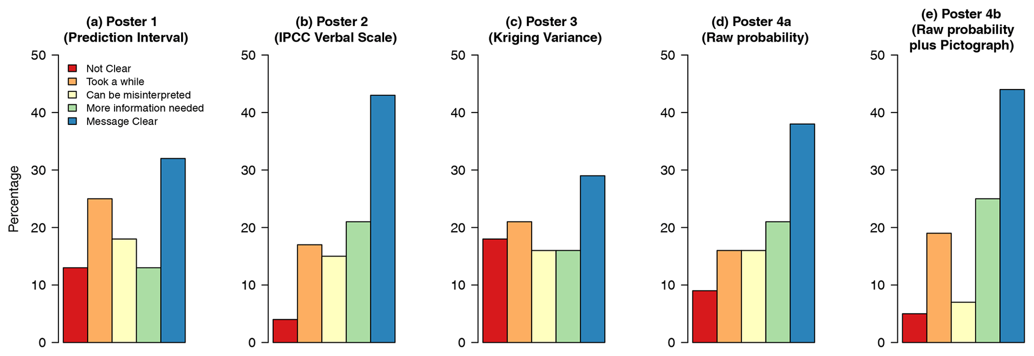
Figure 4Bar charts showing how participants responded to whether a method is straightforward to interpret (Q5).
Figure 5Bar charts showing how participants responded to how each poster helped them understand uncertainty in the spatial predictions (Q6).
Table 10Analysis of Q7 according to all the respondents, the location of the meeting and the professional group.
The asterisk (*) indicates the probability of obtaining a deviance statistic this large or larger if the null hypothesis of random ranking of the rows and columns of the table holds.
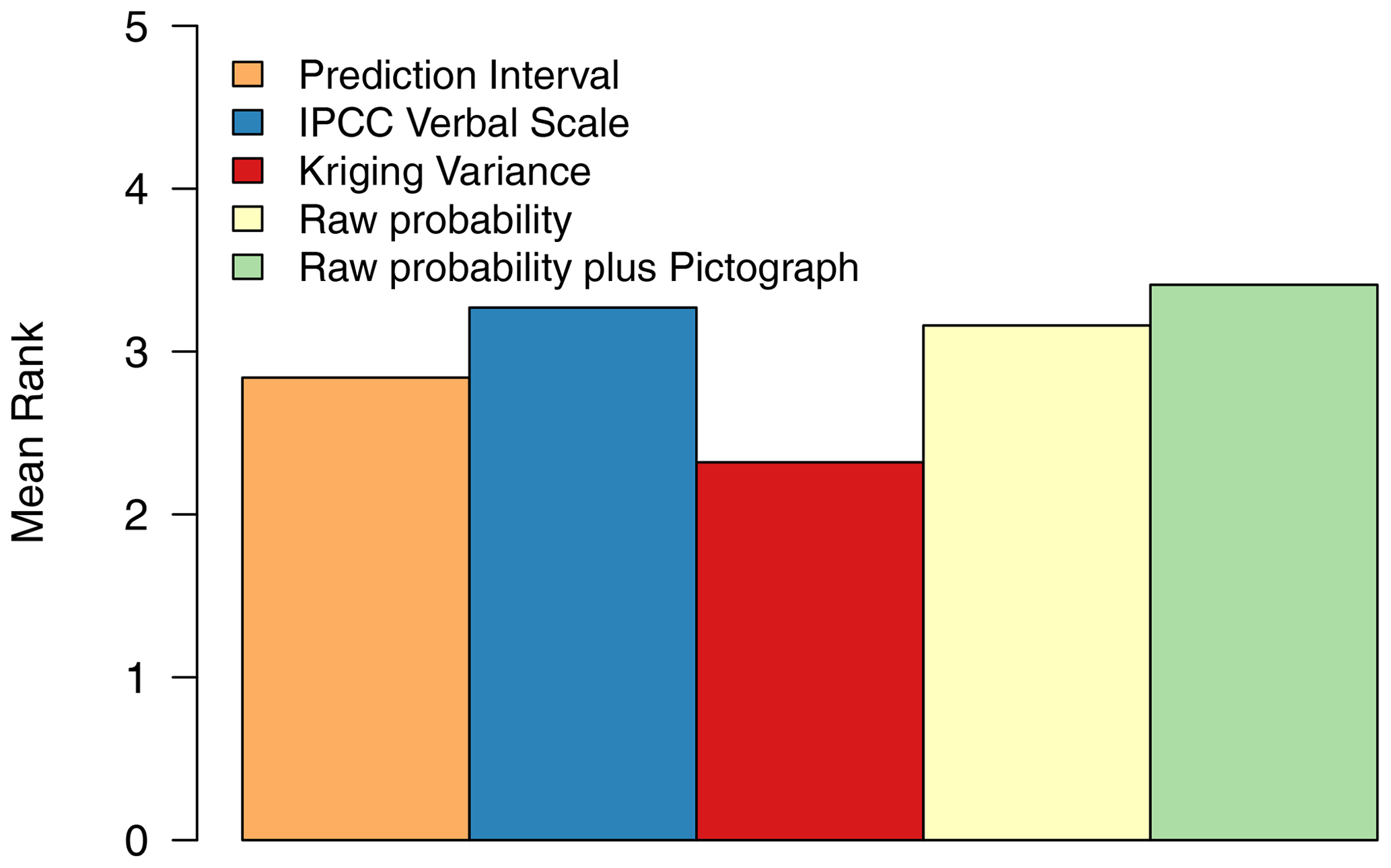
Figure 6Ranking of posters in terms of the most effective at communicating uncertainty about spatial predictions.
3.4 Assessment of the method
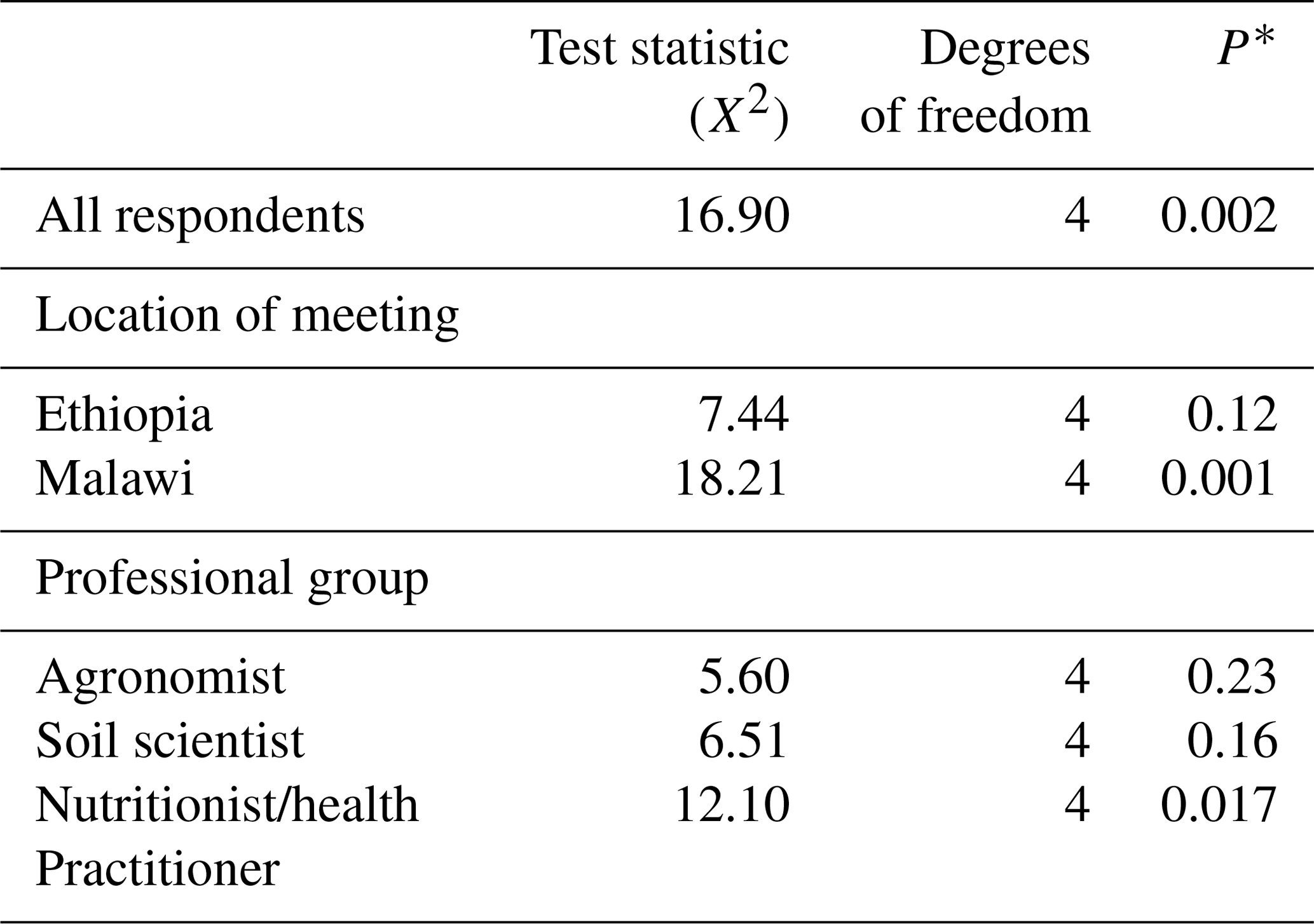
For Q7, first, we computed the mean ranks for all the participants and measured the evidence against the null hypothesis of random ranking using Eq. (3). Table 10 shows that there is strong evidence (P=0.002) against the null hypothesis of random ranking.
Second, we computed mean ranks for each location of the meeting. After the test, we found no evidence (P=0.12) against the null hypothesis in Ethiopia. However, at the Malawi meeting, there was strong evidence (P=0.001). The difference may be because the set of stakeholders at the Malawi meeting was more homogenous in terms of professional group (a less even distribution among them) and level of mathematical education than the stakeholders at the Ethiopia meeting.
Last, we computed mean ranks for the different professional groups. We found strong evidence against the null hypothesis of random ranking for the nutritionists/health practitioners (P=0.017) and not for soil scientists (P=0.16) and agronomists (P=0.23).
Figure 6 shows the mean rankings for the separate posters for all the respondents graphically. Posters 4b (raw probability plus pictograph) and 2 (IPCC verbal scale) had the largest mean ranks, and poster 3 (kriging variance) had the least. Threshold-based methods were found to be more effective at communicating uncertainty about spatial predictions of grain Se concentration.
In this study, we tested strategies to communicate uncertain information through a systematic evaluation and comparison with distinct groups of data end-users. We found significant differences between participants' responses to the posters which employed general measures of uncertainty (kriging variance or prediction interval) and those which presented the probability that the Se concentration in grain falls below or above a threshold. The interpretative task that participants undertook was based on interpretation of the information relative to a nutritional threshold. The presentation of uncertainties in terms of probabilities framed with respect to this threshold was found more accessible by data users than the general measures of uncertainty, despite the general view (see Spiegelhalter et al., 2011) that users of information commonly find probabilities hard to interpret. Our results suggest that users of information can find information presented in terms of probabilities accessible and clear.
There was no evidence that the participants responded more positively to communication of uncertainty in the form of probabilities when these were supported with pictographs, or the calibrated phrases of the IPCC scheme, in contrast to the simple map of probability, although the maps with pictographs were highest ranked. These methods to assist the interpretation of probability are widely used because of the assumption that many users of information find probabilities hard to interpret. However, there is evidence that calibrated phrases are themselves not without problems. Budescu et al. (2009) reported substantial inconsistencies in how people interpret scales of calibrated phrases, with a tendency to have a “regressive” interpretation (interpreting large or small probabilities as close to 0.5). Jenkins et al. (2019) found that presentations of probability in numerical formats were consistently perceived as more credible than verbal expressions. While the posters using pictographs were ranked highest (Fig. 6) in our study, we have not shown that they are markedly preferred. We note that our study focussed on stakeholders' preferences and opinions and did not include tests of how correctly the information was interpreted. We, therefore, suggest that further work is needed before a definitive assessment can be made of the value of calibrated phrases or pictographs in supplementing raw probability, while noting that we have not found them to be markedly more congenial to the user.
Kriging variances were the lowest-ranked poster in the participants' overall assessment (Fig. 6). The kriging variance is fundamental to the geostatistical approach for predicting spatial variables. It is the quantity which is minimised by the kriging predictor, and its virtues as a built-in measure of the uncertainty of point predictions have been widely acknowledged. Nonetheless, it is clear that the kriging variance in itself is not an accessible measure of uncertainty for most end-users. Along with prediction intervals, the kriging variance is a general measure of uncertainty which reflects the spatial variability of the target variable and the local density of the sample. Although the kriging variance is a valid statistic, in this context it has very little value as a means for communicating uncertainty for a general audience. That is particularly true in this case, where the kriging variance must remain on transformed units, and so it serves as little more than a general uncertainty index. This was clear a priori and is confirmed by the responses we received. Our findings here cannot, therefore, be regarded as definitive, and a similar experiment for variables which do not require transformation would be necessary in further research. In such cases, one could also include the kriging standard error as an uncertainty measure to assess (i) whether the fact that it is presented in the units of the target variable makes it preferable to kriging variance and (ii) whether it is regarded as less interpretable than its rescaled form as a prediction interval. That said, our results do show that the communication of prediction intervals requires more attention.
These considerations aside, kriging variances, standard error and prediction intervals must be interpreted by the user along with other information (for example, is the predicted value close to the threshold or substantially different from it?) in order to make a judgement at a particular location. Our results do show that the probability measure, tied directly to the interpretative task, is clearer to the user than general measures of uncertainty.
Prediction intervals were not ranked highly by our participants, and we had no evidence that they were found any clearer than the kriging variance. In part, this might be because of the limitations in presenting the predictions and upper and lower bounds of the prediction interval as three separate maps. The task of interpreting the information at one location or comparing two, when this entails examining three maps, may have influenced the participants' responses. In other settings, the prediction intervals might be more effective for interpretation, for example where the user of information can display the prediction intervals for a prediction at a site of interest as a single figure (e.g. a bar against a scale) with the threshold value of concern indicated. Further work is needed on different ways to present the prediction intervals for interpretative tasks.
We only found strong evidence of differences between the meeting location for questions on interpretative and decision-focused tasks. This can be attributed to the composition of each group. Participants at the Malawi meeting comprised researchers and stakeholders already somewhat engaged with the GeoNutrition project, whereas those in Ethiopia were mainly local stakeholders not previously involved with the project.
The participant groups from the two locations differed in their self-assessed level of mathematical education and use of mathematics and statistics in their work. We had more participants with mathematical components in their education up to degree level in Malawi than in Ethiopia. We had fewer people who had mathematical education only to secondary/high school level in Malawi than in Ethiopia. There were fewer participants who used mathematics and statistics regularly at the Ethiopia meeting. This, along with the differences in role noted in the previous paragraph, might contribute to differences between the locations. However, our data cannot support a more detailed assessment of the effects of mathematical background because they are strongly unbalanced. For example we only had 3 % of participants educated up to certificate/diploma level at the Ethiopia meeting. Further work to address this question and examine how stakeholders interpreted each poster will require an elicitation with sufficient numbers of participants with different mathematical backgrounds. This would be useful for a better understanding of how different learning styles influence the interpretation of uncertain information.
No map is perfect (Heuvelink, 2018), but maps must be used as a basis for decisions. It is, therefore, important to ensure that the user of spatial information is aware of the uncertainty in these predictions, and that these are communicated in a clear way. The user must be aware that the predictions have an attached uncertainty, and it is therefore possible that a decision they make might be judged as being incorrect in the light of perfect information. Given this, the user must have a clear enough understanding of the uncertainty attached to a prediction so as to be confident that the decision they make will be robust given the uncertainty. For example, the predicted concentration of a nutrient in a staple crop at a location may be such that the intake of the nutrient should be sufficient to meet the needs of those who eat that crop. The user should consider the uncertainty in that prediction. If the probability that the threshold concentration is exceeded is just 0.6 (about as likely as not on the IPCC scale), then they may conclude that a decision on whether or not to proceed with an intervention at that location requires further information. If, on the other hand, the probability is 0.95 (very likely) then they may be confident in deciding to prioritise interventions elsewhere. However, if the uncertainty is not communicated clearly, then the data user might be over-confident in predictions where the probability that the threshold is exceeded is only just over 0.5 and may waste resources in further investigation or unnecessary interventions at locations where the prediction was well supported and indicated adequate local concentrations of the nutrient.
The findings of this study complement work that has been done on cartography and visualisation for spatial information (Kunz et al., 2011; Beven et al., 2015). Our findings show the importance of finding cartographic solutions to represent probability information and to develop interactive methods for interpretation in a geographic information system (GIS) environment (e.g. to produce pictographs, like those we have used, for sites of interest or to find more effective ways of representing the 95 % prediction interval). It is good practice to use a consistent colour scale for the three legends showing the lower and upper 95 % prediction interval and the conditional median. However, in our study, we could not use one colour legend for the three maps for Fig. S1 (poster 1) because of the marked differences in the predicted values on back-transformation. This made it difficult to find a working colour scale from the minimum value in the lower bound to the maximum in the upper bound on which one would see the variation in all three maps. We opted to use a continuous legend on the map of the mean and discrete ones for the lower and upper limits. This might have hindered interpretation. However, we suspect that there is a need for fundamentally different ways of visualising prediction intervals, perhaps by using interactive methods to display them in a GIS environment.
We accept that a possible source of bias in any such study is that a participant feels that they are being tested on their interpretative skills and so might select a response which suggests, in a general sense, that they understand the input (e.g.“message clear” for the case in Table 3). However, all participants were aware that their responses were strictly anonymous, and it was emphasised that the task involved their evaluation of several methods for the communication of an interpretation which was provided. In future studies, it might be useful to include some final questions which actually are “tests of interpretation”, secondary to the main task, to see whether this affects the responses given for different methods.
Despite the general expectation that users of spatial information do not generally find probabilities a congenial way to express uncertainty, we found that when probability is used to quantify the uncertainty in a specific interpretation of spatial information, based on a nutritionally significant threshold, end-users largely found the approach clear and preferable to general measures of uncertainty which are not directly linked to the specific interpretation (prediction intervals and kriging variance). In the general assessment and ranking of how methods to present uncertainty succeeded, the methods based on a specific interpretation of the information, using probability, were again preferred. There was no significant evidence for a difference in assessment by users of presentations which used probability alone or those which used pictographs or verbal phrases to aid in the interpretation of the raw probability values, although these latter methods were ranked highest among all methods.
Because decisions on interventions to address nutrient deficiencies may have positive and negative effects on peoples' health and well-being, the interpretation of information such as that we have used is not value neutral, and uncertainty in information has ethical implications (given that all spatial information is uncertain, how much uncertainty is ethically acceptable in the decision-making process?). While these considerations are outside the scope of the study reported here, it would be interesting, in future research, to examine how individual attitudes to the ethics of fortification interventions affect their responses and whether individuals' perspectives on the ethical implications of basing decisions on uncertain information differs between different methods to communicate that uncertainty.
To conclude, we suggest that the challenge of communicating the significance of uncertain information to a range of stakeholders should be considered in the context of specific interpretations of the information (e.g. nutrient concentrations relative to thresholds of nutritional significance) and that, in this setting, probabilities can be accessible to a wide range of end-users. Calibrated phrases or pictographs seem to have some value (given the rankings by our participants), although there is no strong evidence that they should be preferred to a simple map of the probability. While general measures of uncertainty (kriging variance and prediction intervals) are valid ways of quantifying uncertainty, they are less effective for communication, although other ways of presenting prediction intervals for spatial data in interactive formats online or in a GIS may merit further investigation.
In this section, we describe how we partitioned contingency tables to evaluate whether there were differences between the location of the meeting and professional groups. A full table, such as the one shown in Fig. A1, may be hard to interpret. Table A1 shows a full table of how many individuals selected a given response to Q1, the interpretive task. It is possible to partition the table, and its deviance statistic and degrees of freedom, into components corresponding to pooled tables and subtables of the full table. This is illustrated in Fig. A1. Here the full table is partitioned into a subtable for responses from Malawi and another subtable for responses from Ethiopia, as shown also in Table A2. A pooled table, in which the responses pooled over all posters in Malawi were compared with the responses similarly pooled from Ethiopia, completes the partition. As shown in Fig. A1, the deviance statistics for these three tables, and their degrees of freedom, sum to the deviance and degrees of freedom for the full table. In this case, we could conclude whether there are differences in the responses between the two locations (if not, then we might pool the responses for any poster at the two locations), and whether there are differences in responses to the posters at each location in turn. As described below, we used this approach to evaluate whether there were differences between the two locations. We also used it to examine evidence for differences in the responses for professional groups. Having done this, we then analysed either pooled tables or separate subtables (e.g. for responses in Ethiopia and responses in Malawi) to examine a priori contrasts between particular posters and groups of posters.
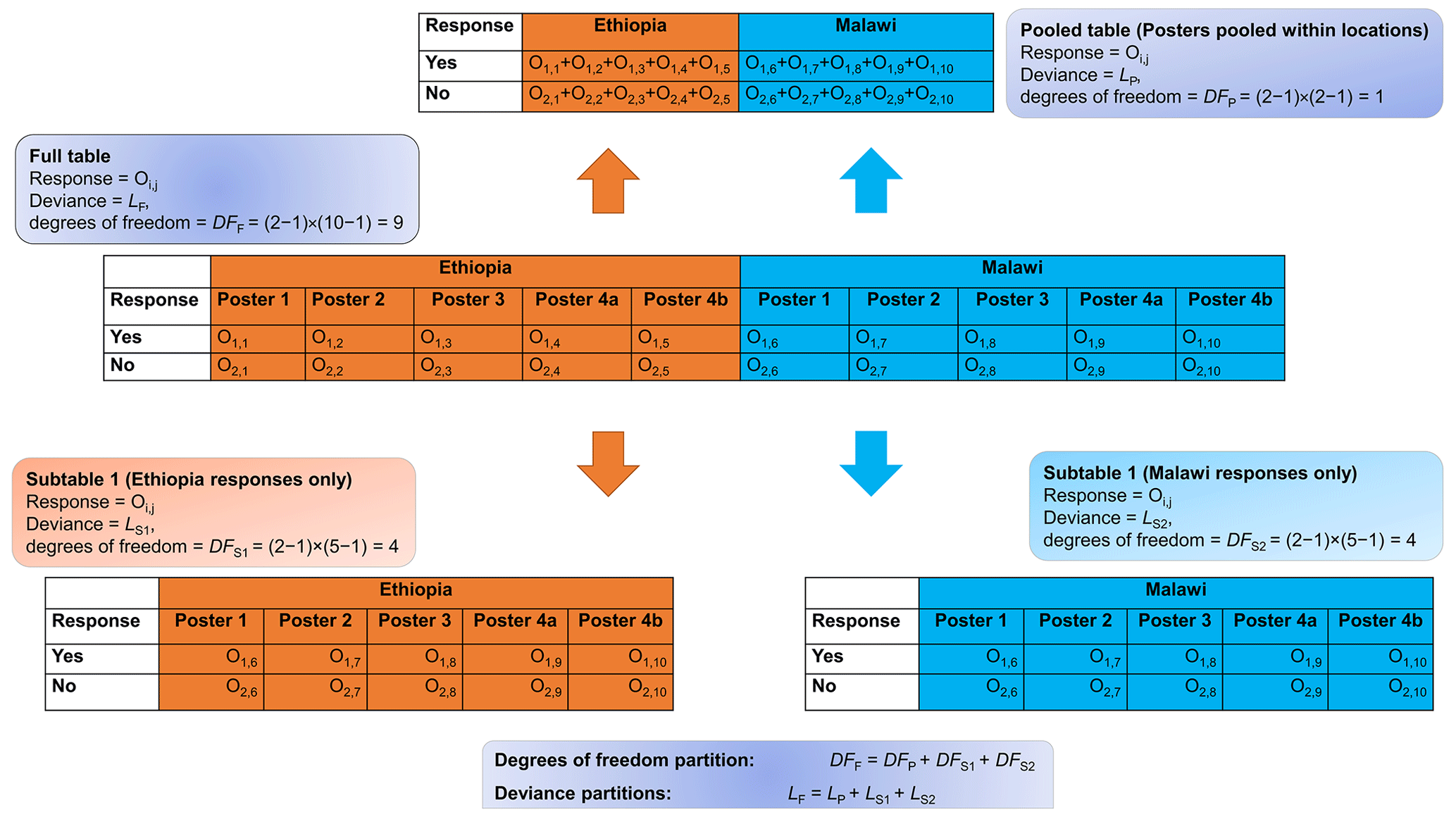
Figure A1An illustration of how the log likelihood ratio can be partitioned into subtables and pooled tables.
Table A1The full contingency table showing how many individuals selected a given response to Q1 (interpretive task). The table is presented according to the location of the meeting and the method of communication. The figures in parentheses are the expected numbers, and ei,j is the product of the row and column totals (ni and nj) divided by the total number of responses (N).
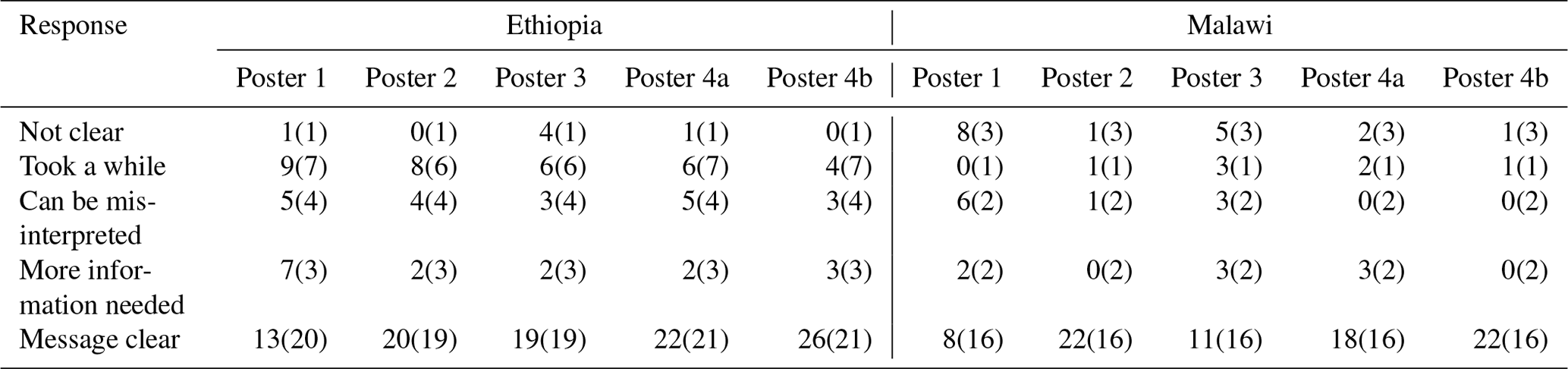
Table A2A subtable showing how many individuals selected a given response to Q1 when columns are pooled within the location of the meeting.

Table A3Responses to Q5 pooled responses from the Ethiopia and Malawi meetings.
The data and code that support this research are available at https://doi.org/10.6084/m9.figshare.14465736.v2 (Chagumaira et al., 2021).
The supplement related to this article is available online at: https://doi.org/10.5194/gc-4-245-2021-supplement.
The project was conceived, designed and implemented by CC, AEM and RML. PCN, JGC and DG supervised the data collected. RML and MRB were responsible for project administration and funding acquisition. All authors contributed to the preparation of the article.
The authors declare that they have no conflict of interest.
The funders of this paper were not involved in the study design or the collection, management, analysis and interpretation of the data, the writing of the report or the decision to submit the report for publication.
The authors gratefully acknowledge the contributions made to this research by the participating farmers and field sampling teams. In Ethiopia, field sampling teams were from the Amhara National Regional Bureau of Agriculture. In Malawi, field sampling teams were from the Department of Agricultural Research Services and the Lilongwe University of Agriculture and Natural Resources.
We also would like to acknowledge the contributions made by E. Louise Ander, Edward J. M. Joy and Alexander A. Kalimbira during the design of the experiment. We also appreciate Diriba B. Kumssa, Adamu Belay, Mesfin Kebede, Demeke Teklu Senbetu, Kidist Gemechu and Hasset Tamirat for their roles as facilitators during the elicitation in Malawi and Ethiopia.
This research has been supported by the Bill and Melinda Gates Foundation (grant no. INV-009129) and the Nottingham–Rothamsted Future Food Beacon (International Agriculture DTP).
This paper was edited by Kirsten von Elverfeldt and reviewed by Hazel Napier and one anonymous referee.
AfSIS: New cropland and rural settlement maps of Africa, available at: http://africasoils.net/2015/06/07/new-cropland-and-rural-settlement-maps-of-africa (last access: 25 April 2020), 2015
Belay, A., Joy, E., Chagumaira, C., Zerfu, D., Ander, E. L., Young, S. D., Bailey, E. H., Lark, R. M., Broadley, M. R., and Gashu, D.: Selenium Deficiency Is Widespread and Spatially Dependent in Ethiopia, Nutrients, 12, 1565, https://doi.org/10.3390/nu12061565, 2020.
Beven, K., Lamb, R., Leedal, D., and Hunter, N.: Communicating uncertainty in flood inundation mapping: a case study, Int. J. River Basin Manage., 13, 285–295, https://doi.org/10.1080/15715124.2014.917318, 2015.
Broadley, M. R., Alcock, J., Alford, J., Cartwright, P., Foot, I., Fairweather-Tait, S. J., Hart, D. J., Hurst, R., Knott, P., McGrath, S. P., Meacham, M. C., Norman, K., Mowat, H., Scott, P., Stroud, J. L., Tovey, M., Tucker, M., White, P. J., Young, S. D., and Zhao, F. J.: Selenium biofortification of high-yielding winter wheat (Triticum aestivum L.) by liquid or granular Se fertilisation, Plant Soil, 332, 5–18, https://doi.org/10.1007/s11104-009-0234-4, 2010.
Budescu, D. V., Broomell, S. B., and Han, P.: Improving communication of uncertainty in the reports of Intergovernmental Panel on Climate Change, Psychol. Sci., 20, 299–308, 2009.
Chagumaira, C., Murray L. R., and Milne, A. E.: Data and Code for Chagumaira et al. 2021 [Dataset], figshare, https://doi.org/10.6084/m9.figshare.14465736.v2, 2021.
Chilimba, A. D. C., Young, S. D., Black, C. R., Rogerson, K. B., Ander, E. L., Watts, M. J., Lammel, J., and Broadley, M. R.: Maize grain and soil surveys reveal suboptimal dietary selenium intake is widespread in Malawi, Sci. Rep., 1, 72, https://doi.org/10.1038/srep00072, 2011.
Christensen, R.: Log-Linear Models and Logistic Regression, Springer, Springer-Verlag, New York, 1997.
Diggle, P. and Ribeiro, P. J.: Model-based geostatistics, Springer-Verlag, New York, 2010.
Fairweather-Tait, S. J., Bao, Y. P., Broadley, M. R., Collings, R., Ford, D., Hesketh, J. E., and Hurst, R.: Selenium in Human Health and Disease, Antioxid. Redox Sign., 14, 1337–1383, https://doi.org/10.1089/ars.2010.3275, 2011.
Gashu, D., Lark, R., Milne, A., Amede, T., Bailey, E., Chagumaira, C., Dunham, S., Gameda, S., Kumssa, D., Mossa, A., Walsh, M., Wilson, L., Young, S., Ander, E., Broadley, M., Joy, E., and McGrath, S.: Spatial prediction of the concentration of selenium (Se) in grain across part of Amhara Region, Ethiopia, Sci. Total Environ., 733, 139231, https://doi.org/10.1016/j.scitotenv.2020.139231, 2020.
Goovaerts, P.: Geostatistics for Natural Resources Evaluation, Oxford University Press, 1997.
Goovaerts, P.: Geostatistics: a common link between medical geography, mathematical geology, and medical geology, J. S. Afr. I. Min. Metall., 114, 605–612, 2014.
Grafström, A. and Lisic, J.: BalancedSampling: Balanced and Spatially Balanced Sampling. R package version 1.5.2, available at: https://CRAN.R-project.org/package=BalancedSampling (last access: 26 March 2020), 2016.
Hatvani, I. G., Szatmàri, G., Kern, Z., Erdélyi, D., Vreča, P., Kanduč, T., Czuppon, G., Lojen, S., and Kohán , B.: Geostatistical evaluation of the design of the precipitation stable isotope monitoring network for Slovenia and Hungary, Environ. Int., 146, 106263, https://doi.org/10.1016/j.envint.2020.106263, 2021.
Heuvelink, G. B. M.: Uncertainty and uncertainty propagation in soil mapping and modelling, in: Pedometrics (Progress in Soil Science), edited by: McBratney A. B., Minasny, B., and Stockmann, U., Springer International Publishing, 439–461, https://doi.org/10.1007/978-3-319-63439-5-14, 2018.
Holmes, K. W., Van Niel, K. P., Kendrick, G. A., and Radford, B.: Probabilistic large-area mapping of seagrass species distributions, Aquat. Conserv., 17, 385–407, 2007.
Hurst, R., Siyame, E. W. P., Young, S. D., Chilimba, A. D. C., Joy, E. J. M., Black, C. R., Ander, E. L., Watts, M. J., Chilima, B., Gondwe, J., Kang'ombe, D., Stein, A. J., Fairweather-Tait, S. J., Gibson, R. S., Kalimbira, A. A., and Broadley, M. R.: Soil-type influences human selenium status and underlies widespread selenium deficiency risks in Malawi, Sci. Rep., 3, 1425, https://doi.org/10.1038/srep01425, 2013.
Jenkins, S. C., Harris, A. J. L., and Lark, R. M.: When unlikely outcomes occur: the role of communication format in maintaining communicator credibility, J. Risk Res., 22, 537–554, https://doi.org/10.1080/13669877.2018.1440415, 2019.
Joy, E. J. M., Kumssa, D. B., Broadley, M. R., Watts, M. J., Young, S. D., Chilimba, A. D. C., and Ander, E. L.: Dietary mineral supplies in Malawi: spatial and socioeconomic assessment, BMC Nutrition, 1, 1–25, 2015.
Joy, E. J. M., Kalimbira, A. A., Gashu, D., Ferguson, E. L., Sturgess, J., Dangour, A. D., Banda, L., Chiutsi-Phiri, G., Bailey, E. H., Langley-Evans, S. C., Lark, R. M., Millar, K., Young, S. D., Matandika, L., Mfutso-Bengo, J., Phuka, J. C., Phiri, F. P., Gondwe, J., Ander, E. L., Lowe, N. M., Nalivata, P. C., Broadley, M. R., and Allen, E.: Can selenium deficiency in Malawi be alleviated through consumption of agro-biofortified maize flour? Study protocol for a randomised, double-blind, controlled trial, Trials, 20, 795, https://doi.org/10.1186/s13063-019-3894-2, 2019.
Kunz, M., Grêt-Regamey, A., and Hurni, L.: Visualization of uncertainty in natural hazards assessments using an interactive cartographic information system, Nat. Hazards, 59, 1735–1751, https://doi.org/10.1007/s11069-011-9864-y, 2011.
Lark, R. M. and Marchant, B. P.: How should a spatial-coverage sample design for a geostatistical soil survey be supplemented to support estimation of spatial covariance parameters?, Geoderma, 319, 89–99, https://doi.org/10.1016/j.geoderma.2017.12.022, 2018.
Lark, R. M., Ander, E. L., Cave, M. R., Knights, K. V., Glennon, M. M., and Scanlon, R. P.: Mapping trace element deficiency by cokriging from regional geochemical soil data: A case study on cobalt for grazing sheep in Ireland, Geoderma, 226, 64–78, https://doi.org/10.1016/j.geoderma.2014.03.002, 2014a.
Lark, R. M., Mathers, S. J., Marchant, A., and Hulbert, A.: An index to represent lateral variation of the confidence of experts in a 3-D geological model, P. Geologists' Assoc.,125, 267–278, 2014b.
Lawal, B.: Applied Statistical Methods in Agriculture, Health and Life Sciences, Springer International Publishing, Switzerland, 2014.
Lelliott, M. R., Cave, M. R., and Wealthall, G. P.: A structured approach to the measurement of uncertainty in 3D geological models, Q. J. Eng. Geol. Hydroge., 42, 95–105, 2009.
Ligowe, I. S., Phiri, F. P., Ander, E. L., Bailey, E. H., Chilimba, A. D., Gashu, D., Joy, E. J., Lark, R. M., Kabambe, V., Kalimbira, A. A., Kumssa, D. B., Nalivata, P. C., Young, S. D., and Broadley, M. R.: Selenium deficiency risks in sub-Saharan African food systems and their geospatial linkages, P. Nutr. Soc., 79, 457–467, https://doi.org/10.1017/S0029665120006904, 2020a.
Ligowe, I. S., Young, S. D., Ander, E. L., Kabambe, V., Chilimba, A. D., Bailey, E. H., Lark, R. M., and Nalivata, P. C.: Selenium biofortification of crops on a Malawi Alfisol under conservation agriculture, Geoderma, 369, 114–315, 2020b.
Marden, J.: Analyzing and modeling rank data, CRC Press, Boca Raton, 1995.
Mastrandrea, M. D., Field, C. B., Stocker, T. F., Ottmar, E., Ebi, K. L., Frame, D. J., Held, H., Kriegler, E., Mach, K. J., Matschoss, P. R., Plattner, G.-K., Yohe, G. W., and Zwiers, F. W.: Guidance note for lead authors of the IPCC fifth assessment report on consistent treatment of uncertainties, Intergovernmental Panel on Climate Change (IPCC), IPCC Cross-Working Group Meeting on Consistent Treatment of UncertaintiesJasper Ridge, CA, USA, 6–7 July, 2010.
Milne, A. E., Glendining, M. J., Lark, R. M., Perryman, S. A. M., Gordon, T., and Whitmore, A. P.: Communicating the uncertainty in estimated greenhouse gas emissions from agriculture, J. Environ. Manage., 160, 139–153, https://doi.org/10.1016/j.jenvman.2015.05.034, 2015.
Pawlowsky-Glahn, V., and Olea, R. A.: Geostatistical Analysis of Compositional Data, Oxford University Press, 2004
Phiri, F. P., Ander, E. L., Bailey, E. H., Chilima, B., Chilimba, A. D. C., Gondwe, J., Joy, E. J. M., Kalimbira, A. A., Kumssa, D. B., Lark, R. M., Phuka, J. C., Salter, A., Suchdev, P. S., Watts, M. J., Young, S. D., and Broadley, M. R.: The risk of selenium deficiency in Malawi is large and varies over multiple spatial scales, Sci. Rep., 9, 6566, https://doi.org/10.1038/s41598-019-43013-z, 2019.
Phiri, F. P., Ander, E. L., Lark, R. M., Bailey, E. H., Chilima, B., Gondwe, J., Joy, E. J. M., Kalimbira, A. A., Phuka, J. C., Suchdev, P. S., Middleton, D. R. S., Hamilton, E. M., Watts, M. J., Young, S. D., and Broadley, M. R.: Urine selenium concentration is a useful biomarker for assessing population level selenium status, Environ. Int., 134, 105218, https://doi.org/10.1016/j.envint.2019.105218, 2020.
R Core Team: R: A language and environment for statistical computing, R Foundation for Statistical Computing, Vienna, Austria, available at: http://www.R-project.org/, last access: 3 March 2020.
Rayman, M. P.: The importance of selenium to human health, Lancet, 356, 233–241, https://doi.org/10.1016/s0140-6736(00)02490-9, 2000.
Spiegelhalter, D., Pearson, M., and Short, I.: Visualizing Uncertainty About the Future, Science, 333, 1393–1400, https://doi.org/10.1126/science.1191181, 2011.
Venables, W. N. and Ripley, B. D.: Modern Applied Statistics with S. Fourth Edition, Springer-Verlag, New York, 2002.
Walvoort, D. J. J., Brus, D. J., and de Gruijter, J. J.: An R package for spatial coverage sampling and random sampling from compact geographical strata by k-means, Comput. Geosci., 36, 1261–1267, https://doi.org/10.1016/j.cageo.2010.04.005, 2010.
Webster, R. and Oliver, M. A.: Geostatistics for Natural Environmental Scientists, 2nd edn., John Wiley & Sons Chichester, 2007.
Winther, K. H., Rayman, M. P., Bonnema, S. J., and Hegedus, L.: Selenium in thyroid disorders – essential knowledge for clinicians, Nat. Rev. Endocrinol., 16, 165–176, https://doi.org/10.1038/s41574-019-0311-6, 2020.
Zikmund-Fisher, B. J., Fagerlin, A., and Ubel, P. A.: Improving Understanding of Adjuvant Therapy Options by Using Simpler Risk Graphics, Cancer, 113, 3382–3390, https://doi.org/10.1002/cncr.23959, 2008.