the Creative Commons Attribution 4.0 License.
the Creative Commons Attribution 4.0 License.
 | 06 Sep 2023
Understanding representations of uncertainty, an eye-tracking study – Part 1: The effect of anchoring
Kelsey J. Mulder
Louis Williams
Matthew Lickiss
Alison Black
Andrew Charlton-Perez
Rachel McCloy
Eugene McSorley
Geoscience communicators must think carefully about how uncertainty is represented and how users may interpret these representations. Doing so will help communicate risk more effectively, which can elicit appropriate responses. Communication of uncertainty is not just a geosciences problem; recently, communication of uncertainty has come to the forefront over the course of the COVID-19 pandemic, but the lessons learned from communication during the pandemic can be adopted across geosciences as well. To test interpretations of environmental forecasts with uncertainty, a decision task survey was administered to 65 participants who saw different hypothetical forecast representations common to presentations of environmental data and forecasts: deterministic, spaghetti plot with and without a median line, fan plot with and without a median line, and box plot with and without a median line. While participants completed the survey, their eye movements were monitored with eye-tracking software. Participants' eye movements were anchored to the median line, not focusing on possible extreme values to the same extent as when no median line was present. Additionally, participants largely correctly interpreted extreme values from the spaghetti and fan plots, but misinterpreted extreme values from the box plot, perhaps because participants spent little time fixating on the key. These results suggest that anchoring lines, such as median lines, should only be used where users should be guided to particular values and where extreme values are not as important in data interpretation. Additionally, fan or spaghetti plots should be considered instead of box plots to reduce misinterpretation of extreme values. Further study on the role of expertise and the change in eye movements across the graph area and key is explored in more detail in the companion paper to this study (Williams et al., 2023; hereafter Part 2).
- Article
(6521 KB) - Full-text XML
- Companion paper
- BibTeX
- EndNote


Over the course of the COVID-19 pandemic, the last mile of the forecasting process, the need to effectively and clearly communicate forecasts and their inherent uncertainty has been brought into sharp focus. Real-world decisions by members of the public with no specialist training and that have major public health, social, and economic impacts depend on this last mile. Without careful design of how forecasts are communicated, especially with respect to uncertainty, scientists run the risk of misinterpretation and more importantly poorly informed decision-making that exacerbates the impact of the forecast hazard on those affected. COVID-19 showed that the problems in communicating uncertainty are not unique to one scientific application; rather they are universal across science. In environmental science specifically, there are numerous examples of the need to communicate uncertain forecasts to the public. These include forecasts of short-term hazards like landfalling hurricanes and property flooding and longer-term hazards associated with seismic risk and the changing climate. Presentations of uncertain forecasts in geoscience often need to balance three communication imperatives: robustness, richness, and saliency (Stephens et al., 2012). In recent years, there has been a much greater volume of geoscience research which explores this space of communication imperatives in creative ways, informed by examples from other fields (Spiegelhalter et al., 2011; Lorenz et al., 2015; Harold et al., 2016; Petropoulos et al., 2022).
For long-term climate risk, one focus has been the narrative consistency of predictions through, for example, the storyline approach to communicating climate risk (e.g. Shepherd et al., 2018; Sillmann et al., 2021). This approach can have obvious advantages for a wide variety of end users. However, there are occasions where the narrative changes with evolving science or model forecasts. That change in narrative can lead to distrust in the forecast. Nonetheless, there are still many situations where communicating environmental risk forecasts that result from an ensemble of model predictions is an appropriate choice, often when there is an explicit or implicit cost–loss basis to any decision. In this study, we focus on understanding the cognitive process under which end users might interrogate and act upon different representations of the kinds of ensemble forecasts common across many environmental sciences. Generally, past research has shown that including uncertainty information with forecasts helps end users make more economically rational decisions, both for non-experts (e.g. Nadav-Greenberg and Joslyn, 2009; Roulston and Kaplan, 2009; Savelli and Joslyn, 2013) and experts (e.g. St John et al., 2000; Nadav-Greenberg et al., 2008). One reason humans are able to quickly and efficiently interpret complicated probabilistic information is the use of heuristics (Tversky and Kahneman, 1974). Heuristics help simplify probabilistic information so it can be used to inform and speed decisions. The anchoring heuristic, for example, helps a user interpret data based on a particular value (Tversky and Kahneman, 1974). For example, when negotiating a price, a person would be anchored around an asking price, if provided.
Although anchoring can help interpret information to make decisions, it can also hinder communication. For example, professional forecasters tended to forecast a higher wind speed when given model output showing maximum possible wind speeds compared with modeled median wind speeds (Nadav-Greenberg et al., 2008). Anchoring can affect interpretations of graphical data as well. On the US National Hurricane Center's hurricane track graphic, often referred to as the “cone of uncertainty”, including a center line distracted users from possible hurricane tracks away from the center line (Broad et al., 2007). In our previous experiment using the same survey as in this study, both experts and non-experts succumbed to anchoring when making forecasts based on uncertain data for a new or unfamiliar forecast style, reporting values that were significantly closer to the value of the anchor than when no anchor was provided (Mulder et al., 2020). Additionally, anchoring lines caused non-experts to underestimate extreme values (Mulder et al., 2020).
Beyond heuristics, other design choices can affect end users' decisions and the time taken to reach them (Speier, 2006; Kelton et al., 2010; Wickens et al., 2021). Providing tornado warnings with probabilistic information of where a tornado might strike increased response in areas of higher risk than deterministic warnings (Ash et al., 2014). Different designs of box plots (Correll and Gleicher, 2014; Bosetti et al., 2017) or graphs (Tak et al., 2013, 2015) showing the same data can also affect user decisions and interpretations based on those data. Similarly, when forecasting maximum values from data (again, using the same survey as in this study), participants interpreted values from the box plot as between the top of the box and the top of the whisker, even though the plot's key stated that the top of the whisker was only the 90th percentile of the data. Participants interpreted maximum values greater than what was shown on the fan plot (a time series with a shaded polygon showing the range of possible outcomes; example in Fig. 1d, e), which similarly showed a maximum value representing the 90th percentile. Participants interpreted maxima as they were shown on the spaghetti plot (Mulder et al., 2020).
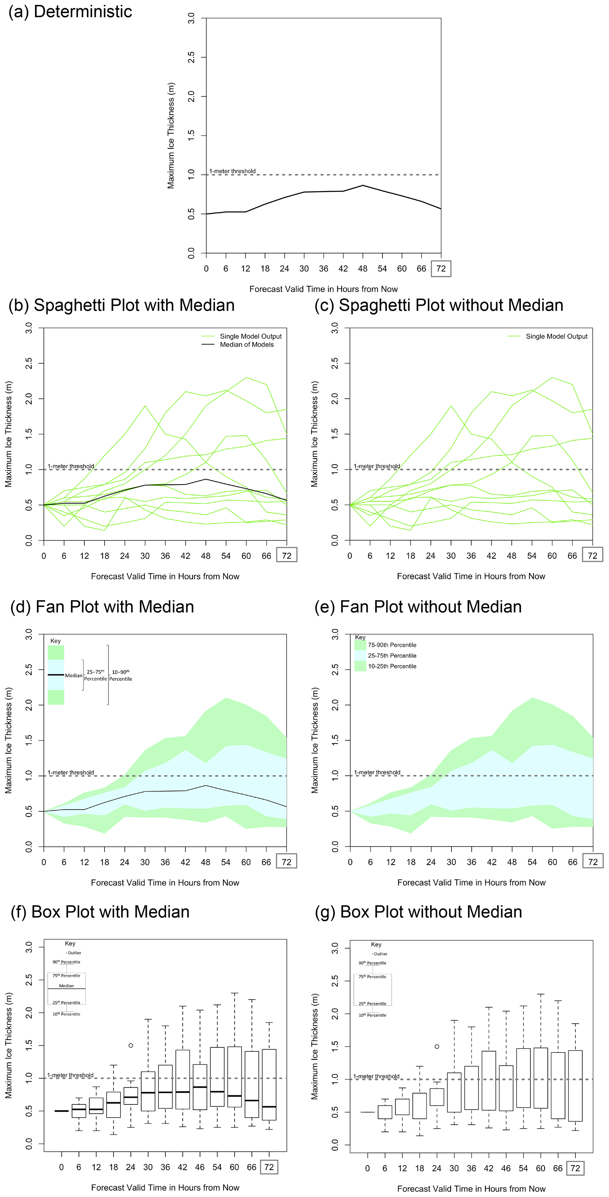
Figure 1The four forecast representations used in this analysis: (a) deterministic (using only the median line), (b, c) spaghetti plot, (d, e) fan plot, and (f, g) box plot. Uncertainty forecasts were shown both with median lines (b, d, f) and without median lines (c, e, g). All forecasts represent the same information: 3 of 10 model runs show ice greater than 1 m thick. The same plots were produced for 50 % and 70 % chance of ice greater than 1 m thick (not shown). The dotted line in each graphic shows 1 m ice thickness, the threshold the participants predicted.
Although end-user survey responses inform us about how heuristics and design choices can affect users' decisions and data interpretations, they do not always provide information on how users come to their decisions. This can make it difficult to generalize the results from experiments with end users, since context, prior experience, and the inherent limitations of surveying methodology limit general applicability.
In this study, we make use of another approach widely used in other fields: eye tracking users during a decision task. Eye tracking monitors users' eye movements during the decision-making process, giving insight into how users process complex information before making a final choice (McSorley and McCloy, 2009; Orquin and Loose, 2013; Balcombe et al., 2015). Eye tracking has been used across many disciplines such as sports (e.g. how players anticipate the landing location of a football; North et al., 2009), medicine (e.g. detecting a lesion in a mammogram; Kundel et al., 2007), and decision theory (e.g., investment decisions; Rubaltelli et al., 2016). Eye tracking has previously been used in environmental science to test data presentation such as color and legends for floods (e.g. Fuchs et al., 2009), earthquakes (Sutton et al., 2020), tornadoes (Sutton and Fischer, 2021), and hurricanes (Sherman-Morris et al., 2015). However, to our knowledge, eye tracking has not been used to determine how different presentations of forecast uncertainty influence the decision-making process, which is the focus of this study.
In particular, we seek to answer the following questions:
-
How is the use of the anchoring heuristic (in this study, tested using a central tendency line) influenced by different presentations of forecast uncertainty?
-
How do people interpret uncertainty bounds (minimum and maximum possible outcomes) from different presentations of forecast uncertainty?
-
Do different presentations of forecast uncertainty affect the amount of time required to make decisions?
By answering these questions, we are able to offer guidance about how presentation choices influence the decision-making process for generic, uncertain geoscientific forecasts. Although this study uses the same survey as a previous study (Mulder et al., 2020), the focus of this paper is on the cognitive process behind decisions made based on uncertain information, rather than the economic rationality of the decisions that were made.
2.1 Participants
A decision task survey was conducted with a range of representations of environmental forecasts showing uncertainty. Participants' eye movements were tracked while they completed the tasks. Between each task, there was a cross present to help participants focus back to the center of the screen prior to moving on to recalibrate where the participant looked before the next task was presented. The length of time and location where their eyes focused, or fixated, on the environmental forecasts were measured. Participants were undergraduate students recruited from the University of Reading through email invitation. Participants were aged between 18 and 32 (mean of 21.2). There were 38 females and 27 males. Participants were between 0 and 4 (mean of 1.0) years along in their degree course. Participants were paid for participation in the study, but there was no incentive for performance on the study task. This participant group is not necessarily representative of the all populations.
The survey instrument used in this study was the same as used in previous studies, which focused on the economic rationality of decisions made using different graphic types (Mulder et al., 2020). The study by Mulder et al. (2020) had a wider participant base of 12 expert (academics and professional forecasters) and 99 non-expert (decision-makers in industry and members of the general public) users and was intended to focus more on the decisions themselves being economically rational. The current study added eye tracking to study how decisions were made and the length of time of those decisions. Due to the time-intensive nature of the eye-tracking study, it was not feasible to obtain a large sample representative of the wider public. However, the sample's survey responses replicated those of the non-experts in the previous studies, except for maximum ice-thickness interpretations for the fan plot, anchoring in the maximum ice-thickness interpretations, and the difference in confidence across forecast representations (Mulder et al., 2020).
Data were analyzed using an analysis of variance approach, which tests for differences across the mean responses in cases where there are multiple conditions or groups greater than two. Further post hoc analyses examining differences between specific pairs of conditions or groups were carried out using t tests which are Bonferroni-corrected (this is a correction to the significance threshold criteria to control for the number of comparisons carried out; see Baguley, 2012, for an example).
2.2 Decision and interpretation tasks
A hypothetical scenario of ice-thickness forecasts was provided for a fictional location. Ice thickness was chosen deliberately, as a form of rarely made forecast with which participants were unlikely to be familiar, helping to control for participants' preconceived notions of data uncertainty in relation to a specific phenomenon. In the scenario, participants were told they were making shipments across an icy strait. Using ice-thickness forecasts, they had to decide whether to use a small ship (which could crush through ice up to 1 m thick) or a large ship (which could crush through ice over 1 m thick). The small ship cost GBP 1000, whereas the large ship cost GBP 5000. If the participants chose the small ship and the ice was thicker than 1 m, there would be spoilage, resulting in an additional cost of GBP 8000.
Ice-thickness forecasts up to 72 h in the future (an arbitrary lead time, with forecasts designed to show the ice thickness at this time was uncertain) were presented in seven different representations: deterministic line, spaghetti plot with or without a median line, fan plot with or without a median line, and box plot with or without a median line (Fig. 1). The presence of the median line was used to test the anchoring heuristic. Each of these seven forecast representations was shown to represent 30 %, 50 %, and 70 % probability of ice thickness exceeding 1 m (only 30 % shown). The 30 %, 50 %, and 70 % probability representations were created by creating a spaghetti plot (Fig. 1b, c) with three, five, and seven forecasts above the 1 m depth, respectively, and then converting these plots into the different representation types. Therefore, each participant received 21 forecasts (seven representations times three probabilities). The order of the forecasts was randomized to reduce ordering bias.
For each forecast representation, participants completed decision and data interpretation tasks while their eye movements were recorded. The decision and data interpretation tasks were collected using paper and pen. Participants decided which ship to use (to test economic rationality), noted confidence in their decision (along a 10 cm visual analog scale, with 0 cm corresponding to “Not at all confident” and 10 cm corresponding to “Extremely confident”), and forecasted their best guess (deterministic forecast based on the forecast representation), maximum possible, and minimum possible ice thickness. The maximum and minimum possible ice thicknesses were used as a measure of uncertainty bounds to determine the respondents' perceived range of uncertainty in the forecast. For results on the economic rationality and uncertainty range estimates from a wider participant base, see Mulder et al. (2020). Minimum ice-thickness forecasts were skewed toward 0 (because it cannot be less than 0) and therefore were not used in the following analysis.
2.3 Eye-tracking apparatus
Participants were fitted with an Eye link II tracker headset (sampling rate of 500 Hz), which recorded eye movements of the right eye as they completed the survey on a 21 in. color desktop PC (refresh rate of 75 Hz). A chin rest was used to constrain any head movements, and participants were placed in a set position. The distance between the monitor and participant was 57 cm. Fixation location and its duration were used as measures of which aspects of the forecast representations participants were attending to when they formed their decisions. This gave an insight into what visual features and information are salient to help reduce uncertainty in forecasting. In this study, we monitored the location and duration of eye fixations, defined as a maintained gaze (the eye was still, i.e. no saccades were detected) on one location. For more information on methods used in eye-tracking studies, see Holmqvist et al. (2011).
3.1 Understanding how the anchoring heuristic influences interpretation of environmental forecasts
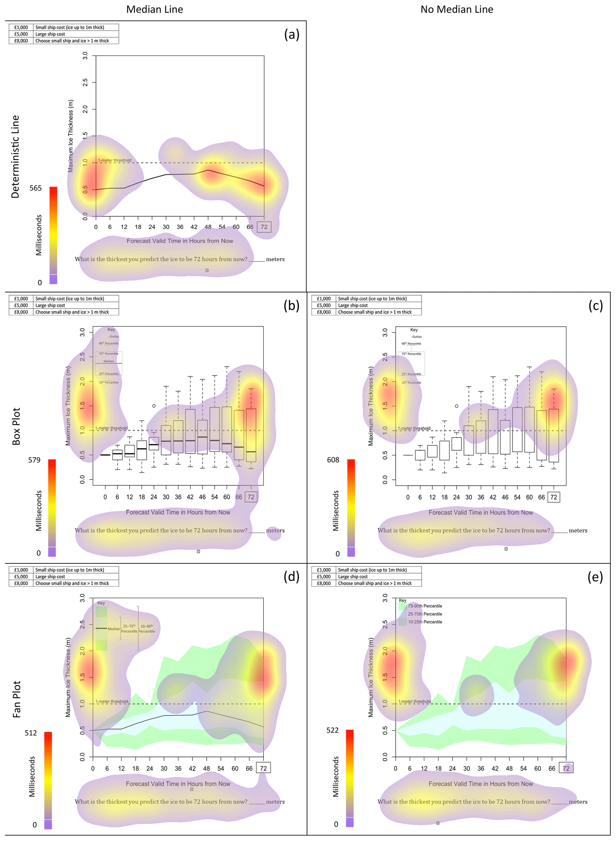
Eye tracking helps us to explain the anchoring seen in the survey results from Mulder et al. (2020), where deterministic ice-thickness forecasts were anchored to a central tendency line when provided in the forecasts. Composite heat maps, which accumulate eye fixation times across all participants, indicate that although participants look at multiple possible values for ice thickness when making their ship decision (e.g. Fig. 2a and b illustrates this effect for the spaghetti plot, and heat maps for the rest of the forecast representations are in Appendix B) and maximum ice-thickness forecast (Fig. 2c, d), their eye movements were anchored toward the median line when provided. Without the median line, the eye movements tracked wider in the vertical for the spaghetti plot (Fig. 2b). Even in the maximum ice-thickness forecast, where the median would not necessarily be relevant, participants still fixated on the median line (Fig. 2c).
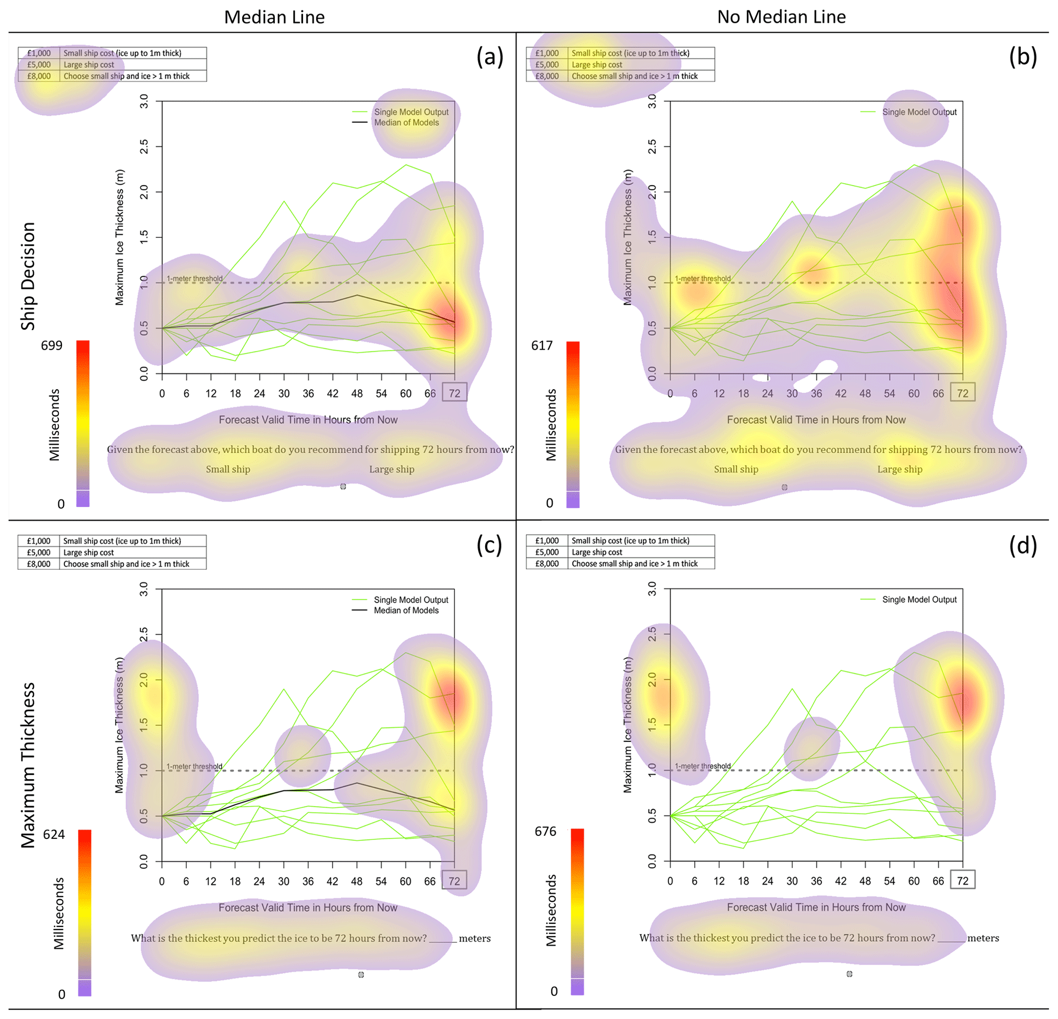
Figure 2Composite heat maps accumulating the duration of eye fixations (in milliseconds) of all participants for the ship decision (a, b) and maximum ice-thickness (c, d) tasks. Heat maps are shown only for the spaghetti plot with (a, c) and without (b, d) median lines. Heat maps for the other forecast representations can be found in Appendix B. Between each question, there was a cross present to help participants focus back to to the center of the screen prior to moving on. Artifacts of this centering can be seen on the heat maps.
The location of the eye fixations in choice of ship decision when given a median line was significantly closer to the location of the median line than when there was no median line (based on the absolute fixation distance from the median line). This was the case for all forecast representations at all probability levels (Fig. 2). A repeated measure ANOVA showed main effects of forecast representation (F=8.82, p<0.001), presence of a median line (F=56.43, p<0.001), and probability level (F=253.30, p<0.001) on the best-guess forecast (Fig. 3). There were no significant interacting effects. We would expect eye fixations to differ based on forecast representation because different types of representations have different foci in different locations. We would also expect eye fixations to differ based on probability level because the location of the information changed as the probability of exceeding 1 m increased. Forecasts with median lines resulted in eye fixations significantly lower (closer to the median line) than forecasts without median lines (post hoc Bonferroni t test; p<0.001). Therefore, the presence of a median line affected the location of participants' eye fixations, verifying the effect of the anchoring heuristic.
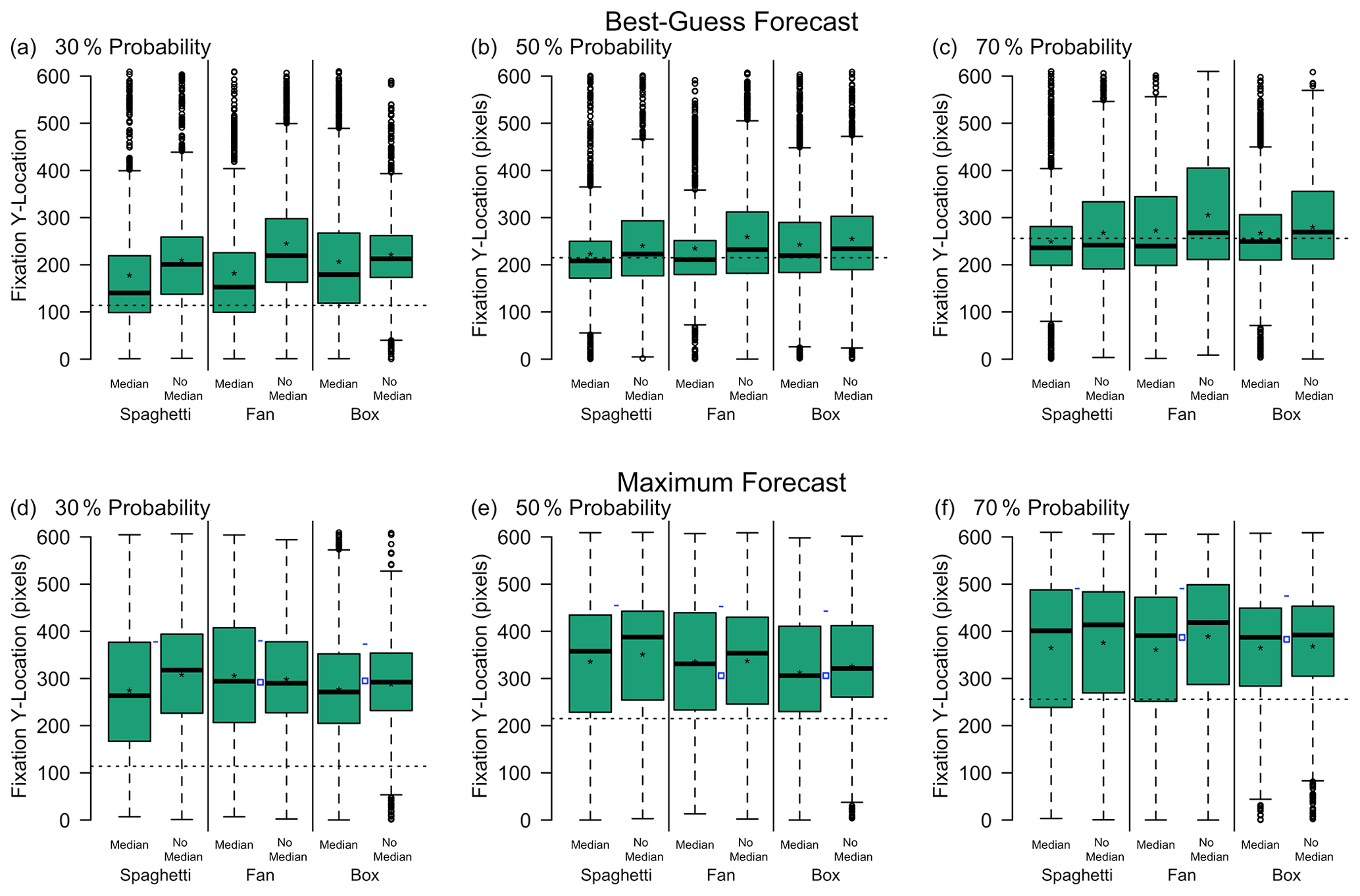
Figure 3The y axis fixation location when asked to provide their best-guess ice thickness (a, b, c) or maximum ice-thickness forecast (d, e, f), given a 30 % (a, d), 50 % (b, e), or 70 % (c, f) probability forecast. Results are separated based on forecast representation (spaghetti, fan, and box) and whether or not a median was present. Stars represent the mean. The dashed line shows the median value, shown in the line representation and representations with a median line. In panels (d), (e), and (f), the blue dashes represent the maximum ice-thickness value shown for the spaghetti, fan, and box plots. The blue squares show the top of the 75th percentile value for the fan and box plots.
3.2 How do people interpret uncertainty bounds from different presentations of forecast uncertainty?
When looking at how a larger population of experts and non-experts interpreted maximum values, Mulder et al. (2020) found that non-experts may be misinterpreting the box plot. The key shown with the box plot defined the top of the whisker as the 90th percentile and the top of the box as the 75th percentile. Despite the key, non-experts interpreted maximum values as between the top of the box and the top of the whisker (Mulder et al., 2020). This is a problem because box plots are commonly used in presenting environmental data. The fan plot, which similarly showed values up to the 90th percentile, encouraged maximum forecasts greater than the 90th percentile, suggesting a more rational understanding of the plot. Participants' (both from Mulder et al., 2020, and the eye-tracking survey reported here) maxima for the spaghetti plot were not significantly different from the highest member of the spaghetti plot.
One hypothesis for participants misinterpreting maxima for the box plot is they were not reading or understanding the key. When the first box plot was shown to each participant, the total number of seconds they fixated on the key and the number of fixations on the key were recorded (Fig. 4a, b).
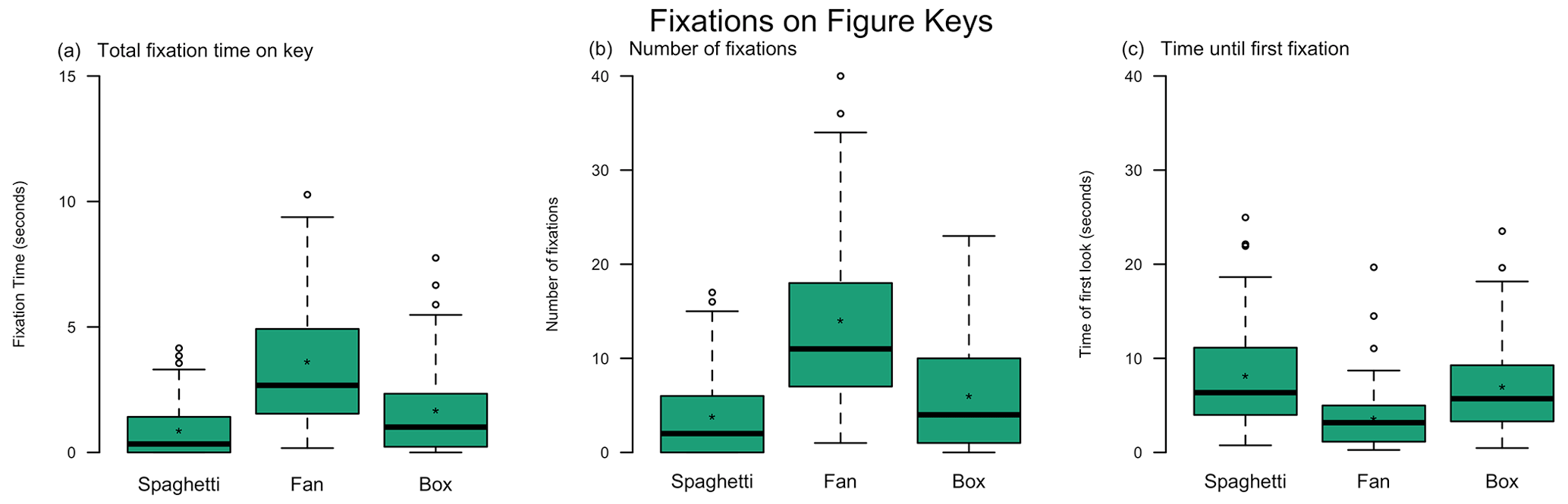
Figure 4Eye-tracking analysis of a participant's first look at each graphic type to determine (a) the total amount of time spent looking at the key, (b) the number of fixations within the key area, and (c) the amount of time from the beginning of the question it took for the participant to look at the key.
There was a significant main effect of plot type on the number of seconds participants fixated on the key (one-way ANOVA; F=23.03, p<0.001). Participants fixated on the box plot key (mean of 7.8 % of the time it took to complete the question) for significantly less time than the fan plot key (mean of 17.4 % of the time it took to complete the question, Bonferroni-corrected t test; p<0.001). Similarly, participants fixated on the spaghetti plot key (mean of 5.1 % of the time it took to complete the question) for significantly less time than the fan plot key (Bonferroni-corrected t test; p<0.001). This suggests that participants not using the key could explain their misinterpretation of box plot forecasts.
Additionally, there were fewer fixations on the box plot key than the fan plot key (Fig. 4b). There was a significant main effect of plot type on the number of fixations on the keys (one-way ANOVA; F=28.91, p<0.001). Participants had fewer fixations on the box plot key (mean of 6.2 % of fixations were on the key) and spaghetti plot key (mean of 4.9 % of fixations were on the key) than the fan plot key (mean of 15.2 % of fixations were on the key for the Bonferroni-corrected t test; p<0.001 for both). With subsequent box plot forecasts, the number of fixations and number of seconds fixating on the key were reduced further (not shown).
The amount of time elapsed before participants' first fixation on the key was significantly longer for the box plot than the fan plot (Fig. 4c). There was a significant main effect of plot type on the amount of time elapsed before the first fixation on the key (F=12.87, p<0.001). Participants let more time elapse before first fixating on the box (mean of 7.0 s) and spaghetti (mean of 8.1 s) plot keys than the fan plot key (mean of 3.6 s for the Bonferroni-corrected t test; p<0.001 for both).
Participants took longer before looking at the box plot key and looked at the key fewer times. Without referencing the key, participants were unlikely to know what each part of the box or whiskers represents for this complicated plot. Additionally, the amount of time elapsed before participants first fixated on the key of each plot was calculated. It took longer before participants first fixated on the key for the box plot compared with the fan plot. Participants may think they already understand what the symbols in the box plot represent and therefore may not reference the key for long enough to get an accurate interpretation of the plot. Alternatively, participants may simply not understand the box plot or its key.
Participants had a higher number of fixations on the fan plot key and waited less time before their first fixation on the key. Even though the fan plot may have been new to the participants, extreme values were more accurately understood in the survey results, perhaps because the forecast representation is easier to understand, and they took time to study the key.
Participants spent little time fixating on the key of the spaghetti plot, similar to the results of the box plot. Participants fixated fewer times on the key of the spaghetti plot and a longer amount of time before the first fixation; however, the survey results suggest the participants correctly interpreted the spaghetti plot. The reason participants paid little attention to the spaghetti plot could be that the type of forecast representation is intuitive or that the key was simple and therefore did not require much time to understand (Fig. 1b, c). Indeed, Bosetti et al. (2017) found that presenting climate information including individual model estimates aids in user interpretation of the data.
3.3 Does data presentation affect how long it takes a participant to complete a task?
One question about including uncertainty information and designing forecast representations is whether it affects the amount of time a user takes to make their decisions. This is particularly relevant when users have limited time or attention to make inferences from the data. To address this, we calculated the amount of time it took each participant to complete each survey task (decision of which ship to use, best-guess forecast, maximum ice thickness, and confidence in decision). After the first two forecast representations (and subsequent tasks; listed above), the amount of time to complete the tasks converged to a standard average time. Therefore, the responses to the tasks for the first two forecast representations were removed from this analysis.
Anchoring, or using the median line when provided, affected the amount of time it took to complete the survey tasks (Fig. 5). There was a significant main effect of anchoring (repeated measures ANOVA, excluding the deterministic forecast; F=20.79, p<0.001) and probability level (F=5.24, p=0.030) on the amount of time for participants to make the decision on which ship to use. The interacting effects were also significant (F=4.41, p=0.040), showing that anchoring increased as the probability level increased. There was a significant main effect of anchoring (F=11.85, p=0.001) on best-guess forecast with no main effect of probability and no interacting effects. There was also a significant main effect of anchoring (F=4.64, p=0.035) on maximum ice-thickness forecasts when aggregated across plot types, with no main effect of probability and no interacting effects. There were no significant main effects of anchoring or probability on confidence with no interacting effects.
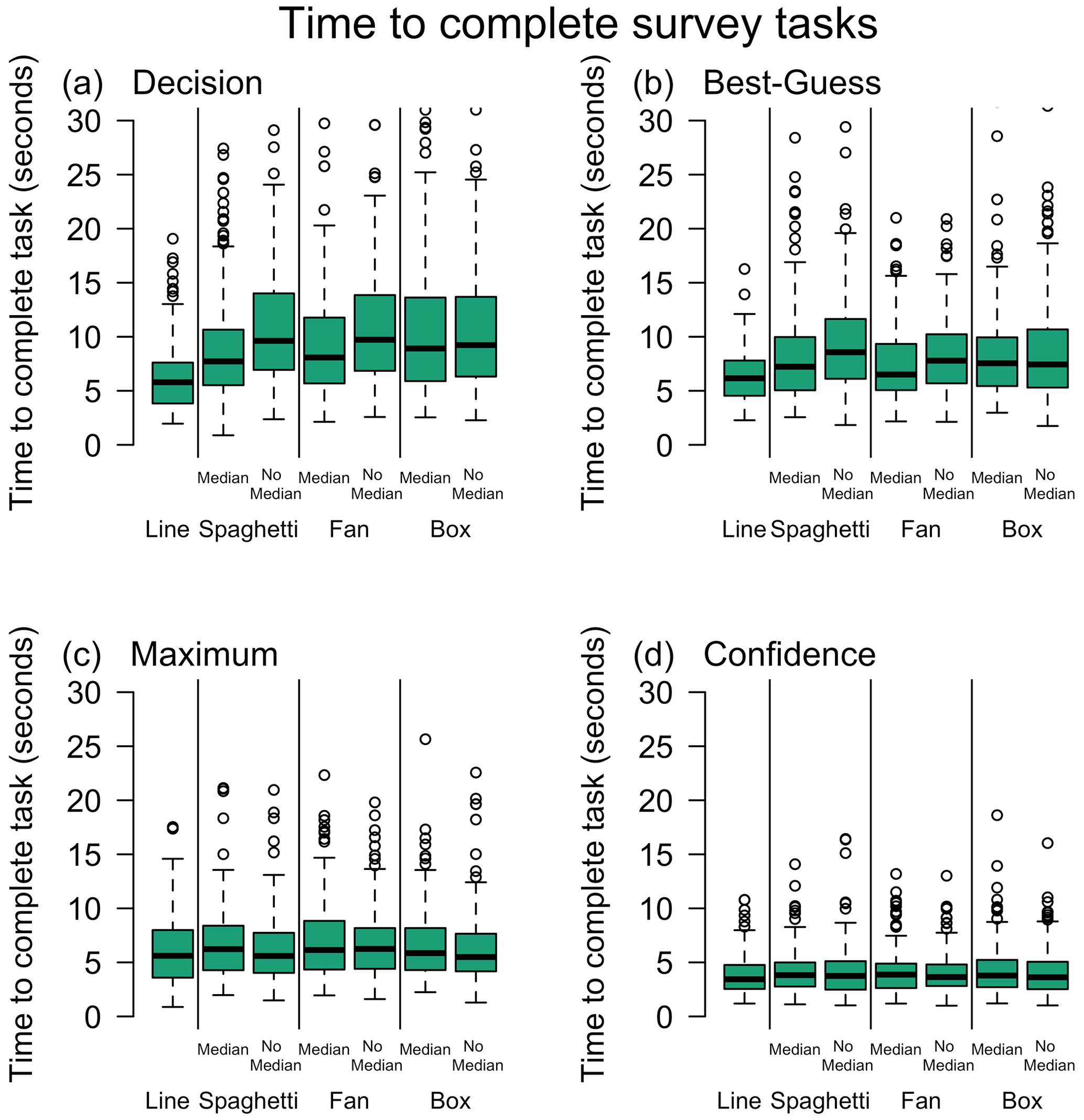
Figure 5Amount of time it took each participant to complete each question: (a) ship decision, (b) best-guess ice-thickness forecast, (c) maximum ice thickness, and (d) confidence in decisions. The first two graphics each participant used were removed from this analysis to remove trials where participants were getting used to the task. After two graphics, the amount of time it took participants to complete each task converged.
Using Bonferroni-corrected post hoc t tests for the above significant ANOVAs, the inclusion of a median line significantly reduced the amount of time to complete both the decision (p<0.001) and best-guess forecast tasks (p=0.002) but significantly increased the amount of time to interpret the maximum (p=0.048) ice thickness. This suggests that the effect of anchoring aids decision-making and decision time for deterministic outcomes, but it hinders the interpretations of less likely but still possible extremes.
Communicating uncertain information is a key tenant to all sciences, highlighted recently in public health by the COVID-19 pandemic. The type of information communicated in this study (uncertainty around a potentially hazardous environmental event) is similar to that found elsewhere in the public sphere, for example in a weather forecast warning for extreme precipitation or future climate impacts. Because this study was purposefully conducted with a hazard not familiar to our participants, there were no preconceived notions of forecast skill. These results are therefore not constrained to any particular hazard and may be extended across other environmental data and hazards.
The results of the eye-tracking study verify previous research that anchoring affects non-experts' interpretations of data (Mulder et al., 2020). The change in eye movements across the graph area and key and the role of expertise are explored in more detail in Part 2 of this study. However, some general conclusions which apply to all groups can be drawn from the analysis in this part of the study. When interpreting best-guess ice thickness based on uncertainty data, the locations of the eye fixations were closer to the median line. It took less time to complete the decision and best-guess tasks when given uncertainty forecasts with a median line compared with those without a median line. This evidence suggests that when a median line is present, participants' eyes are guided toward the median line, and they make decisions without necessarily considering extreme values. We expect this effect to also be present for other forms of average or center lines. This can be helpful for decisions and interpretations using values in the middle of a spread of data. In addition, it can help users make faster decisions in a time-sensitive environment.
Anchoring can be detrimental to how users interpret information, inhibiting their ability to assess values other than the anchor value (Tversky and Kahneman, 1974). Although results from this study did not find a significant anchoring effect on the value of maximum ice thickness as in Mulder et al. (2020), the presence of median lines increased the amount of time it took participants to interpret the maximum values.
From the eye-tracking participants' responses, participants largely correctly interpreted extreme values from the spaghetti and fan plots but misinterpreted extreme values from the box plot. The eye-tracking data suggest that participants rarely looked at the box plot's key, fixating fewer times and waiting longer before referencing the key. Not looking at the key or not looking long enough to decode the box plot may have led to misinterpretations of the plot. How eye fixations changed from early, intermediate, and later viewing periods is explored further in Part 2 of this study.
On the other hand, the results suggest that participants correctly interpreted data from the fan and spaghetti plots. Eye-tracking data show participants looked at the key of the fan plot, a representation participants were unlikely to have seen before, sooner, for longer, and with more fixations than the box and spaghetti plots. This suggests that although participants may not have been familiar with the fan plot, the key aided their comprehension. The spaghetti plot had a similar number of fixations and amount of time fixating at the key as the box plot, but the responses to the tasks suggest participants better understood the forecast representation. Perhaps the simplicity of the representation was easier for non-experts to interpret.
Based on this study's results, we provide some recommendations when designing forecast representations. Median lines (but we expect similar effects with any other form of average or center line) should only be used when it is helpful to guide a user's eye toward a particular value, for example a hurricane track forecast where confidence in the track is high. Scientists communicating data need to be aware that when using anchoring lines, users tend to underestimate extreme values. When it is important that users focus on extreme values, for example in connection with maximum flood levels, anchoring lines are not recommended. Non-experts tended to misinterpret extreme values when given a box plot, even when a key was provided. This is likely to have been due to lack of familiarity with the form of presentation. However, the fan and spaghetti plots led to more accurate interpretations of extreme values and are recommended in place of box plots.
Overall, the responses to the survey questions were similar to the results from Mulder et al. (2020). As in Mulder et al. (2020), participants in the eye-tracking study exhibited clear anchoring in their survey responses. Best-guess forecasts were significantly lower (closer to the median line) when provided with a median line (paired t test; 30 %: , p<0.001; 50 %: , p=0.001; 70 %: , p<0.001). Contrary to Mulder et al. (2020), where anchoring produced significantly lower maximum thickness interpretations, participants in the eye-tracking experiment only had a significant main effect of probability on maximum ice-thickness interpretations (ANOVA; F=11.42, p<0.001) with no main effect on the presence of a median line and no interacting effects. The maximum thickness increased with increasing probability (post hoc Bonferroni-corrected t test; p<0.001 for all).
There were no significant main effects for forecast representation on best-guess forecast, but there was a significant main effect of probability (ANOVA; F=19.01, p<0.001) with no interacting effects. Participants' best-guess forecasts increased with increasing probability (post hoc Bonferroni-corrected t test; p<0.001 for all). This was the same finding as with non-experts from Mulder et al. (2020).
There was a significant main effect of forecast representation (ANOVA; F=5.50, p=0.004) and probability (F=7.66, p=0.006) on confidence with no interacting effects. Forecast representations' effect on confidence became insignificant in post hoc tests (Bonferroni-corrected t test). That forecast representations had no effect on confidence between the spaghetti, box, and fan plots corresponds to the results from Mulder et al. (2020). Unlike Mulder et al. (2020), the eye-tracking participants chose the large ship more significantly frequently as the probability of exceeding 1 m thickness increased (p<0.001 for all)
In Mulder et al. (2020), there was a significant difference in confidence by probability and no significant difference by forecast representation for non-experts. Conversely, with the eye-tracking participants, there was no significant main effect of probability and a significant main effect on confidence (F=7.90, p<0.001) with no interacting effects. Confidence in decisions was significantly greater for the fan plot than the box and spaghetti plots (post hoc Bonferroni-corrected t test; p<0.001 for both).
For maximum ice thickness, eye-tracking participants consistently predicted maxima less than the top of the whisker (t test; 30 %: , p<0.001; 50 %: , p<0.001; 70 %: , p<0.001) and greater than the top of the box (30 %: t=5.95, p<0.001; 50 %: t=6.89, p<0.001; 70 %: t=6.96, p<0.001), similar to the results in Mulder et al. (2020). Contrary to the findings in Mulder et al. (2020), the eye-tracking participants forecast maximum ice thickness significantly greater than what was shown for the fan plot only at 30 % (t=2.84, p=0.003). For the fan plot at 50 % and 70 %, there was no significant difference between the participants' interpreted maximum ice thickness and what was shown as the maximum value on the forecast. Similar to the findings of Mulder et al. (2020), there was no significant difference in maximum ice-thickness interpretation and the maximum shown on the spaghetti plots at 30 % or 50 %, but it was less than the value shown on the spaghetti plot at 70 % (, p=0.004).
Here we include additional figures showing composite heat maps, accumulating eye fixation times across all participants, for box plots and fan plots (Figs. B1, B2). Along with the spaghetti plots shown in Fig. 2 of the main paper, these plots indicate that although participants look at multiple possible values for ice thickness when making their ship decision and maximum ice-thickness forecast, their eye movements were anchored toward the median line, when provided. Without the median line, the eye movements tracked more discriminately and separably in the vertical for the box plot (Fig. B1). Even in the maximum ice-thickness forecast, where the median would not necessarily be relevant, participants were still fixated on the median line (Fig. B2).
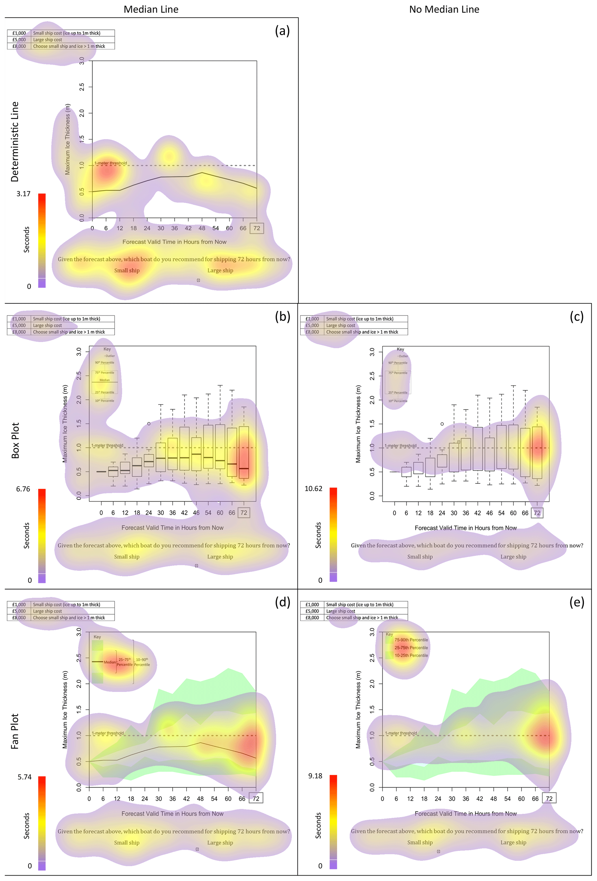
Figure B1Heat maps overlaying the eye fixations of all participants for the ship decision for the deterministic line (a), box plot (b, c), and fan plot (d, e). Heat maps are shown with (a, b, d) and without (c, e) median lines. Between each question, a cross was present to help participants focus back to the center of the screen prior to moving on. Artifacts of this centering can be seen on the heat maps.
Data created during the research reported in this article are openly available from the University of Reading Research Data Archive at https://doi.org/10.17864/1947.110 (Mulder et al., 2018).
KJM: formal analysis, visualization, and writing (original draft preparation). LW: conceptualization, investigation, and writing (review and editing). ML: writing (review and editing). AB: funding acquisition and writing (review and editing). ACP: funding acquisition and writing (review and editing). RM: funding acquisition and writing (review and editing). EM: conceptualization, resources, and writing (review and editing).
The contact author has declared that none of the authors has any competing interests.
The University of Reading Ethics Board approved the study, and the study was conducted in accordance with the standards described in the 1964 Declaration of Helsinki. Participants provided written informed consent.
Publisher’s note: Copernicus Publications remains neutral with regard to jurisdictional claims in published maps and institutional affiliations.
We thank our eye-tracking study participants. We also acknowledge the Natural Environment Research Council (NERC) for funding.
This research has been supported by the Natural Environment Research Council (NERC; grant no. NE/J017221/1).
This paper was edited by Steven Rogers and reviewed by two anonymous referees.
Ash, K. D., Schumann III, R. L., and Bowser, G. C.: Tornado warning trade-offs: Evaluating choices for visually communicating risk, Weather Clim. Soc., 6, 104–118, 2014.
Baguley, T.: Serious stats: A guide to advanced statistics for the behavioural sciences, Palgrave Macmillan, ISBN: 9780230577176, 2012.
Balcombe, K., Fraser, I., and McSorley, E.: Visual attention and attribute attendance in multi-attribute choice experiments, J. Appl. Economet., 30, 447–467, 2015.
Bosetti, V., Weber, E., Berger, L., Budescu, D. V., Liu, N., and Tavoni, M.: COP21 climate negotiators' responses to climate model forecasts, Nat. Clim. Change, 7, 185–190, 2017.
Broad, K., Leiserowitz, A., Weinkle, J., and Steketee, M.: Misinterpretations of the “cone of uncertainty” in Florida during the 2004 hurricane season, B. Am. Meteorol. Soc., 88, 651–668, 2007.
Correll, M. and Gleicher, M.: Error bars considered harmful: Exploring alternate encodings for mean and error, IEEE T. Vis. Comput. Gr., 20, 2142–2151, 2014.
Fuchs, S., Spachinger, K., Dorner, W., Rochman, J., and Serrhini, K.: Evaluating cartographic design in flood risk mapping, Environ. Hazards-UK, 8, 52–70, 2009.
Harold, J., Lorenzoni, I., Shipley, T. F., and Coventry, K. R.: Cognitive and psychological science insights to improve climate change data visualization, Nat. Clim. Change, 6, 1080–1089, 2016.
Holmqvist, K., Nyström, M., Andersson, R., Dewhurst, R., Jarodzka, H., and Van de Weijer, J.: Eye tracking: A comprehensive guide to methods and measures, OUP Oxford, ISBN: 9780199697083, 2011.
Kelton, A. S., Pennington, R. R., and Tuttle, B. M.: The effects of information presentation format on judgment and decision making: A review of the information systems research, Journal of Information Systems, 24, 79–105, 2010.
Kundel, H. L., Nodine, C. F., Conant, E. F., and Weinstein, S. P.: Holistic component of image perception in mammogram interpretation: gaze-tracking study, Radiology, 242, 396–402, 2007.
Lorenz, S., Dessai, S., Forster, P. M., and Paavola, J.: Tailoring the visual communication of climate projections for local adaptation practitioners in Germany and the UK, Philos. T. Roy. Soc. A, 373, 20140457, https://doi.org/10.1098/rsta.2014.0457, 2015.
McSorley, E. and McCloy, R.: Saccadic eye movements as an index of perceptual decision-making, Exp. Brain Res., 198, 513–520, 2009.
Mulder, K., Williams, L., Lickiss, M., Black, A., Charlton-Perez, A., McCloy, R., and McSorley, E.: Eye Tracking of Vegetable Shipping Line Graph Testing Survey, University of Reading [data set], https://doi.org/10.17864/1947.110, 2018.
Mulder, K. J., Lickiss, M., Black, A., Charlton-Perez, A. J., McCloy, R., and Young, J. S.: Designing environmental uncertainty information for experts and non-experts: Does data presentation affect users' decisions and interpretations?, Meteorol. Appl., 27, e1821, https://doi.org/10.1002/met.1821, 2020.
Nadav-Greenberg, L. and Joslyn, S. L.: Uncertainty forecasts improve decision making among nonexperts, Journal of Cognitive Engineering and Decision Making, 3, 209–227, 2009.
Nadav-Greenberg, L., Joslyn, S. L., and Taing, M. U.: The effect of uncertainty visualizations on decision making in weather forecasting, Journal of Cognitive Engineering and Decision Making, 2, 24–47, 2008.
North, J. S., Williams, A. M., Hodges, N., Ward, P., and Ericsson, K. A.: Perceiving patterns in dynamic action sequences: Investigating the processes underpinning stimulus recognition and anticipation skill, Appl. Cognitive Psych., 23, 878–894, 2009.
Orquin, J. L. and Loose, S. M.: Attention and choice: A review on eye movements in decision making, Acta Psychol., 144, 190–206, 2013.
Petropoulos, F., Apiletti, D., Assimakopoulos, V., Babai, M. Z., Barrow, D. K., Ben Taieb, S., Bergmeir, C., Bessa, R. J., Bijak, J., Boylan, J. E., Browell, J., Carnevale, C., Castle, J. L., Cirillo, P., Clements, M. P., Cordeiro, C., Cyrino Oliveira, F. L., De Baets, S., Dokumentov, A., Ellison, J., Fiszeder, P., Franses, P. H., Frazier, D. T., Gilliland, M., Gönül, M. S., Goodwin, P., Grossi, L., Grushka-Cockayne, Y., Guidolin, M., Guidolin, M., Gunter, U., Guo, X., Guseo, R., Harvey, N., Hendry, D. F., Hollyman, R., Januschowski, T., Jeon, J., Jose, V. R. R., Kang, Y., Koehler, A. B., Kolassa, S., Kourentzes, N., Leva, S., Li, F., Litsiou, K., Makridakis, S., Martin, G. M., Martinez, A. B., Meeran, S., Modis, T., Nikolopoulos, K., Önkal, D., Paccagnini, A., Panagiotelis, A., Panapakidis, I., Pavía, J. M., Pedio, M., Pedregal, D. J., Pinson, P., Ramos, P., Rapach, D. E., Reade, J. J., Rostami-Tabar, B., Rubaszek, M., Sermpinis, G., Shang, H. L., Spiliotis, E., Syntetos, A. A., Talagala, P. D., Talagala, T. S., Tashman, L., Thomakos, D., Thorarinsdottir, T., Todini, E., Trapero Arenas, J. R., Wang, X., Winkler, R. L., Yusupova, A., and Ziel, F.: Forecasting: theory and practice, Int. J. Forecasting, 38, 705–871, 2022.
Roulston, M. S. and Kaplan, T. R.: A laboratory-based study of understanding of uncertainty in 5-day site-specific temperature forecasts, Meteorol. Appl., 16, 237–244, 2009.
Rubaltelli, E., Agnoli, S., and Franchin, L.: Sensitivity to affective information and investors' evaluation of past performance: An eye-tracking study, J. Behav. Decis. Making, 29, 295–306, 2016.
Savelli, S. and Joslyn, S.: The advantages of predictive interval forecasts for non-expert users and the impact of visualizations, Appl. Cognitive Psych., 27, 527–541, 2013.
Shepherd, T. G., Boyd, E., Calel, R. A., Chapman, S. C., Dessai, S., Dima-West, I. M., Fowler, H. J., James, R., Maraun, D., Martius, O., Senior, Catherine A., Sobel, A. H., Stainforth, D. A., Tett, S. F. B., Trenberth, K. E., van den Hurk, B. J. J. M., Watkins, N. W., Wilby, R. L., Zenghelis, D. A.: Storylines: an alternative approach to representing uncertainty in physical aspects of climate change, Climatic Change, 151, 555–571, 2018.
Sherman-Morris, K., Antonelli, K. B., and Williams, C. C.: Measuring the effectiveness of the graphical communication of hurricane storm surge threat, Weather Clim. Soc., 7, 69–82, 2015.
Sillmann, J., Shepherd, T. G., van den Hurk, B., Hazeleger, W., Martius, O., Slingo, J., and Zscheischler, J.: Event-based storylines to address climate risk, Earth's Future, 9, e2020EF001783, https://doi.org/10.1029/2020EF001783, 2021.
Speier, C.: The influence of information presentation formats on complex task decision-making performance, Int. J. Hum.-Comput. St., 64, 1115–1131, 2006.
Spiegelhalter, D., Pearson, M., and Short, I.: Visualizing uncertainty about the future, Science, 333, 1393–1400, 2011.
St John, M., Callan, J., Proctor, S., and Holste, S.: Tactical decision-making under uncertainty: Experiments I and II, Pacific Science & Engineering Group, Inc., San Diego, CA, Technical Report Number 1821, 1–22, https://apps.dtic.mil/sti/citations/ADA378170 (last access: 22 March 2023), 2000.
Stephens, E. M., Edwards, T. L., and Demeritt, D.: Communicating probabilistic information from climate model ensembles–lessons from numerical weather prediction, WIREs Clim. Change, 3, 409–426, 2012.
Sutton, J. and Fischer, L. M.: Understanding visual risk communication messages: An analysis of visual attention allocation and think-aloud responses to tornado graphics, Weather Clim. Soc., 13, 173–188, 2021.
Sutton, J., Fischer, L., James, L. E., and Sheff, S. E.: Earthquake early warning message testing: Visual attention, behavioral responses, and message perceptions, Int. J. Disast. Risk Re., 49, 101664, https://doi.org/10.1016/j.ijdrr.2020.101664, 2020.
Tak, S., Toet, A., and van Erp, J.: The perception of visual uncertainty representation by non-experts, IEEE T. Vis. Comput. Gr., 20, 935–943, 2013.
Tak, S., Toet, A., and Van Erp, J.: Public understanding of visual representations of uncertainty in temperature forecasts, Journal of Cognitive Engineering and Decision Making, 9, 241–262, 2015.
Tversky, A. and Kahneman, D.: Judgment under uncertainty: Heuristics and biases, Science, 185, 1124–1131, 1974.
Wickens, C. D., Helton, W. S., Hollands, J. G., and Banbury, S.: Engineering psychology and human performance, Routledge, ISBN: 9781003177616, 2021.
Williams, L., Mulder, K. J., Charlton-Perez, A., Lickiss, M., Black, A., McCloy, R., McSorley, E., and Young, J.: Understanding representations of uncertainty, an eye-tracking study – Part 2: The effect of expertise, Geosci. Commun., 6, 111–123, https://doi.org/10.5194/gc-6-111-2023, 2023.