the Creative Commons Attribution 4.0 License.
the Creative Commons Attribution 4.0 License.
 | 06 Sep 2023
Understanding representations of uncertainty, an eye-tracking study – Part 2: The effect of expertise
Louis Williams
Kelsey J. Mulder
Andrew Charlton-Perez
Matthew Lickiss
Alison Black
Rachel McCloy
Eugene McSorley
Joe Young
As the ability to make predictions regarding uncertainty information representing natural hazards increases, an important question for those designing and communicating hazard forecasts is how visualizations of uncertainty influence understanding amongst the intended, potentially varied, target audiences. End-users have a wide range of differing expertise and backgrounds, possibly influencing the decision-making process they undertake for a given forecast presentation. Our previous, Part 1 study (Mulder et al., 2023) examined how the presentation of uncertainty information influenced end-user decision making. Here, we shift the focus to examine the decisions and reactions of participants with differing areas of expertise (meteorology, psychology, and graphic-communication students) when presented with varied hypothetical forecast representations (boxplot, fan plot, or spaghetti plot with and without median lines) using the same eye-tracking methods and experiments. Participants made decisions about a fictional scenario involving the choices between ships of different sizes in the face of varying ice thickness forecasts. Eye movements to the graph area and key and how they changed over time (early, intermediate, and later viewing periods) were examined. More fixations (maintained gaze on one location) and more fixation time were spent on the graph and key during early and intermediate periods of viewing, particularly for boxplots and fan plots. The inclusion of median lines led to less fixations being made on all graph types during early and intermediate viewing periods. No difference in eye movement behaviour was found due to expertise; however, those with greater expertise were more accurate in their decisions, particularly during more difficult scenarios. Where scientific producers seek to draw users to the central estimate, an anchoring line can significantly reduce cognitive load, leading both experts and non-experts to make more rational decisions. When asking users to consider extreme scenarios or uncertainty, different prior expertise can lead to significantly different cognitive loads for processing information, with an impact on one's ability to make appropriate decisions.
- Article
(3372 KB) - Full-text XML
- Companion paper
- BibTeX
- EndNote


The importance of understanding the most ideal approach for communicating uncertainty information is common across multiple domains in everyday life and across a range of sciences (Fischhoff et al., 2011) and is an established problem in geoscience communication (Stephens et al., 2012). This importance has been highlighted by the current COVID-19 pandemic, during which there has been a sharp increase in the use of unfamiliar visualizations of uncertainty for presentation to the public in order to explain the basis of decisions made and to justify the response being asked of them in terms of adopting modified and new behaviours in order to mitigate transmission. As more unfamiliar and detailed information is presented to and interpreted by non-specialists, the decisions made as a result have a significant impact on health, society, and the environment so careful consideration of communication is essential (Peters, 2008). It is clear that people have trouble gaining an appropriate understanding of uncertainty information and how best to use this in order to support optimal decisions (e.g. Tversky and Kahneman, 1974; Nadav-Greenberg and Joslyn, 2009; Roulston and Kaplan, 2009; Savelli and Joslyn, 2013). A great deal of research has been concerned with addressing the most appropriate way to communicate uncertainty to promote effective decision making and understanding (Fischhoff et al., 2011; Milne et al., 2015). The factors of what uncertainty information should be included, what ought to be emphasized, and the manner in which it is best conveyed all have an important role to play (Bostrom et al., 2016; Broad et al., 2012; Morss et al., 2015; Padilla et al., 2015). Furthermore, there is a reluctance by authors, such as data scientists, journalists, designers, and science communicators, to present visual representations of quantified uncertainty (Hullman, 2019). There is a belief that it will overwhelm the audience and the main purpose of the data, that it will invite criticism and scepticism, and that it may be erroneously interpreted as incompetence and that a lack of confidence which will encourage a mistrust of the science (Fischhoff et al., 2011; Gustafson and Rice, 2019; Hullman, 2019). This research points to the lack of consistent recommendations and stresses the need for the form of communication being tailored to both the aims and desired outcomes of the communicator and the needs and abilities of the audience (Spiegelhalter et al., 2011; Lorenz et al., 2015; Harold et al., 2016; Petropoulos et al., 2022).
Visualizing uncertainty in geoscience forecasts needs to balance robustness, richness, and saliency (Stephens et al., 2012). Recently, numerous studies have focussed on creative ways to achieve this (Lorenz et al., 2015; Harold et al., 2016; Petropoulos et al., 2022). Communication of uncertainty can take the form of words, but this can lead to issues of ambiguity caused by the language used and the variation in user interpretation (Wallsten et al., 1986; Skubisz et al., 2009). However, there is clearly strength to this approach when it is needed. For example, taking a storyline approach has been shown to be a powerful technique for communicating risk when less focus is needed on probabilistic information and when more emphasis is needed on plausible future events (Shepherd et al., 2018; Sillmann et al., 2021). To overcome the issues of the ambiguity of words, numbers are often used to present uncertainty as probabilities in the form of fractions (), natural frequencies (1 in 100), or percentages (1 %), but these forms can lead to ratio bias or denominator neglect (Morss et al., 2008; Kurz-Milcke et al., 2008; Reyna and Brainerd, 2008; Denes-Raj and Epstein, 1994; Garcia-Retamero et al., 2010), and the most effective form to use to aid understanding can depend on the context (Gigerenzer and Hoffrage, 1995; Joslyn and Nichols, 2009). Similarly, presenting uncertainty graphically can take many forms, which means this has the advantage of flexibility of presentation, can be tailored to specific audiences, can help with differing levels of numeracy, and can help people focus on the important gist of the information when using uncertainty to help reach a decision (Feldman-Stewart et al., 2007; Peters et al., 2007; Lipkus and Hollands, 1999). As with the use of words, the choice of graphic to be employed is dependent on the audience and the intended message outcome (Spiegelhalter, 2017) and can lead to the overestimation of risk and negative consequences depending on the framing of the information (Vischers et al., 2009). Pie charts are good for presenting proportions and part-to-whole comparisons and benefit from being intuitive and familiar to the public, but interpretation can sometimes be difficult (Nelson et al., 2009). Bar charts are useful for communicating magnitude and for allowing comparisons (Lipkus, 2007), while line graphs are helpful in conveying trend information about the change in uncertainty over time. Icons can also be very useful, especially for people with low numeracy, and have been found to be effective when supplemented by a tree diagram (Galesic et al., 2009; Gigerenzer et al., 2007; Kurz-Milcke et al., 2008). These types of graphical communication can also include information about the range of uncertainty (such as a “cone of uncertainty”; Morss et al., 2016).
Previous research has shown that including uncertainty information can aid users in making more rational decisions (Nadav-Greenberg et al., 2008; Nadav-Greenberg and Joslyn, 2009; Roulston and Kaplan, 2009; Savelli and Joslyn, 2013; St John et al., 2000). One way in which this is achieved is by use of heuristics (Tversky and Kahneman, 1974). If selected wisely then these can help simplify probabilistic information to bolster and speed up decisions that promote the optimal interpretation of data. However, poor selection can hinder this and encourage suboptimal decisions (Mulder et al., 2020). For example, providing an anchor value alongside data can help users interpret the data more efficiently by focussing them on that particular value (for example, in weather forecasting focussing people on the precipitation level recorded on previous days that match the one being forecasted as a start point to estimating rainfall) but if chosen poorly can encourage a more extreme and suboptimal interpretation (focussing on the maximum precipitation level would encourage higher estimates of rainfall). In terms of a graphical visualization of uncertainty, providing a central line showing a likely hurricane track has been reported to distract users from possible hurricane tracks given by the cone of uncertainty. Equally, however, the cone of uncertainty has sometimes been misinterpreted as showing the extent of the storm (Broad et al., 2007). Beyond heuristics, other design choices have also been found to affect optimal and efficient decision making (Speier, 2006; Kelton et al., 2010; Wickens et al., 2021). Different designs of boxplots and graphs showing the same information affect decisions and interpretations (Correll and Gleicher, 2014; Bosetti et al., 2017; Tak et al., 2013, 2015). Forecasting maximum values from graphs was found to depend on the graph type (Mulder et al., 2020). Giving tornado warnings with probabilistic information about where a tornado may strike increased the response in those areas compared to the response elicited with deterministic information (Ash et al., 2014).
Part I of this study, which from here will be called the companion paper (Mulder et al., 2023), shows that, for all groups, great care is needed in designing graphical representations of uncertain forecasts. This is especially so when attention needs to be given to critical information, and the presentation of the data makes this more difficult. In particular, well-known anchoring effects associated with mean or median lines can draw attention away from extreme values for particular presentation types (Broad et al., 2007; Nadav-Greenberg et al., 2008; Mulder et al., 2020). The availability of easy-to-use tools that make the development of complex graphical representations of forecasts quick and cheap to produce poses new challenges for the geo-scientists. Within the environmental sciences, making forecasts of natural hazards (such as landfall of hurricanes, flooding, seismic risk, and the changing climate) that are useful to end-users depends critically on communicating in a concise and informative way, particularly since end-users have a wide range of differing expertise, spanning a spectrum from geo-physical scientists to those with no formal scientific training. Therefore, the way in which information is displayed is very important for avoiding misperceptions and ensuring that appropriate steps are taken by end-users, especially when perceptions of natural hazards can differ between experts and non-experts (Fuchs et al., 2009; Goldberg and Helfman, 2010). Here, we compare the response of three different groups of end-users with different levels of scientific expertise to the same series of forecast presentations to explore how more and less complex presentations influence decision making and perception.
Expertise differences may be due to greater familiarity with the ways in which hazard information is made available. This enables experts to make more economically rational decisions and to interpret uncertainty information more effectively (Mulder et al., 2020). However, the role of expertise remains unclear; some studies show no differences in decision-making tasks, with both experts and non-experts being able to process and use forecast information to make decisions and with the inclusion of uncertainty information being found to be useful for both experts and non-experts (Nadav-Greenberg et al., 2008; Kirschenbaum et al., 2014; Wu et al., 2014). Furthermore, it is unclear whether the presentation of uncertainty information in visual formats results in benefits over using verbal and numerical expressions. For instance, uncertainty presented as a pictograph or with graphical representations may help with understanding and interpretation (Zikmund-Fisher et al., 2008; Milne et al., 2015; Susac et al., 2017). Additionally, research is required to examine differences in expertise, particularly as deterministic construal errors can be made as observers are often unaware that uncertainty is being depicted within visualizations (Joslyn and Savelli, 2021). Inappropriate information that captures attention is also often relied on, which can distort judgements (Fundel et al., 2019).
Experts are better at directing attention (through eye movements) to the important information required for making a decision. For example, in judgements of flight failures, expert pilots were found to make faster and more correct decisions, making more eye movements to the cues related to failures than non-experts (Schriver et al., 2008). Kang and Landry (2014) also found non-experts to improve after they were trained with the eye movement scan paths of experts; training led non-experts to make fewer errors (false alarms) on aircraft conflict detection tasks. However, there is little research examining eye movements when experts and non-experts are required to make decisions using graphical and numerical forecast information. It is not clear which aspects of forecast information are being examined and when and, equally, which are being ignored.
More generally, research has shown that, when viewing images, more fixations are made on informative regions and areas of interest (Unema et al., 2005). The times at which these fixations are made has been found to vary depending on the task, decision type, and expertise. Antes (1974) found that early fixations in the first few seconds of viewing pictures were oriented towards informative areas. Goldberg and Helfman (2010) also showed that important regions of interest were fixated on early during observation of different graphs. Experts have been shown to identify and fixate on informative aspects of visual information more quickly and more often than non-experts (Maturi and Sheridan 2020; Charness et al., 2001; Kundel et al., 2008). In addition to the informative parts of a scene or image, Shimojo et al. (2003) reported that the likelihood that fixation would be made on the item preferred increased over time, particularly in the final second before selection (see also Glaholt and Reingold, 2009; Simion and Shimojo, 2006; Williams et al., 2018). These results show that informative and preferred areas of images are selectively fixated on early, more often, and for longer. As viewing evolves, fixations start to reflect final choices and preferences. The temporal development of this is task-dependent and influenced by expertise.
Here, we explore eye movement behaviour in similar hypothetical scenarios but with a particular interest in differences due to participant expertise or background, following the research discussed, in terms of gaze to graph areas and keys over different time periods of the decision-making process. Regardless of expertise, the presence of a median line on graphs has been found to influence the location of participants' gaze fixations, moving their distributions closer to the median line (Mulder et al., 2020). Depending on the graph type, the presence of a key can lead to errors, which may be a function of finding that the key is not directly fixated on in those representations (Mulder et al., 2020). Here we explore these patterns, particularly whether these are a function of expertise. As in our companion paper (Mulder et al., 2023), we examine gaze patterns when faced with the task of making decisions about a fictional scenario involving the choices between ships of different sizes in the face of varying ice thickness forecasts (30 %, 50 %, 70 %), with the necessary information being presented in different formats (boxplot, fan plot, or spaghetti plot and with or without median lines).
We use eye-tracking techniques and exploration of the accuracy of decision tasks across expertise to address the following questions:
-
Does the presence of a median line and expertise affect gaze over the course of the decision-making process?
-
Does expertise affect gaze to the key over the course of the decision-making process?
-
Does expertise affect the accuracy of decisions?
2.1 Participants
A total of 65 participants took part in this study: 22 meteorology students, 22 psychology students, and 21 graphic-communication students recruited from the University of Reading (38 females, 27 males). Participants were aged 18–32 (M=21.2) and had completed 0–4 (M=1.0) years of their respective degrees. Meteorology students are considered to have more training in graph reading, scientific data use, and quantitative problem solving as part of their degree and in qualifying for the course compared to students in other degree courses which have less of a focus on these areas. Within this study, meteorology students were therefore considered to have greater expertise compared to the psychology and graphic-communication students, although psychology students are also likely to have statistical knowledge and experience reading graphs. The research team involved academics who taught on each of these subjects and therefore can substantiate these generalizations.
2.2 Design and procedure
A hypothetical scenario of ice thickness forecast for a fictional location was provided to participants (see Mulder et al., 2023, for further details). This type of forecast was chosen as it is very unlikely to be one that is familiar to our participants; this minimizes any effects of preconceived notions of uncertainty. Participants were informed that they were making shipments across an icy strait and, using ice thickness forecasts, had to decide whether to send a small ship or large ship. The small ship could crush 1 m thick ice, whereas the large ship could crush ice larger than this. There was a differential cost involved in this decision, with the small ship costing GBP 1000 to send and the large ship costing GBP 5000 to send. The participants were additionally made aware that if the ice was thicker than 1 m and the small ship was sent, this would incur a penalty cost of GBP 8000.
Ice thickness forecasts were presented using four different representations: deterministic line, box plot, fan plot, and spaghetti plot. Each representation was presented with or without a median line. Each of these graph types was shown to represent 30 %, 50 %, and 70 % probability of the ice thickness exceeding 1 m (see Fig. 1 for examples of each graph type). In this paper, we only examined the decision task question where participants were asked to select which ship (small or large) to send across an icy strait 72 h ahead of time using a 72 h forecast of ice thickness (see our companion paper, Mulder et al., 2023, for further details on the hypothetical scenarios). While performing this task, participants wore an EyeLink II eye tracker headset, which recorded eye movements of the right eye as they completed the survey. Head movements were restrained, and the eye tracker was calibrated to ensure accurate eye movement recording.
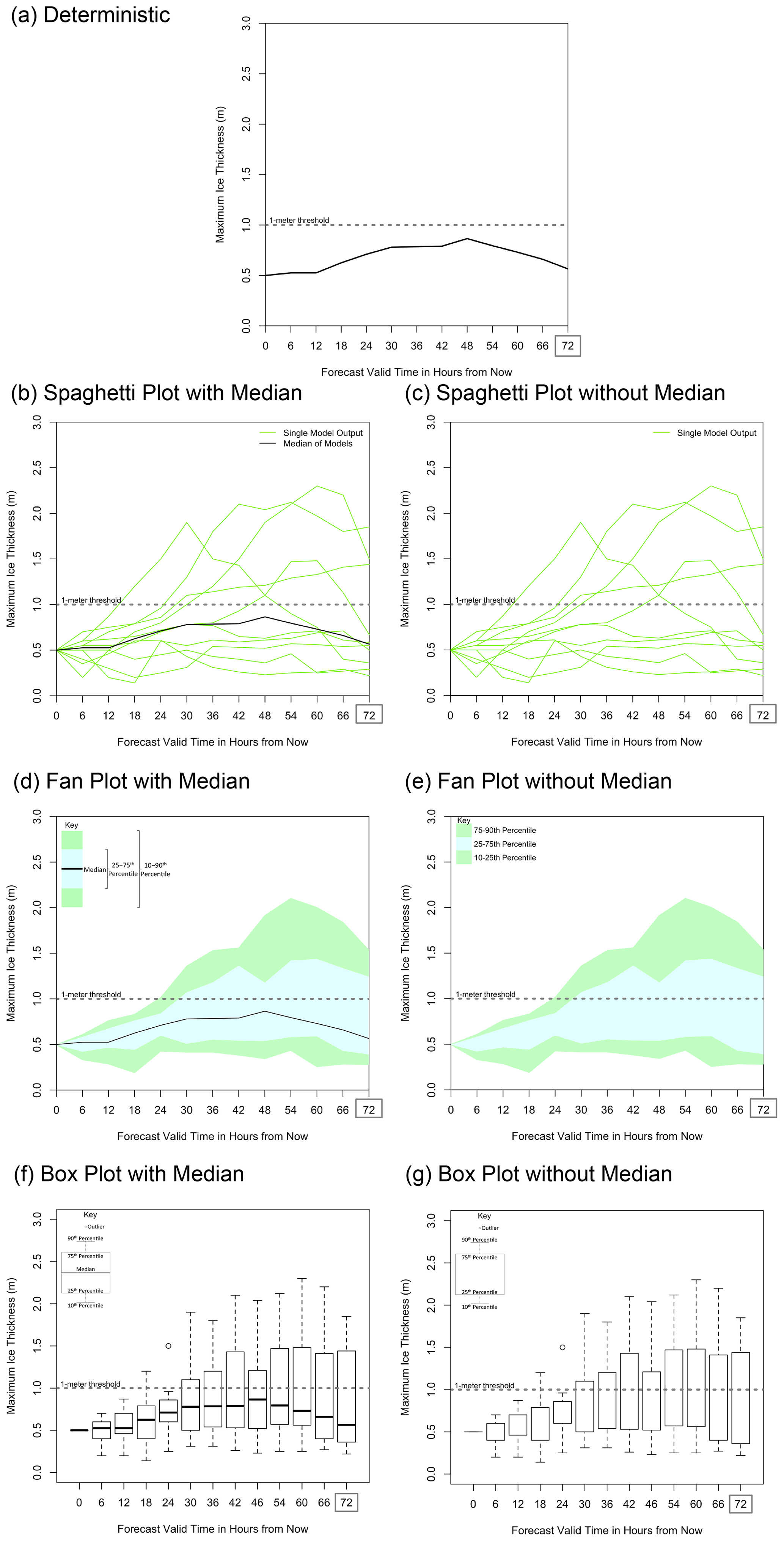
Figure 1The four forecast representations used in this analysis: (a) deterministic (using only the median line), (b, c) spaghetti plot, (d, e) fan plot, and (f, g) box plot. Uncertainty forecasts were shown both with median lines (b, d, f) and without median lines (c, e, g). All forecasts represent the same information: 3 of 10 model runs show ice greater than 1 m thick. The same plots were produced for 50 % and 70 % chance of the ice being greater than 1 m thick (not shown). The dotted line in each graphic shows 1 m ice thickness, the threshold the participants predicted.
2.3 Eye-tracking apparatus
Participants wore an EyeLink II (SR Research Ltd) eye tracker headset (Fig. 2), which recorded eye movements of the right eye at a rate of 500 Hz as they completed the task. The EyeLink II is a high-resolution, comfortable, head-mounted, video-based eye tracker with 0.5∘ average accuracy (offset between actual gaze location and that recorded) and 0.01∘ resolution (dispersal of gaze locations during fixations), which gives highly accurate spatial and temporal resolutions. Participants' gazes were precisely calibrated and re-calibrated throughout the study as necessary to maintain accurate recording. Each forecast and task was presented on a 21-inch coloured-desktop PC with a monitor refresh rate of 75 Hz. Participants were seated at a distance of 57 cm from the monitor, and their head movements were minimized by a chin rest (Fig. 2). Fixation location and duration were extracted after study completion. Fixation was defined as times when the eyes were still and not in motion (i.e. no saccades were detected). These measures were used as proxies of the aspects of the forecasts that were being attended to by participants as they made their decisions. These give direct insight into the information and visual features that are salient when participants are attempting to understand and use uncertainty in forecasting in order to make decisions. For more information on the methods used in eye-tracking studies, see Holmqvist et al. (2011).
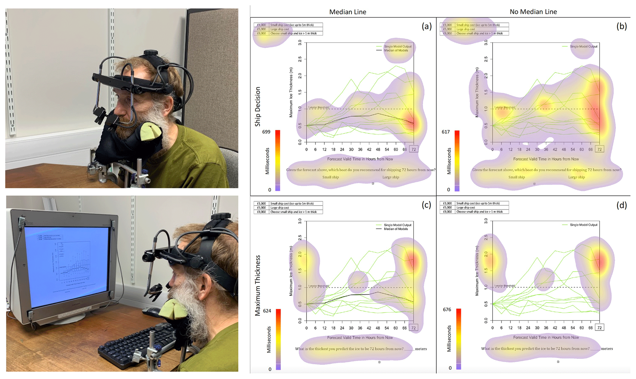
Figure 2On the left are pictures of the head-mounted eye tracker, EyeLink II (SR Research Ltd), used to record participants' eye movements while taking part in the study, with an example of boxplot trial shown on the display. (a–d) Composite heat maps are shown. These show the accumulation of the duration of eye fixations (in milliseconds) of all participants for the ship decision (a, b) and maximum ice thickness (c, d) tasks. Heat maps are shown only for the spaghetti plot with (a, c) and without (b, d) median lines. Heat maps for the other forecast representations can be found in Appendix B of Mulder et al. (2023). Please note that, between each question, there was a cross present to help participants focus back to the centre of the screen prior to moving on to the next trial. This central start position resulted in collections of fixations in the centre of the displays and can be seen on all of the four heat maps shown. It is most clear in the top-right heat map.
2.4 Data analysis
Two interest areas were formed from a post hoc classification to address our research questions (graph area and key). Three viewing periods across trials were created (early, intermediate, late). The exact definition of early, intermediate, and late differed by type of graph due to each style evoking slightly different viewing periods. Viewing periods for each specific graph type were made up of equal bins divided across the average time to complete the question and therefore ranged between 5 and 6 s. In this study, we report the number of fixations and the total fixation duration.
In our companion paper (Mulder et al., 2023), our analysis of gaze was across all experimental trials and all tasks. However, as we are concerned with the viewing period and want to avoid effects of learning, we examine gaze when participants were faced with each graph type for the first time. Repeated exposure to graph type and the demand to make the same judgement may influence gaze patterns as informative parts of the figures are located more swiftly. Therefore, six trials for each graph type for each participant were examined. We analysed the accuracy of responses to this question (making the safe and cost-effective choice of the two options) and participants' gaze (number and total fixation duration).
Based on the results of our companion paper (Mulder et al., 2023), we further explore the impact of the presence of a median line considering the viewing period, expertise, and graph type. We then focus on fixation towards the keys, including viewing period, expertise, graph type, and the presence of a median line as variables. Data were analysed using an analysis of variance (also known as ANOVA) approach, which tests for differences across the mean responses in cases where there are multiple conditions or groups greater than two. Further post hoc analyses examining differences between specific pairs of conditions or groups were carried out using t tests, which are Bonferroni corrected (this is a correction to the significance threshold criteria to control for the number of comparisons carried out; see Baguley, 2012, for an example). For both research questions, a four-way mixed-measures ANOVA was conducted, including graph type, presence of a median line, and viewing period as within-subject variables (i.e. all participants took part in all these conditions) and expertise as a between-subjects variable (participants were grouped by expertise). Finally, we report the accuracy of responses for the ice ship decision task, highlighting any differences due to expertise. There are a number of components to the output of the analysis of variance (ANOVA). Below, we provide a key which may help in understanding the output we report.
3.1 Does the presence of a median line and expertise affect gaze over the course of the decision-making process?
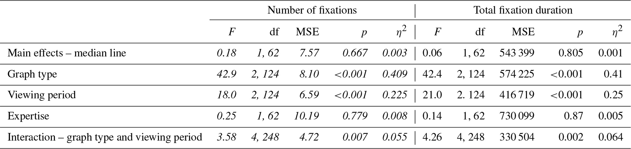
Here, we examined how the presence of the median line influences eye movement behaviour when considered across the viewing period from early to late stages and across different levels of expertise, as well as according to the graph type. Table 1 shows a summary of the statistical outcomes detailed in the paragraphs below, along with a short description of what they show.
The main effect of the presence of a median line was found for the number of fixations and the total fixation duration in relation to the graph area (p′s<0.015). More fixations were made, and more time was spent fixating on the graph area of the display when no median line was present (fixation count M=8.74; total duration M=2128.64) compared to when a median line was provided (fixation count M=7.89; total duration M=1887.47).
The main effect of graph type was also found for the number of fixations and the total fixation duration in relation to the graph area (p′s<0.001). Boxplots elicited more fixations, and more time was spent fixating on boxplots (fixation count M=9.07; total duration M=2222.21) and fan plots (fixation count M=8.71; total duration M=2091.04) compared to spaghetti plots (fixation count M=7.17; total duration M=1710.92).
There was also a main effect observed in terms of the viewing period for the number of fixations and the total fixation duration in relation to the graph area (p′s<0.001). There was found to be a greater number of fixations with longer dwell times on the graph area during early (fixation count M=9.83; total duration M=2399.96) and intermediate (fixation count M=9.52; total duration M=2284.11) viewing periods compared to later periods (fixation count M=5.60; total duration M=1340.09).
There was no main effect of expertise on fixation count and total fixation duration (p′s>0.05).
In addition to the main effects of the median line, graph type, and viewing period, there was an interaction between the median line and the viewing period for the total fixation duration (p=0.03). Less time was spent fixating on the graph area during the early and intermediate stages of viewing when a median line was present (early total duration M=2174.97; intermediate total duration M=2137.79, p<0.001) compared to when no median line was present (early total duration M=2624.96; intermediate total duration M=2430.43, p=0.05). However, no differences were found due to the presence (later total duration M=1349.65) or absence (later total duration M=1330.54) of a median line during the later stages (p=0.896). No other interactions were found to be significant. These findings support that the median line can reduce cognitive load, impacting the total fixation duration and the number of fixations made on the graph area, particularly during early stages of the decision-making process, and adds to results from our companion paper that showed how fixation location was towards the median line when present, regardless of the type of graph.
Table 1A summary of the main significant statistical outcomes examining the effect of median line presence, graph type, viewing period, and expertise on gaze behaviour, as detailed in the text. All significant main effects and interactions are included, along with important non-significant findings. The numerical outcome values of the statistical analysis are included here and are italicized.
Key to analysis of variance (ANOVA) output
-
F is the inferential statistic test returned by the ANOVA, which shows the proportion of variance in the participant data as explained by a model of the data that includes the levels of the independent variable compared to that which can be accounted for when that variable is not included (i.e. by chance alone).
-
The df (degrees of freedom) are shown in brackets after the F value.
-
MSE is the mean square error, which is the mean of the variance accounted for by chance alone.
-
p shows the chances that the results would be found if there was actually no difference to be found, the common threshold being 0.05 (5 %). A p value less than 0.05 would be commonly labelled as being significant; i.e. we were unlikely to have recorded the data we did if there was actually no difference caused by the independent variable(s).
-
η2 refers to partial eta-squared, which is a measure of effect size. This gives insight into the strength of the effect of an independent variable; p values are affected by sample size, whereas effect size measures are not and so allow comparisons to be made across variables.
3.2 Is gaze to the key influenced by expertise and the viewing period during the decision-making process?
In order to examine how gaze parameters in relation to the graph key change throughout the viewing period prior to the final decision, we extracted the number of fixations made on the key and their duration. Table 2 shows a summary of the statistical outcomes detailed in the paragraphs below, along with a short description of what they show.
The main effect of graph type was found for the number of fixations and the total fixation duration in relation to the key (p′s<0.001). More fixations were made and more time was spent fixating on fan plot keys (fixation count M=2.45; total duration M=626.79) compared to both boxplot (fixation count M=1.48; total duration M=387.75) and spaghetti plot keys (fixation count M=0.56; total duration M=127.13), and more fixations were made and more time was spent on boxplot keys compared to spaghetti plot keys.
There was a main effect of the viewing period on the number of fixations on the key within the display, as well as on the total amount of fixations (p′s<0.001). More fixations and longer dwell times in relation to the key occurred during the early (fixation count M=1.61; total duration M=407.15) and intermediate (fixation count M=1.99; total duration M=515.33) viewing periods compared to later periods (fixation count M=0.90; total duration M=219.20).
No main effect of the median line on either fixation count or total fixation durations was found (p′s>0.05) nor was there a main effect of expertise on fixation count and total fixation duration (p′s>0.05).
An interaction between the graph type and viewing period for fixation count and total fixation duration was found (p′s<0.008). More fixations were made and more time was spent fixating on the boxplot key during the early (fixation count M=1.68; total duration M=423.76) and intermediate (fixation count M=2.06; total duration M=577.11) stages of the viewing period compared to the later stage (fixation count M=0.71; total duration M=162.39) (p′s<0.005). Similarly, more fixations were made and more time was spent fixating on the fan plot key during the early (fixation count M=2.69; total duration M=695.64) and intermediate stages (fixation count M=3.10; total duration M=791.37) compared to the later stage (fixation count M=1.55; total duration M=393.37) (p′s<0.005). However, no differences were found between viewing periods for spaghetti plots (p′s>0.05). The reason for less fixation in relation to spaghetti plot keys generally and for the lack of differences over time could be the intuitiveness of this form of plot and the simplicity of the key.
Table 2A summary of the main significant statistical outcomes examining the effect of median line presence, graph type, viewing period, and expertise on gaze behaviour in terms of the graph keys detailed in the text. All significant main effects and interactions are included, along with important non-significant findings. The numerical outcome values of the statistical analysis are included here and are italicized.
3.3 Does expertise affect accuracy of decisions?
Mulder et al. (2020) found no significant difference in the accuracy of decisions made between the graph types; there was only a difference in the amount of uncertainty interpreted from them. Here, accuracy responses in terms of the number of times participants correctly identified which ship would be most economically rational to send were measured considering expertise and probability of risk.
Table 3Table 3 presents accuracy results for all probabilities of risk for differing expertise. A small ship is the correct ship to send for a 30 % risk of ice thickness, and a large ship is the correct ship to send for 50 % and 70 % risk levels.
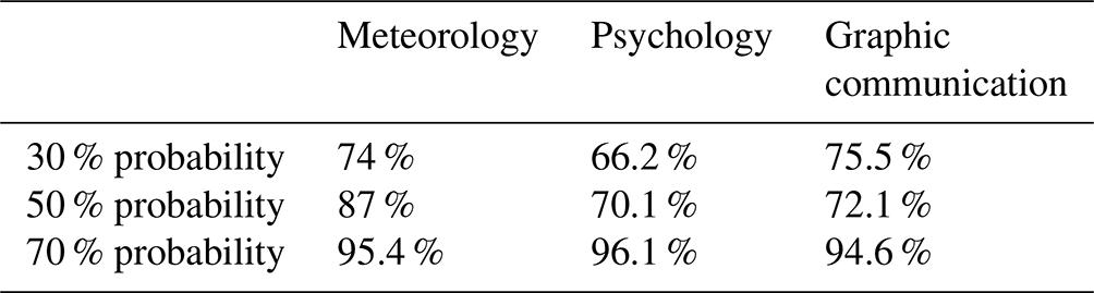
Overall, participants were accurate in their choice of ship (meteorology = 85.5 %; psychology = 77.9 %; graphic communication = 80.7 %); however, some differences were apparent due to expertise. A one-way ANOVA shows differences in accuracy when presented with 50 % probability of risk, which is the most challenging task (, MSE = 2.27, p=0.023, η2=0.115). Multiple comparisons show meteorology students to be significantly more accurate than psychology students in choosing the large ship during these scenarios (p=0.035) and more accurate than graphic communication students, although this difference is not significant (p=0.08). No differences between levels of expertise were found for the 30 % and 70 % trials (p>0.05).
As scientific information is increasingly being presented to non-specialists graphically, it is important to consider how this information is delivered. This approach to open science, which is less dependent on expert interpretation, is a natural development as general scientific literacy increases and is welcomed by both scientific producers and consumers. As this approach develops, it becomes much more important to have a clear understanding of the biases in interpretation that result from different forms of data presentation. While relevant to many fields of science, there is a particular need for this understanding in the environmental sciences as environmental hazards increase and change.
Prior research presents mixed results, with some authors suggesting that, when making slight variations to graph representations that display uncertainty, decisions and interpretations differ (Correll and Gleicher, 2014; Tak et al., 2015), whilst others show that, despite greater discrepancies in forecast representation such as between graphic visualizations and written forms, there are no differences (Nadav-Greenberg and Joslyn, 2009). Furthermore, few studies explore how experts and non-experts interpret forecast information from different types of graphical forecast representations (Mulder et al., 2020). The current research examines these areas further by using eye movement techniques considering expertise and the viewing period during the decision-making process when observing a range of graph types.
More economically rational responses to the ship decision were made by meteorology students (greater level of expertise) during the most difficult scenarios. We found participants, regardless of expertise, to spend less time fixating on the overall graph when a median line was presented, particularly during early and intermediate stages of viewing. This provides more evidence for the anchoring bias suggested in previous papers (Mulder et al., 2020). Participants focussed on the key for boxplots and fan plots more during early and intermediate stages compared to later stages. This provides evidence that early stages of viewing are more exploratory and oriented towards informative areas (Buswell, 1935; Yarbus, 1967; Antes, 1974; Nodine et al., 1993; Locher, 2006; Locher et al., 2008; Locher, 2015; Goldberg and Helfman, 2010). However, considering the results and the differences found due to graph type, spaghetti plots appear to be simpler to interpret, potentially reducing cognitive load (Walter and Bex, 2021), corroborating the findings in Mulder et al. (2020) that the spaghetti plot helped users interpret extreme values.
Overall, this study, together with the analysis in our companion paper (Mulder et al., 2023), demonstrates that there are many challenges when presenting natural-hazard data to both experts and non-experts; the way that information is portrayed can impact interpretations and decisions. It is important to note that the graph area and key are specific to the particular tasks presented in this study and are used as indicators of the impact of expertise, graph type, and viewing period. Furthermore, the course of study within higher education was used as a proxy for expertise, with meteorology students being regarded to have higher levels of expertise. However, future research would benefit from examining the behaviour and decisions of academics and forecasters who would be considered experts.
Responses to the ship decision (small or large) based on economic rationality support the importance of expertise. While accuracy is generally reduced with the probability of ice thickness, those with greater expertise are less prone to this and are more accurate during more uncertain situations. While their accuracy was as low as others for 30 % probability conditions, with a little less uncertainty (50 % probability of risk), accuracy improved more than with the other groups. This suggests that the meteorology students were able to use their expertise to understand the forecasts to inform their decisions more effectively than the other groups. However, expertise appears to have little impact on eye movement behaviour within our study. Differences between experts and non-experts in terms of their decisions and interpretations of best-guess forecasts and their inference of uncertainty have been reported previously (Mulder et al., 2020). However, Doyle et al. (2014) found no differences in the use of probabilistic information for forecasts of volcanic eruptions. Other contradictory evidence has also been reported in tests of numeracy as a predictor for making economically rational decisions (Roulston and Kaplan, 2009; Tak et al., 2015). Differences may be due to what “expert” means in these circumstances. As pointed out, our sample used years of study as the expertise proxy, and while showing some effect, this may not reflect the decision-making and behaviour of those with many years of experience. Thus, it may well be the case that those with greater expertise would show a more effective use of forecast information provided both in terms of accuracy and more effective information extraction, as shown through eye movement differences not found in our sample.
The results show how median lines can reduce cognitive load, drawing users to the central estimate regardless of expertise. A median line reduces the perceived uncertainty in a graphic, even when explicitly presented (Mulder et al., 2020) so use of a median line should be used when the amount of uncertainty in the estimate is less critical to understand. Use of the key within graphical representations can also impact interpretations of data. For forecast providers, this suggests that standard information design principles which seek to reduce visual noise in data presentation and draw the user to the critical parts can have major benefits in terms of their ability to effectively communicate with both expert and non-expert end-users.
More broadly, taken together, the results reported here and those reported by Mulder et al. (2023) suggest that incorporating eye-tracking and other techniques from cognitive science into the process of the design of forecast communication tools could be extremely fruitful. These techniques are now well established with technology that makes them relatively cheap to set up and use. Graphical presentation of geo-scientific forecasts can happen with a range of breadth and longevity of communication in mind. While eye-tracking and related techniques would not be appropriate for all purposes, where graphics are being developed for routine and wide use, for example in routine weather forecasts, this kind of approach would be a very valuable addition to end-user engagement. One obvious extension to the work in the two parts of this study is applying the same techniques to well-known and widely used geo-scientific forecast graphics.
Data created during the research reported in this article are openly available from the University of Reading Research Data Archive at https://doi.org/10.17864/1947.110 (Mulder et al., 2018).
LW: conceptualization, investigation, formal analysis, writing – original draft preparation. KJM: writing – review and editing. ACP: funding acquisition, writing – review and editing. ML: writing – review and editing. AB: funding acquisition, writing – review and editing. RM: funding acquisition, writing – review and editing. EM: conceptualization, resources, writing – review and editing. JY: funding acquisition.
The contact author has declared that none of the authors has any competing interests.
The University of Reading Ethics Board approved the study, and the study was conducted in accordance with the standards described in the 1964 Declaration of Helsinki. Participants provided written informed consent. The authors declare that there is no conflict of interest.
Publisher’s note: Copernicus Publications remains neutral with regard to jurisdictional claims in published maps and institutional affiliations.
We thank our eye-tracking study participants. We also acknowledge the Natural Environment Research Council (NERC) for funding.
This research has been supported by the Natural Environment Research Council (NERC; grant no. NE/J017221/1).
This paper was edited by Solmaz Mohadjer and Stephanie Zihms, and reviewed by Laura Carey and Christopher Chagumaira.
Ash, K. D., Schumann III, R. L., and Bowser, G. C.: Tornado warning trade-offs: Evaluating choices for visually communicating risk, Weather Clim. Soc., 6, 104–118, 2014.
Antes, J.: The time course of picture viewing, J. Exp. Psychol., 103, 62–70, https://doi.org/10.1037/h0036799, 1974.
Baguley, T.: Serious stats: A guide to advanced statistics for the behavioural sciences, Palgrave Macmillan, Basingstoke, https://doi.org/10.1007/978-0-230-36355-7, 2012.
Bosetti, V., Weber, E., Berger, L., Budescu, D. V., Liu, N., and Tavoni, M.: COP21 climate negotiators' responses to climate model forecasts, Nat. Clim. Change, 7, 185–190, 2017.
Bostrom, A., Morss, R. E., Lazo, J. K., Demuth, J. L., Lazrus, H., and Hudson, R.: A Mental Models Study of Hurricane Forecast and Warning Production, Communication, and Decision-Making, Weather Clim. Soc., 8, 111–129, https://doi.org/10.1175/WCAS-D-15-0033.1, 2016.
Broad, K., Leiserowitz, A., Weinkle, J., and Steketee, M.: Misinterpretations of the “cone of uncertainty” in florida during the 2004 hurricane season, B. Am. Meteorol. Society, 88, 651–668, https://doi.org/10.1175/BAMS-88-5-651, 2007.
Broad, K., Demuth, J. L., Morss, R. E., Hearn-Morrow, B, and Lazo, J. L.: Creation and communication of hurricane risk information, B. Am. Meteorol. Society, 93, 1133–1145, https://doi.org/10.1175/BAMS-D-11-00150.1, 2012.
Buswell, G. T.: How people look at pictures, University of Chicago Press, Chicago, ISBN 0598831339, 1935.
Charness, N., Reingold, E. M., Pomplun, M., and Stampe, D. M.: The perceptual aspect of skilled performance in chess: Evidence from eye movements, Mem. Cognition, 29, 1146–1152, https://doi.org/10.3758/BF03206384, 2001.
Correll, M. and Gleicher, M.: Error bars considered harmful: Exploring alternate encodings for mean and error, IEEE T. Vis. Comput. Gr., 20, 2142–2151, https://doi.org/10.1109/TVCG.2014.2346298, 2014.
Denes-Raj, V. and Epstein, S.: Conflict between intuitive and rational processing: when people behave against their better judgment, J. Pers. Soc. Psychol., 66, 819–829, https://doi.org/10.1037/0022-3514.66.5.819, 1994.
Doyle, E. E., McClure, J., Johnston, D. M., and Paton, D.: Communicating likelihoods and probabilities in forecasts of volcanic eruption, J. Volcanol. Geoth. Res., 272, 1–15, https://doi.org/10.1016/j.jvolgeores.2013.12.006, 2014.
Feldman-Stewart, D., Brundage, M. D., and Zotov, V.: Further insight into the perception of quantitative information: judgments of gist in treatment decisions, Med. Decis. Making, 27, 34–43, 2007.
Fischhoff, B., Brewer, N. T., and Downs, J. S. (Eds.): Communicating risks and benefits: an evidence-based user’s guide, Department of Health and Human Services, Food and Drug Administration, Silver Spring, MD, http://www.fda.gov/ScienceResearch/SpecialTopics/RiskCommunication/default.htm (last access: 25 April 2023), 2011.
Fuchs, S., Spachinger, K., Dorner, W., Rochman, J., and Serrhini, K.: Evaluating cartographic design in flood risk mapping, Environ. Hazards, 8, 52–70, https://doi.org/10.3763/ehaz.2009.0007, 2009.
Fundel, V. J., Fleischhut, N., Herzog, S. M., Göber, M., and Hagedorn, R.: Promoting the use of probabilistic weather forecasts through a dialogue between scientists, developers and end-users, Q. J. Roy. Meteor. Soc., 145, 210–231, https://doi.org/10.1002/qj.3482, 2019.
Galesic, M., Garcia-Retamero, R., and Gigerenzer, G.: Using icon arrays to communicate medical risks: overcoming low numeracy, Health Psychol., 28, 210–216, https://doi.org/10.1037/a0014474, 2009.
Garcia-Retamero, R., Galesic, M., and Gigerenzer, G.: Do icon arrays help reduce denominator neglect?, Med. Decis. Making, 30, 672–684, https://doi.org/10.1177/0272989X10369000, 2010.
Gigerenzer, G. and Hoffrage, U.: How to improve Bayesian reasoning without instruction: Frequency formats, Psychol. Rev., 102, 684–704, https://doi.org/10.1037/0033-295X.102.4.684, 1995.
Gigerenzer, G., Gaissmaier, W., Kurz-Milcke, E., Schwartz, L. M., and Woloshin, S.: Helping doctors and patients make sense of health statistics, Psychol. Sci. Publ. Int., 8, 53–96, 2007.
Glaholt, M. G. and Reingold, E. M.: The time course of gaze bias in visual decision tasks, Vis. Cogn., 17, 1228–1243, https://doi.org/10.1080/13506280802362962, 2009.
Goldberg, J. H. and Helfman, J. I.: Comparing information graphics: a critical look at eye tracking, in: Proceedings of the 3rd BELI'10 Workshop: Beyond time and errors: novel evaluation methods for Information Visualization, 71–78, https://doi.org/10.1145/2110192.2110203, 2010.
Gustafson, A. and Rice, R. E.: The Effects of Uncertainty Frames in Three Science Communication Topics, Sci. Commun., 41, 679–706, https://doi.org/10.1177/1075547019870811, 2019.
Harold, J., Lorenzoni, I., Shipley, T. F., and Coventry, K. R.: Cognitive and psychological science insights to improve climate change data visualization, Nat. Clim. Change, 6, 1080–1089, 2016.
Holmqvist, K., Nyström, M., Andersson, R., Dewhurst, R., Jarodzka, H., and Van de Weijer, J.: Eye tracking: A comprehensive guide to methods and measures, Oxford University Press, Oxford, UK, ISBN 10: 0198738595, 2011.
Hullman, J.: Why Authors Don't Visualize Uncertainty, IEEE T. Vis. Comput. Gr., 26, 130–139, https://doi.org/10.1109/TVCG.2019.2934287, 2019.
Joslyn, S. L. and Nichols, R. M.: Probability or frequency? Expressing forecast uncertainty in public weather forecasts, Meteorol. Appl., 16, 309–314, https://doi.org/10.1002/met.121, 2009.
Joslyn, S. and Savelli, S.: Visualizing Uncertainty for Non-Expert End Users: The Challenge of the Deterministic Construal Error, Frontiers in Computer Science, 2, 590232, https://doi.org/10.3389/fcomp.2020.590232, 2021.
Kang, Z. and Landry, S. J.: Using scanpaths as a learning method for a conflict detection task of multiple target tracking, Hum. Factors, 56, 1150–1162, https://doi.org/10.1177/0018720814523066, 2014.
Kelton, A. S., Pennington, R. R., and Tuttle, B. M.: The effects of information presentation format on judgment and decision making: A review of the information systems research, Journal of Information Systems, 24, 79–105, 2010.
Kirschenbaum, S. S., Trafton, J. G., Schunn, C. D., and Trickett, S. B.: Visualizing uncertainty: The impact on performance, Hum. Factors, 56, 509–520, https://doi.org/10.1177/0018720813498093, 2014.
Kundel, H. L., Nodine, C. F., Krupinski, E. A., and Mello-Thoms, C.: Using gaze-tracking data and mixture distribution analysis to support a holistic model for the detection of cancers on mammograms, Acad. Radiol., 15, 881–886, https://doi.org/10.1016/j.acra.2008.01.023, 2008.
Kurz-Milcke, E., Gigerenzer, G., and Martignon, L.: Transparency in risk communication: graphical and analog tools, Ann. NY Acad. Sci., 1128, 18–28, https://doi.org/10.1196/annals.1399.004, 2008.
Lipkus, I. M.: Numeric, verbal, and visual formats of conveying health risks: suggested best practices and future recommendations, Med. Decis. Making, 27, 696–713, 2007.
Lipkus, I. M. and Hollands, J. G.: The visual communication of risk, JNCI Monographs, 149–163, 1999.
Locher, P.: The usefulness of eye movement recordings to subject an aesthetic episode with visual art to empirical scrutiny, Psych. Sci., 48, 106–114, 2006.
Locher, P., Krupinski, E. A., Mello-Thoms, C., and Nodine, C. F.: Visual interest in pictorial art during an aesthetic experience, Spatial Vision, 21, 55–77, 2008.
Locher, P. J.: The aesthetic experience with visual art “at first glance”, in: Investigations into the Phenomenology and the Ontology of the Work of Art: What Are Artworks and How Do We Experience Them, edited by: Bundgaard, P. and Stjernfeld, F., Springer Open, New York, 75–88, ISBN 3319140892, 2015.
Lorenz, S., Dessai, S., Forster, P. M., and Paavola, J.: Tailoring the visual communication of climate projections for local adaptation practitioners in Germany and the UK, Philos. T. R. Soc. A, 373, 20140457, https://doi.org/10.1098/rsta.2014.0457, 2015.
Maturi, K. S. and Sheridan, H.: Expertise effects on attention and eye-movement control during visual search: Evidence from the domain of music reading, Atten. Percept. Psychophys., 82, 2201–2208, https://doi.org/10.3758/s13414-020-01979-3, 2020.
Milne, A. E., Glendining, M. J. , Lark, R. M., Perryman, S. A., Gordon, T., and Whitmore, A. P.: Communicating the uncertainty in estimated greenhouse gas emissions from agriculture, J. Environ. Manage., 160, 139–153, https://doi.org/10.1016/j.jenvman.2015.05.034, 2015.
Morss, R., Demuth, J. L., and Lazo, J. K.: Communicating uncertainty in weather forecasts: A survey of the U.S. public, Weather Forecast., 23, 974–991, https://doi.org/10.1175/2008WAF2007088.1, 2008.
Morss, R. E., Demuth, J. L., Bostrom, A., Lazo, J. K., and Lazrus, H.: Flash flood risks and warning decisions in Boulder, Colorado: A mental models study of forecasters, public officials, and media broadcasters in Boulder, Colorado, Risk Anal., 35, 2009–2028, https://doi.org/10.1111/risa.12403, 2015.
Morss, R. E., Demuth, J. L., Lazo, J. K., Dickinson, K., Lazrus, H., and Morrow, B. H.: Understanding public hurricane evacuation decisions and responses to forecast and warning messages, Weather Forecast., 31, 395–417, https://doi.org/10.1111/j.1539-6924.2008.01137.x, 2016.
Mulder, K., Williams, L., Lickiss, M., Black, A., Charlton-Perez, A., McCloy, R., and McSorley, E.: Eye Tracking of Vegetable Shipping Line Graph Testing Survey, University of Reading [data set], https://doi.org/10.17864/1947.110, 2018.
Mulder, K. J., Lickiss, M., Black, A., Charlton-Perez, A. J., McCloy, R., and Young, J. S.: Designing environmental uncertainty information for experts and non-experts: Does data presentation affect users' decisions and interpretations?, Meteorol. Appl., 27, e1821, https://doi.org/10.1002/met.1821, 2020.
Mulder, K. J., Williams, L., Lickiss, M., Black, A., Charlton-Perez, A., McCloy, R., and McSorley, E.: Understanding representations of uncertainty, an eye-tracking study – Part 1: The effect of anchoring, Geosci. Commun., 6, 97–110, https://doi.org/10.5194/gc-6-97-2023, 2023.
Nadav-Greenberg, L. and Joslyn, S. L.: Uncertainty forecasts improve decision making among nonexperts, Journal of Cognitive Engineering and Decision Making, 3, 209–227, 2009.
Nadav-Greenberg, L., Joslyn, S. L., and Taing, M. U.: The effect of uncertainty visualizations on decision making in weather forecasting, Journal of Cognitive Engineering and Decision Making, 2, 24–47, 2008.
Nelson, D. E., Hesse, B. W., and Croyle, R. T.: Making Data Talk: The Science and Practice of Translating Public Health Research and Surveillance Findings to Policy Makers, the Public, and the Press, Oxford University Press, ISBN: 9780195381535, 2009.
Nodine, C. F., Locher, P. J., and Krupinski, E. A.: The Role of Formal Art Training on Perception and Aesthetic Judgment of Art Compositions, Leonardo, 26, 219–227, https://muse.jhu.edu/article/606664/summary (last access: 25 April 2023), 1993.
Padilla, L., Hansen, G., Ruginski, I. T., Kramer, H. S., Thompson, W. B., and Creem-Regehr, S. H.: The influence of different graphical displays on nonexpert decision making under uncertainty, J. Exp. Psychol.-Appl., 21, 37–46, https://doi.org/10.1037/xap0000037, 2015.
Peters, E.: Numeracy and the Perception and Communication of Risk, Ann. NY Acad. Sci., 1128, 1–7, https://doi.org/10.1196/annals.1399.001, 2008.
Peters, E., Hibbard, J., Slovic, P., and Dieckmann, N.: Numeracy skill and the communication, comprehension, and use of risk-benefit information, Health Affair., 26, 741–748, 2007.
Petropoulos, F., Apiletti, D., Assimakopoulos, V., Babai, M. Z., Barrow, D. K., Ben Taieb, S., Bergmeir, C., Bessa, R. J., Bijak, J., Boylan, J. E., Browell, J., Carnevale, C., Castle, J. L., Cirillo, P., Clements, M. P., Cordeiro, C., Oliveira, F. L. C., De Baets, S., Dokumentov, A., Ellison, J., Fiszeder, P., Franses, P. H., Frazier, D. T., Gilliland, M., Gönül, M. S., Goodwin, P., Grossi, L., Grushka-Cockayne, Y., Guidolin, M., Guidolin, M., Gunter, U., Guo, X., Guseo, R., Harvey, N., Hendry, D. F., Hollyman, R., Januschowski, T., Jeon, J., Jose, V. R. R., Kang, Y., Koehler, Anne B. Kolassa, S., Kourentzes, N., Leva, S., Li, F., Litsiou, K., Makridakis, S., Martin, G. M., Martinez, A. B., Meeran, S., Modis, T., Nikolopoulos, K., Önkal, D., Paccagnini, A., Panagiotelis, A., Panapakidis, I., Pavía, J. M., Pedio, M., Pedregal, D. J., Pinson, P., Ramos, P., Rapach, D. E., Reade, J. J., Rostami-Tabar, B., Rubaszek, M., Sermpinis, G., Shang, H. L., Spiliotis, E., Syntetos, A. A., Talagala, P. D., Talagala, T. S., Tashman, L., Thomakos, D., Thorarinsdottir, T., Todini, E., Arenas, J. R. T., Wang, X., Winkler, R. L., Yusupova, A., and Ziel, F.: Forecasting: theory and practice, Int. J. Forecasting, 38, 705–871, 2022.
Reyna, V. F. and Brainerd, C. J.: Numeracy, ratio bias, and denominator neglect in judgments of risk and probability, Learn. Individ. Differ., 18, 89–107, 2008.
Roulston, M. S. and Kaplan, T. R.: A laboratory-based study of understanding of uncertainty in 5-day site-specific temperature forecasts, Meteorol. Appl., 16, 237–244, https://doi.org/10.1002/met.113, 2009.
Savelli, S. and Joslyn, S.: The advantages of predictive interval forecasts for non-expert users and the impact of visualizations, Appl. Cognitive Psych., 27, 527–541, 2013.
Schriver, A. T., Morrow, D. G., Wickens, C. D., and Talleur, D. A.: Expertise differences in attentional strategies related to pilot decision making, Hum. Factors, 50, 864–878, https://doi.org/10.1518/001872008X374974, 2008.
Shepherd, T. G., Boyd, E., Calel, R. A., Chapman, S. C., Dessai, S., Dima-West, I. M., Fowler, H. J., James, R., Maraun, D., Martius, O., and Senior, C. A.: Storylines: an alternative approach to representing uncertainty in physical aspects of climate change, Climatic Change, 151, 555–571, 2018.
Shimojo, S., Simion, C., Shimojo, E., and Scheier, C.: Gaze bias both reflects and influences preference, Nat. Neurosci., 6, 1317–1322, https://doi.org/10.1038/nn1150, 2003.
Sillmann, J., Shepherd, T. G., van den Hurk, B., Hazeleger,W., Martius, O., Slingo, J., and Zscheischler, J.: Event-based storylines to address climate risk, Earth's Future, 9, e2020EF001783, https://doi.org/10.1029/2020EF001783, 2021.
Simion, C. and Shimojo, S.: Early interactions between orienting, visual sampling and decision making in facial preference, Vision Res., 46, 3331–3335, https://doi.org/10.1016/j.visres.2006.04.019, 2006.
Skubisz, C., Reimer, T., and Hoffrage, U.: Communicating Quantitative Risk Information, Annals of the International Communication Association, 33, 177–211, https://doi.org/10.1080/23808985.2009.11679087, 2009.
Speier, C.: The influence of information presentation formats on complex task decision-making performance, International Journal of Human Computer Studies, 64, 1115–1131, 2006.
Spiegelhalter. D.: Risk and uncertainty communication, Annu. Rev. Stat. Appl., 4, 31–60, 2017.
Spiegelhalter, D., Pearson, M., and Short, I.: Visualizing uncertainty about the future, Science, 333, 1393–1400, 2011.
St John, M., Callan, J., Proctor, S., and Holste, S.: Tactical decision-making under uncertainty: Experiments I and II, Tech. Rep., Pacific Sciences and Engineering Group Inc. San Diego CA, https://apps.dtic.mil/sti/pdfs/ADA378170.pdf (last access: 25 April 2023), 2000.
Stephens, E. M., Edwards, T. L., and Demeritt, D.: Communicating probabilistic information from climate model ensembles–lessons from numerical weather prediction, WIREs Clim Change, 3, 409–426, https://doi.org/10.1002/wcc.187, 2012.
Susac, A., Bubic, A., Martinjak, P., Planinic, M., and Palmovic, M.: Graphical representations of data improve student understanding of measurement and uncertainty: An eye-tracking study, Physical Review Physics Education Research, 13, 020125, https://doi.org/10.1103/PhysRevPhysEducRes.13.020125, 2017.
Tak, S., Toet, A., and van Erp, J.: The perception of visual uncertainty representation by non-experts, IEEE T. Vis. Comput. Gr., 20, 935–943, 2013.
Tak, S., Toet, A., and Van Erp, J.: Public understanding of visual representations of uncertainty in temperature forecasts, Journal of Cognitive Engineering and Decision Making, 9, 241–262, https://doi.org/10.1177/1555343415591275, 2015.
Tversky, A. and Kahneman, D.: Judgment under uncertainty: Heuristics and biases, Science, 185, 1124–1131, 1974.
Unema, P. J., Pannasch, S., Joos, M., and Velichkovsky, B. M.: Time course of information processing during scene perception: The relationship between saccade amplitude and fixation duration, Vis. Cogn., 12, 473–494, https://doi.org/10.1080/13506280444000409, 2005.
Visschers, V. H., Meertens, R. M., Passchier, W. W., and De Vries, N. N.: Probability information in risk communication: a review of the research literature, Risk Anal., 29, 267–287, 2009.
Wallsten, T. S., Budescu, D. V., Rapoport, A., Zwick, R., and Forsyth, B.: Measuring the vague meaning of probabilistic terms, J. Exp. Psychol.-Gen., 155, 348–365, 1986.
Walter, K. and Bex, P.: Cognitive load influences oculomotor behavior in natural scenes, Scientific Reports, 11, 12405, https://doi.org/10.1038/s41598-021-91845-5, 2021.
Wickens, C. D., Helton, W. S., Hollands, J. G., and Banbury, S.: Engineering psychology and human performance, 5th edn., Routledge, New York, https://doi.org/10.4324/9781003177616, 2021.
Williams, L., McSorley, E., and McCloy, R.: The relationship between aesthetic and drawing preferences, Psychol. Aesthet. Crea., 12, 259–271, https://doi.org/10.1037/aca0000188, 2018.
Wu, H. C., Lindell, M. K., Prater, C. S., and Samuelson, C. D.: Effects of track and threat information on judgments of hurricane strike probability, Risk Anal., 34, 1025–1039, https://doi.org/10.1111/risa.12128, 2014.
Yarbus, A. L.: Eye Movements and Vision, Plenum Press, New York, ISBN 0306302985, 1967.
Zikmund-Fisher, B. J., Fagerlin, A., and Ubel, P. A.: Improving Understanding of Adjuvant Therapy Options by Using Simpler Risk Graphics, Cancer, 113, 3382–3390, https://doi.org/10.1002/cncr.23959, 2008.