the Creative Commons Attribution 4.0 License.
the Creative Commons Attribution 4.0 License.
 | 11 Jun 2025
GC Insights: Consistency in pyrocartography starts with color
Benjamin J. Hatchett
Fire progression maps provide operational and public information regarding wildland fire spread, size, and proximity to critical assets through time. Cartographic guidance regarding the use of color to denote the sequential nature of fire progression is limited, leading to inconsistency in fire progression maps produced for operational, research, and public applications, which potentially limits these maps' accessibility and ability to effectively communicate information. In this paper, I provide color map recommendations to facilitate consistent, intuitive, and accessible fire progression mapping.
- Article
(6731 KB) - Full-text XML
- BibTeX
- EndNote


The movement of wildland fire across the landscape results from factors including weather, fuels, topography, fire history, and fire suppression activities. The most extreme cases of fire spread occur when strong winds and the orientation of topography align with accumulations of continuous fuels available to burn at a high intensity and produce downstream ignitions – i.e., spot fires – meters to kilometers ahead of the flaming front. Fire progression maps (FPMs) provide a first-order visualization of a wildfire's current perimeter and spread since ignition (Fig. 1). Typically, FPMs are produced daily using aircraft-based infrared data, though near-real estimates using satellite data are becoming increasingly available (Chen et al., 2022; Berman et al., 2023; Liu et al., 2024).
Operationally, FPMs assist fire managers in formulating strategies and implementing tactics for achieving desired management outcomes and to understand prior management efforts. Forecast FPMs produced by fire behavior models using existing fire perimeters or ignition locations support fire management by simulating fire spread possibilities and potential smoke production (Kochanski et al., 2023). Public information officers and agency websites (e.g., https://inciweb.wildfire.gov/, last access: 2 March 2025) share FPMs with the public, the media, and agency partners to provide updates on fire activity and suppression efforts. Researchers and Burned Area Emergency Response teams may use FPMs to evaluate when a particular area burned since the time of burning in a particular location often does not coincide with the ignition or containment date. Simulated FPMs extend to pre-fire planning efforts to help prioritize fuel management strategies and locations by mapping potential growth given varying treatments and ignition locations. Taken together, the creation and dissemination of FPMs for applications throughout the fire cycle motivate the need for maps that communicate effectively.
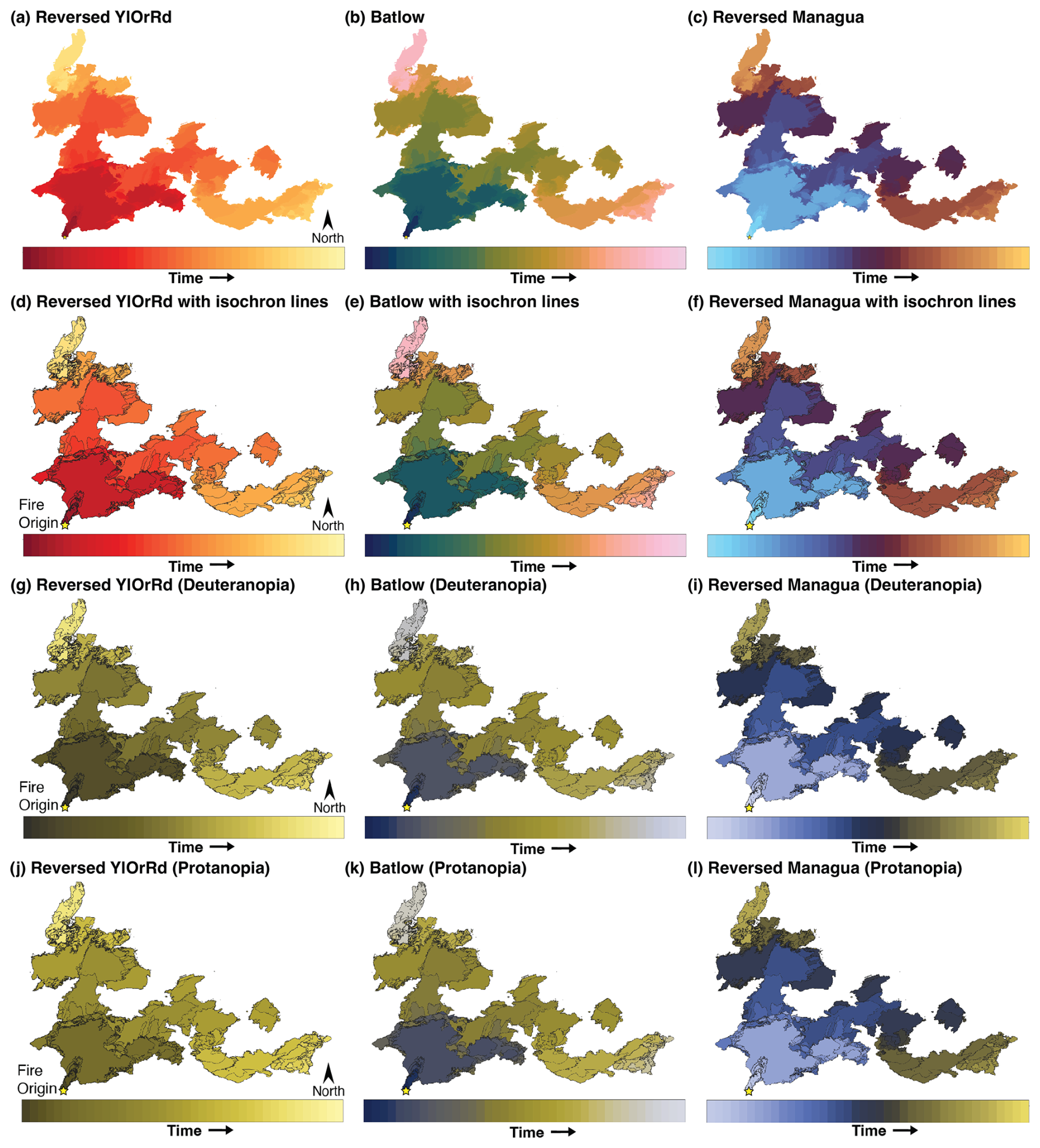
Figure 1(a–c) Daily fire progression maps of the 2021 Dixie Fire using three color maps that are accessible for color-vision-deficient viewers and that demonstrate a physically intuitive sequential progression through time (i.e., older fire shown by cooler colors and newer fire shown by warmer colors). (d–f) As in (a)–(c) but including isochrons. (g–i) Maps in (d)–(f) with deuteranopia (green-blind) color blindness simulation. (j–l) Maps in (d)–(f) with protanopia (red-blind) color blindness simulation. The yellow star denotes the fire origin location.
To provide a basis for consistency in geospatial products for wildfire incidents, the US-based National Wildfire Coordinating Group (NWCG) maintains a set of cartographic standards called the NWCG Standards for Geospatial Operations (GeoOps, Publication Management System 936) (National Wildfire Coordinating Group, 2024). GeoOps provides guidance on map product standards for wildland fire mapping, with two specific recommendations for FPMs. First, it recommends using “standardized” color ramps (or color maps) to show trends instead of discrete values when showing more than five time steps. Second, it recommends the standard element of the fire perimeter data for each time period, transitioning from cool (older) to warm colors (more recent).
Despite this guidance, at the time of writing, the GeoOps examples demonstrate known challenges in visual communication, one being the use of inconsistent (i.e., “standardized” is not defined explicitly) color maps that are potentially inaccessible for color-vision-deficient users with regard to the portrayal of fire progressions (Fig. A1 in Appendix A). This highlights a missing but easily remedied aspect in GeoOps: sets of color maps that improve accessibility (Crameri et al., 2020; Stoelzle and Stein, 2021) and address compliance to Section 508, a US federal law enacted to create and maintain standards enabling the accessibility of electronic and information technology (i.e., web-based content or multimedia such as portable document formats) to those with disabilities (LaVor and Duncan, 1974). Further, the lack of color map consistency in FPMs (cf. Fig. A1 and those in Chen et al., 2022; Kochanski et al., 2023; and Liu et al., 2024) represents another potential limiting factor in terms of user cognition for maps already displaying complex information (Bunch and Lloyd, 2006) if the color maps change substantially from day to day, from incident to incident, or across applications.
Near-daily fire perimeters using airborne infrared data from California's 2021 Dixie Fire (13 July–27 September 2021, covering 389 824 ha (contained on 25 October 2021)) and 2013 Rim Fire (17 August–24 October 2013, covering 104 131 ha) serve to demonstrate alternative color maps that address the aforementioned limitations (Figs. 1 and B1). Perimeter data were acquired from the National Interagency Fire Center (http://ftp.wildfire.gov/, last access: 2 March 2025; Hatchett, 2025). For clarity, I omit other standard cartographic elements of FPMs (key geographic features including topography, hydrography, and roads).
Fire progression across space over time is an ordinal process, implying that sequential maps (Fig. 1a–b) are more logical than diverging maps (Fig. 1c). Further, mapping temporal data enhances the complexity of the display, implying that the use of diverging color maps to show sequential processes may cause users to misinterpret or miss important changes (Buckley, 2017; Crameri et al., 2024). As the GeoOps notes, fire progressions include a thermal component as recently burned areas demonstrate intuitively higher temperatures. This motivates the cool-to-warm sequence, and whether such color maps should preserve intuitive associations (i.e., blue for cool to red for hot) instead of physically consistent associations (i.e., black-body emission temperatures) remains open to discussion. Here, I select the sequential color map “YlOrRd” (yellow–orange–red; reversed to mimic the black-body radiation color curve) from ColorBrewer (Brewer et al., 2003) and the color maps “Batlow” and reversed “Managua” (Crameri, 2021) as suggested alternatives. While the sequential color maps YlOrRd and Batlow print well in grayscale and are accessible to readers with monochromacy, the diverging Managua requires additional annotation (e.g., an origin point and/or labeled isochrons) to orient readers with regard to the correct direction of fire progression (Fig. C1 in Appendix C). The physically intuitive nature of reversed Managua (cool to warm to hot) may also allow it to show sequential fire progressions despite being a diverging color map, thus making it an exception to the guidance provided in Crameri et al. (2024).
Beyond intuitiveness, color maps should consider perceptual uniformity and other components of visual accessibility such as contrast (Crameri et al., 2020; Heggli et al., 2023). Adding contours (isochrons) could help enhance accessibility once continuous color maps become difficult to interpret (Figs. 1d–f and B1d–f); this would address “just noticeable differences” (Ware et al., 2023) – the smallest difference between two colors – as color differences converge towards imperceptibility for long-duration (weeks to months) wildfires. If it becomes necessary to highlight important times during the fire, isochrons could be labeled with dates.
Globally increasing fire activity (Sayedi et al., 2024) implies that FPMs will become more important visual communication aids supporting wildland fire operations, research, and public information. However, accessibility and consistency in visual-product-based science communication are important if improving user cognition and decision making is a goal (Williams and Eosco, 2021; Heggli et al., 2023). Rainbow (or similar concepts, such as the non-perceptually uniform adaptation called “Turbo”) color maps remain frequently used in scientific literature (Westaway, 2022) and occur in FPM research (e.g., Chen et al., 2022; Liu et al., 2024). Further, color maps displaying similar visualization challenges (e.g., Turbo) are currently recommended for use in operations and public communication in GeoOps (Fig. A1d).
Establishing a baseline set of standardized color maps targeting accessibility and consistency in FPMs, especially if incorporated into operational cartographic standards (e.g., as updates to GeoOps; Tony Beauchaine, personal communication, 25 November 2024), may benefit users of FPMs before, during, and after wildland fires. Because many options satisfying these basic criteria exist, I conclude by encouraging the pyrocartographic community to work towards developing a set of standardized color maps. Ideally, collaborative efforts between users and producers of FPMs would integrate social-science-based methods to robustly identify the needs and preferences of map users and the usability and accessibility of maps as informational and/or decision support tools across varied end-user audiences from the general public (e.g., Morrison et al., 2024) to operational fire managers (e.g., Noble and Paveglio, 2020). By providing examples that meet contemporary visualization standards (e.g., accessible for color-vision-deficient users and demonstrating perceptual uniformity in the case of Batlow and reversed YlOrRd) and that are intended to be intuitive (sequential and physically consistent with combustion), the three suggested color maps (Figs. 1 and B1) provide a starting point for such efforts.
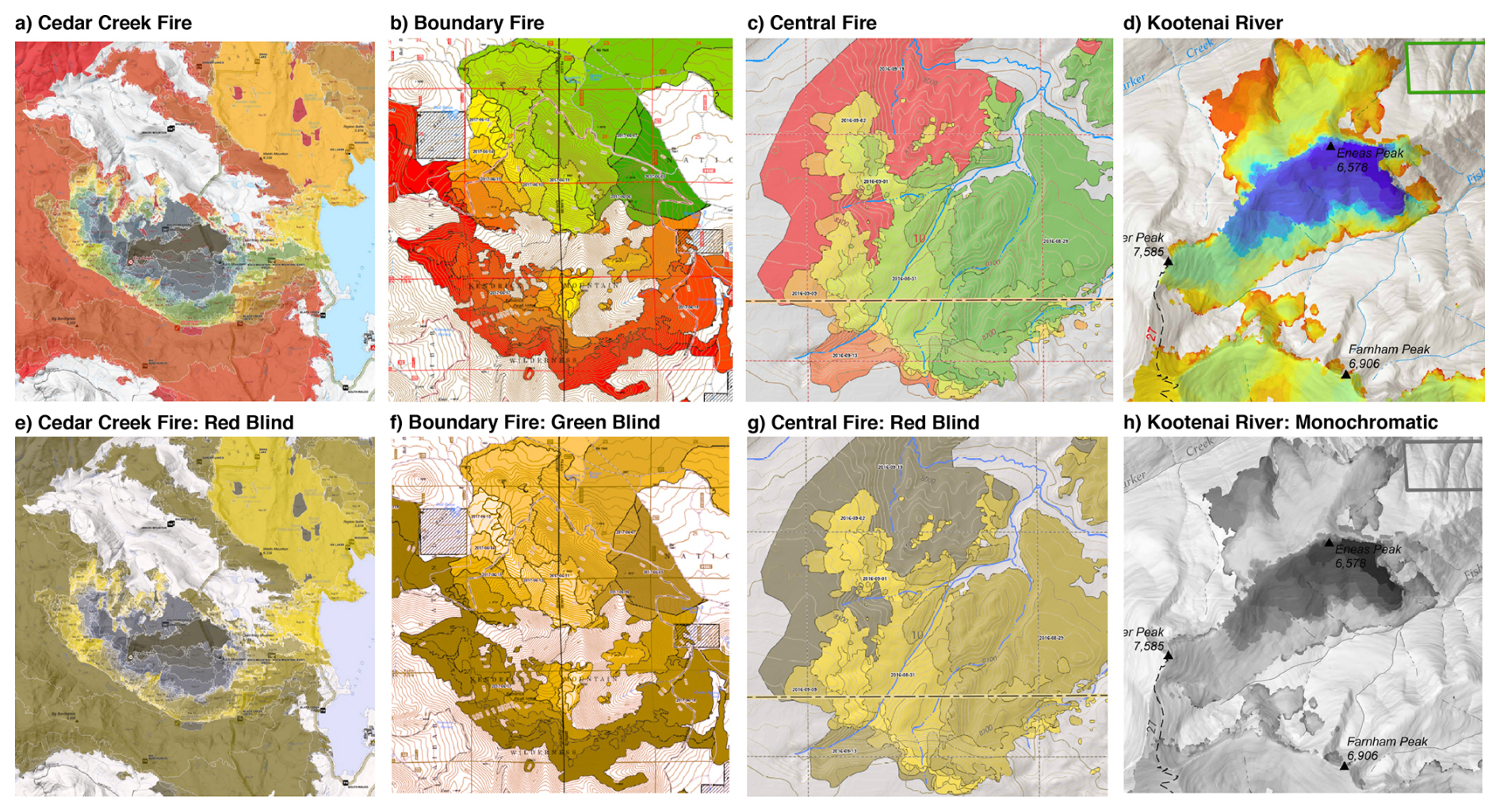
Figure A1(a–d) The four fire progression examples provided in the NWCG Standards for Geospatial Operations (GeoOps) Publication Management System 936 document (National Wildfire Coordinating Group, 2024), accessed on 25 November 2024, reproduced under CC0 (public domain). Legends are omitted for clarity, but colors progress forwards in time from cold (brown (a), green (b–c), or blue (d); older) to hot (red (a–d); recent). (e–h) The Coblis Color Blindness Simulator (https://www.color-blindness.com/coblis-color-blindness-simulator/, last access: 2 March 2025) demonstrates how these examples create varied color blindness challenges (e–g) or challenges in black-and-white printing (h).
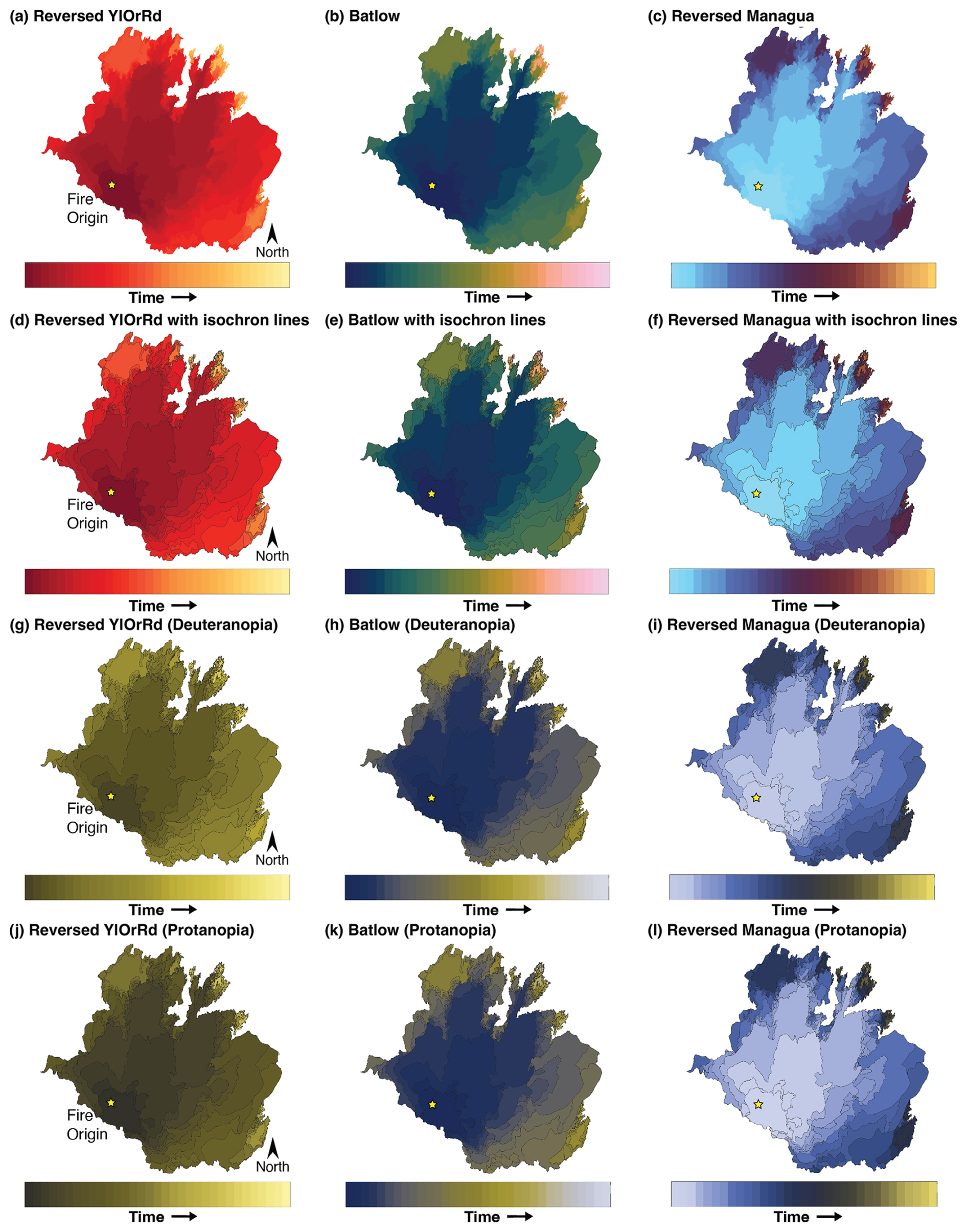
Figure B1(a–c) Daily fire progression maps of the 2013 Rim Fire using three color maps that are accessible for color-vision-deficient viewers and demonstrate a physically intuitive sequential progression through time (i.e., older fire shown by cooler colors and newer fire shown by warmer colors). (d–f) As in (a)–(c) but including isochrons. (g–i) Maps in (d)–(f) with deuteranopia (green-blind) color blindness simulation. (j–l) Maps in (d)–(f) with protanopia (red-blind) color blindness simulation. The yellow star denotes the fire origin location.
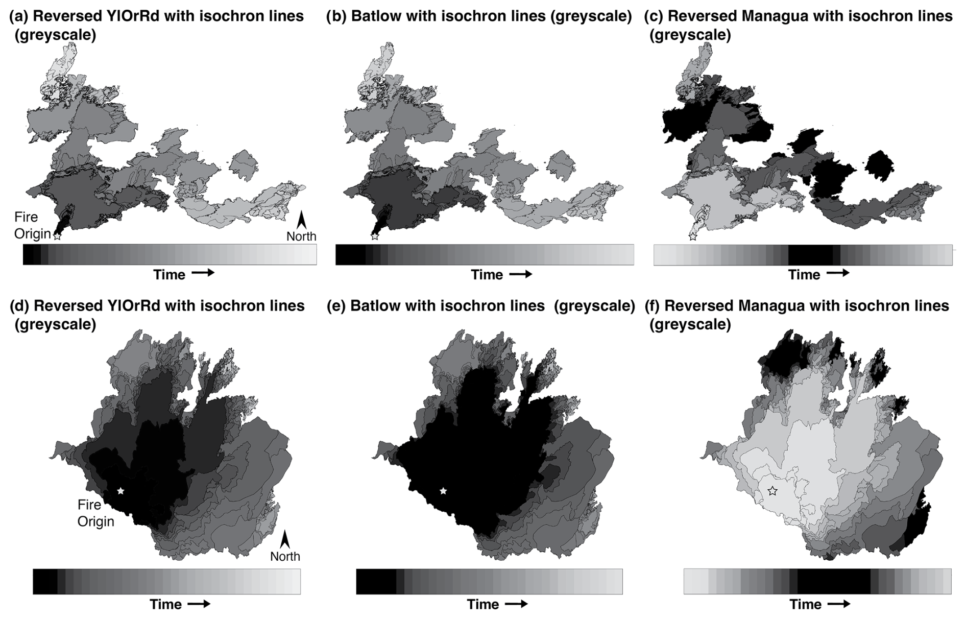
Figure C1(a–c) Daily fire progression maps of the 2021 Dixie Fire using three color maps that are accessible for color-vision-deficient viewers and including isochrons shown using grayscale to simulate black-and-white printing or monochromacy color blindness. (d–f) As in (a)–(c) but for the 2013 Rim Fire. The star denotes the fire origin location.
The MATLAB code to reproduce the figures is available upon request.
Shapefiles of the Dixie Fire and Rim Fire perimeters are available from the National Interagency Fire Center at https://ftp.wildfire.gov/ (last access: 23 May 2025). These data are also available in a Zenodo repository (https://doi.org/10.5281/zenodo.15492982, Hatchett, 2025).
The author has declared that there are no competing interests.
No human subjects or sensitive data were involved in this research; thus, no ethical approval or informed consent was sought.
The statements, findings, conclusions, and recommendations are those of the author and do not reflect the views of NOAA or the US Department of Commerce.
Publisher's note: Copernicus Publications remains neutral with regard to jurisdictional claims made in the text, published maps, institutional affiliations, or any other geographical representation in this paper. While Copernicus Publications makes every effort to include appropriate place names, the final responsibility lies with the authors.
I thank Fabio Crameri and Richard Westaway for providing thoughtful, detailed, and constructive comments that greatly improved this paper.
This research was supported in part by a National Oceanic and Atmospheric Administration cooperative agreement (grant no. NA19OAR4320073) for the Cooperative Institute for Research in the Atmosphere.
This paper was edited by Jenna Sutherland and reviewed by Fabio Crameri and Richard Westaway.
Berman, M. T., Ye, X., Thapa, L. H., Peterson, D. A., Hyer, E. J., Soja, A. J., Gargulinski, E. M., Csiszar, I., Schmidt, C. C., and Saide, P. E.: Quantifying burned area of wildfires in the western United States from polar-orbiting and geostationary satellite active-fire detections, Int. J. Wildland Fire, 32, 665–678, https://doi.org/10.1071/WF22022, 2023. a
Brewer, C. A., Hatchard, G. W., and Harrower, M. A.: ColorBrewer in print: a catalog of color schemes for maps, Cartogr. Geogr. Inf. Sc., 30, 5–32, 2003. a
Buckley, A.: Methods for Mapping Temporal Data, in: Esri User Conference Technical Workshops, San Diego, California, 10–14 July 2017, https://proceedings.esri.com/library/userconf/proc17/tech-workshops/tw_396-490.pdf (last access: 2 November 2024), 2017. a
Bunch, R. L. and Lloyd, R. E.: The cognitive load of geographic information, Prof. Geogr., 58, 209–220, https://doi.org/10.1111/j.1467-9272.2006.00527.x, 2006. a
Chen, Y., Hantson, S., Andela, N., Coffield, S. R., Graff, C. A., Morton, D. C., Ott, L. E., Foufoula-Georgiou, E., Smyth, P., Goulden, M. L., and Randerson, J. T.: California wildfire spread derived using VIIRS satellite observations and an object-based tracking system, Sci. Data, 9, 249, https://doi.org/10.1038/s41597-022-01343-0, 2022. a, b, c
Crameri, F.: Scientific colour maps, Zenodo, https://doi.org/10.5281/ZENODO.5501399, 2021. a
Crameri, F., Shephard, G. E., and Heron, P. J.: The misuse of colour in science communication, Nat. Commun., 11, 5444, https://doi.org/10.1038/s41467-020-19160-7, 2020. a, b
Crameri, F., Shephard, G. E., and Heron, P. J.: Choosing Suitable Color Palettes for Accessible and Accurate Science Figures, Current Protocols, 4, e1126, https://doi.org/10.1002/cpz1.1126, 2024. a, b
Hatchett, B.: Airborne Infrared Perimeters of the Rim Fire (2013) and Dixie Fire (2021) (Version 1), Zenodo [data set], https://doi.org/10.5281/zenodo.15492982, 2025. a
Heggli, A., Hatchett, B., Tolby, Z., Lambrecht, K., Collins, M., Olman, L., and Jeglum, M.: Visual communication of probabilistic information to enhance decision support, B. Am. Meteorol. Soc., 104, E1533–E1551, https://doi.org/10.1175/BAMS-D-22-0220.1, 2023. a, b
Kochanski, A. K., Clough, K., Farguell, A., Mallia, D. V., Mandel, J., and Hilburn, K.: Analysis of methods for assimilating fire perimeters into a coupled fire-atmosphere model, Frontiers in Forests and Global Change, 6, 1203578, https://doi.org/10.3389/ffgc.2023.1203578, 2023. a, b
LaVor, M. L. and Duncan, J. C.: Rehabilitation Act of 1973, P.L. 93–112, Law Rev., 40, 443–449, https://doi.org/10.1177/001440297404000604, 1974. a
Liu, T., Randerson, J. T., Chen, Y., Morton, D. C., Wiggins, E. B., Smyth, P., Foufoula-Georgiou, E., Nadler, R., and Nevo, O.: Systematically tracking the hourly progression of large wildfires using GOES satellite observations, Earth Syst. Sci. Data, 16, 1395–1424, https://doi.org/10.5194/essd-16-1395-2024, 2024. a, b, c
Morrison, R., Kuligowski, E., Dootson, P., Griffin, A. L., Perry, P., Pupedis, G., Begg, C., and Gardner, A.: Understanding the challenges in bushfire map use and effective decision-making amongst the Australian public, Int. J. Wildland Fire, 33, WF24071, https://doi.org/10.1071/WF24071, 2024. a
National Wildfire Coordinating Group: NWCG Standards for Geospatial Operations, 2024. a, b
Noble, P. and Paveglio, T. B.: Exploring Adoption of the Wildland Fire Decision Support System: End User Perspectives, J. Forest., 118, 154–171, https://doi.org/10.1093/jofore/fvz070, 2020. a
Sayedi, S. S., Abbott, B. W., Vannière, B., Leys, B., Colombaroli, D., Romera, G. G., Słowiński, M., Aleman, J. C., Blarquez, O., Feurdean, A., Brown, K., Aakala, T., Alenius, T., Allen, K., Andric, M., Bergeron, Y., Biagioni, S., Bradshaw, R., Bremond, L., Brisset, E., Brooks, J., Brugger, S. O., Brussel, T., Cadd, H., Cagliero, E., Carcaillet, C., Carter, V., Catry, F. X., Champreux, A., Chaste, E., Chavardès, R. D., Chipman, M., Conedera, M., Connor, S., Constantine, M., Courtney Mustaphi, C., Dabengwa, A. N., Daniels, W., De Boer, E., Dietze, E., Estrany, J., Fernandes, P., Finsinger, W., Flantua, S. G. A., Fox-Hughes, P., Gaboriau, D., M. M.Gayo, E., Girardin, M. P., Glenn, J., Glückler, R., González-Arango, C., Groves, M., Hamilton, D. S., Hamilton, R. J., Hantson, S., Hapsari, K. A., Hardiman, M., Hawthorne, D., Hoffman, K., Inoue, J., Karp, A. T., Krebs, P., Kulkarni, C., Kuosmanen, N., Lacourse, T., Ledru, M.-P., Lestienne, M., Long, C., López-Sáez, J. A., Loughlin, N., Niklasson, M., Madrigal, J., Maezumi, S. Y., Marcisz, K., Mariani, M., McWethy, D., Meyer, G., Molinari, C., Montoya, E., Mooney, S., Morales-Molino, C., Morris, J., Moss, P., Oliveras, I., Pereira, J. M., Pezzatti, G. B., Pickarski, N., Pini, R., Rehn, E., Remy, C. C., Revelles, J., Rius, D., Robin, V., Ruan, Y., Rudaya, N., Russell-Smith, J., Seppä, H., Shumilovskikh, L., Sommers, W. T., Tavşanoğlu, Ç., Umbanhowar, C., Urquiaga, E., Urrego, D., Vachula, R. S., Wallenius, T., You, C., and Daniau, A.-L.: Assessing changes in global fire regimes, Fire Ecol., 20, 1–22, https://doi.org/10.1186/s42408-023-00237-9, 2024. a
Stoelzle, M. and Stein, L.: Rainbow color map distorts and misleads research in hydrology – guidance for better visualizations and science communication, Hydrol. Earth Syst. Sci., 25, 4549–4565, https://doi.org/10.5194/hess-25-4549-2021, 2021. a
Ware, C., Stone, M., and Szafir, D. A.: Rainbow colormaps are not all bad, IEEE Comput. Graph., 43, 88–93, https://doi.org/10.1109/MCG.2023.3246111, 2023. a
Westaway, R. M.: GC Insights: Rainbow colour maps remain widely used in the geosciences, Geosci. Commun., 5, 83–86, https://doi.org/10.5194/gc-5-83-2022, 2022. a
Williams, C. A. and Eosco, G. M.: Is a consistent message achievable?: Defining “message consistency” for weather enterprise researchers and practitioners, B. Am. Meteorol. Soc., 102, E279–E295, https://doi.org/10.1175/BAMS-D-18-0250.1, 2021. a
- Abstract
- Introduction
- Current guidelines and current challenges
- Color map recommendations
- Towards consistency in pyrocartography
- Appendix A: NWCG examples and color blindness simulation
- Appendix B: Rim Fire recommended color maps and color blindness simulation
- Appendix C: Grayscale (monochromacy) simulation
- Code availability
- Data availability
- Competing interests
- Ethical statement
- Disclaimer
- Acknowledgements
- Financial support
- Review statement
- References