the Creative Commons Attribution 4.0 License.
the Creative Commons Attribution 4.0 License.
 | 11 Dec 2020
Graphic design and scientific research – the National Institute of Geophysics and Volcanology (INGV) experience
Daniela Riposati
Giuliana D'Addezio
Francesca Di Laura
Valeria Misiti
Patrizia Battelli
One of the primary activities of the Istituto Nazionale di Geofisica e Vulcanologia (National Institute of Geophysics and Volcanology; INGV) is the production of resources concerning educational and outreach projects in geophysics and natural hazard topics. This activity is aimed at transferring, periodically, results at the forefront of ongoing research to the public through an intense and comprehensive plan for scientific dissemination. Over the past 15 years, graphic and visual communication have become essential tools for supporting institutional and research activities. In this paper, we describe successful INGV team experiences resulting from a close relationship and collaborative work between graphic designers and research scientists. The main goal of the projects devoted to the general public, through the creation of a museum exhibition or the production of descriptive brochures, is to support scientists in conveying their message and making concepts fruitful, easier to understand but also fully enjoyable thanks to the emotional involvement that images may generate. Through a careful composition of signs and images, and through the use of different visual tools (colours, form and lettering) on different media (print, video and web), the graphics and editorial products together create a strong INGV-style identity, making it easily recognizable in any educational and outreach project. A full project product package might include a logo or other artwork, organized text and pure design elements such as shapes and colours, which serve the purpose of unifying the whole set. Colour is used not only to help the project logo to stand out from the international overview but, in our case, also to generate a unifying return across all INGV sections. A recent and highly stimulating experience concerned the creation of edu-games, specifically designed for scientific dissemination, through a close collaboration between INGV graphic designers and their reference scientific community. The edu-games were designed as an effective combination of educational content and playful communicative aspects, leading the young players to learn while having fun.
- Article
(76527 KB) - Full-text XML
- BibTeX
- EndNote


The Istituto Nazionale di Geofisica e Vulcanologia (National Institute of Geophysics and Volcanology; INGV) is one of the largest research institutions worldwide for geophysics, geochemistry, seismology and volcanology. In addition to its scientific and technological activities, INGV pays special attention to projects focusing on education and outreach by promoting a number of initiatives, such as publications for school students and for the general public, scientific exhibitions and dedicated web pages.
The Laboratorio Grafica e Immagini (hereinafter Laboratorio) is INGV's reference structure for graphic and visual communication that supports institutional and research activities. Since 2001, the Laboratorio has been playing a crucial role as a partner in INGV's scientific community, and it is now a reference structure for the creation of any visual design institutional products. In this work, we present some of the Laboratorio's products, highlighting how this activity was led by a positive interaction between researchers and graphic designers. We start by describing the managing of the institutional identity, namely the INGV style, starting with the new INGV logo. Then, we present case histories related to the creation of the corporate identity of the research projects. In fact, considering the ever-increasing emphasis on the value of graphics in grant proposals (National Science foundation, 2004), the Laboratorio provides advanced graphics support for any materials required by the main European research projects, infrastructures and partnerships involving INGV such as Space Earth, the European Multidisciplinary Seafloor and water column Observatory (EMSO) and European Research Infrastructure Consortium (ERIC; collectively EMSO ERIC), probabilistic tsunami hazard maps (TSUMAPS) for the northeast Atlantic, the Mediterranean and connected seas (NEAM) region (collectively TSUMAPS NEAM), the International Association for Promoting Geoethics (IAPG), Accelerating Global science In Tsunami HAzard and Risk analysis (AGITHAR), the Forum for International cooperation among Environmental Research Infrastructures (FIERI), and SaveMedCoasts. The Laboratorio's support for editorial production is combined with the development of original web layouts dedicated to the representation of issues relating to Earth sciences and to their dissemination. In this respect, we will briefly discuss the Scienza Insieme project.
As already mentioned, special attention was given to specifically designed layouts for education and outreach projects. In this context, we present our experiences in the production of edu-games as part of editorial products for scientific dissemination. Over the years, the activities of the Laboratorio Grafica e Immagini have been restructured into a conceptualization, design and implementation phase for materials used for ordinary and institutional purposes, for exhibitions, for demonstrations and for special events, including science festivals (e.g. D'Addezio et al., 2014, 2015; Rubbia et al. 2015). With respect to this latter category of events, we present some excerpts from INGV's multi-annual participation in the Festival della Scienza di Genova, an unmissable event for all science enthusiasts, and from the New Space Economy European ExpoForum held in Rome in December 2019.
The main task of Laboratorio is finding the correct relationship and cohesion between the interpretation of the scientists' work and graphic design, using the proper images and products. Our goal is to generate appropriate solutions to transfer purely scientific information, addressing the messages not only to the pertinent scientific community but also to the general public, looking for the right compromise, in the graphic work, between the scientists' message and the visual design. But what do we mean by graphic design? What is graphic design, and why it is so important for graphic composition in scientific communication? Graphic design is the process of communicating visually and of solving communications issues through the correct use of typography, space, images and colours. Graphics attract viewers, and graphic designers use various methods to combine words, symbols and images to create a visual representation of ideas and messages.
The importance of communicating complex ideas with clarity, precision and efficiency, avoiding ambiguities and confusion, was initially developed in the field of data visualization and information design (Tufte, 1983). In this field, graphical excellence is what gives the viewer the greatest number of ideas in the shortest time, with the least ink in the smallest space (Tufte, 1983). A graphic designer may use a combination of typography, visual arts and page layout techniques to produce the desired final result. Common uses of graphic design may include corporate identity, publications, posters, website graphics and elements and product packaging. For example, a product package might include a logo or other artwork, organized text and pure design elements such as images, shapes and colours, all of which serve to unify the piece. Composition is one of the most important features of graphic design, especially when using pre-existing materials or various elements.
In visual scientific communication, common uses include the development of the institutional identity of research bodies and scientific projects, the preparation of publication layouts or posters for scientific meetings, web communication and the design of the entire visual communication strategy of exhibitions aimed at the general public (from the logo to the structure of the panels and all the way to gadgets and web promotion initiatives).
In any case, the object of the graph is to operate a constant mediation between the scientific concept being represented and the visual form that can represent it more clearly.
The approach outlined above has already been used for many INGV productions, thus contributing to the creation of an INGV identity that is strongly characterized in terms of style and is a sort of brand that is highly recognized by the scientific community. This identity has played an important role both in the creation of both products aimed at a specific target audience and more general purpose projects. The most important among the latter is certainly the restyling of the INGV logo.
3.1 The new INGV logo
Considering the almost 30-year lifespan of the INGV logo, we proposed its restyling in 2018, which was to be accomplished by simply modernizing the previously adopted, well-established image.
The INGV logo is formed by a graphic portion and by accompanying text. For the lettering, we adopted the modern and clean DIN Pro bold condensed font in grey 90 %, used in small caps, which replaces the previous Arial bold black 100 % font. The graphic part schematically represents the Earth, a globe strongly characterized by lines representing the parallels and the meridians. The core element has therefore returned to a simpler sphericity, accentuated by the chromatic nuance. This new core image has already entered a number of new editorial projects and has been used on the occasion of several national and international events (see Fig. 1). We will return to this later on.
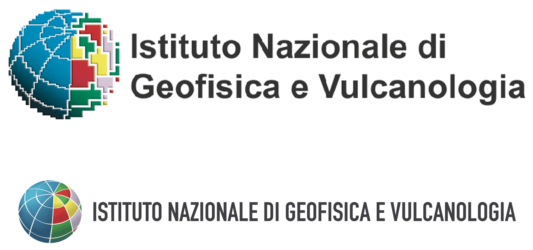
Figure 1Above – the original INGV logo, dating back to 1986. Below – the revised logo from 2018. © Laboratorio Grafica e Immagini; INGV.
3.2 The INGV anniversary
One of the most important events that involved the Laboratorio was the INGV 20th anniversary in 2019.
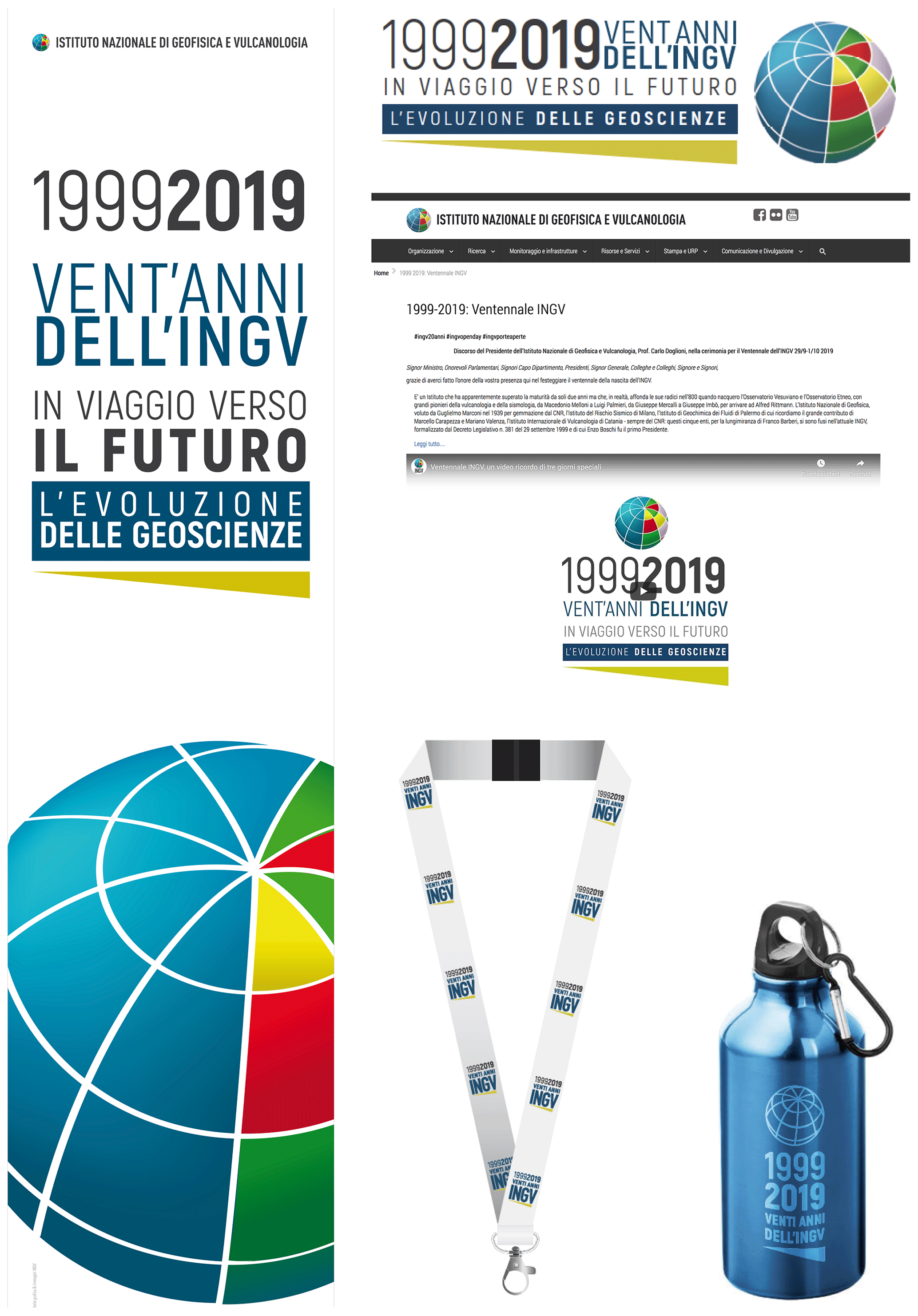
Figure 2Products created for the 20th anniversary of INGV in 2019. © Laboratorio Grafica e Immagini; INGV.
We considered the structure of a logo for the event very carefully, starting from the analysis of its keywords of 20 years, geosciences, travel and future. An overview of the visual communication strategies used for publications dedicated to geosciences revealed that the most frequently used images concerned geologic stratigraphy (i.e. rock layers) and subordinate mountain ranges (i.e. http://www.usgs.gov, last access: 5 December 2020; http://www.mdpi.com/journal/geosciences, last access: 25 September 2020; http://www.agc.org.au, last access: 25 September 2020). We hence decided to develop a graphic project, starting with the INGV logo, and add a horizontal sign that is reminiscent of the stratigraphy and represents the separation between before and after and above and below. It also resembles an arrow, indicating movement towards the future, thus obtaining a strong, yet non-didactic, symbolic element. The yellow colour evokes the preciousness of gold on special occasions. We then developed the coordinated images, adapting them to the various materials provided for the event (internal signage, presentations, web promotion and merchandise). The logo turned out to be very versatile and easy to adapt to different types of reproduction and available spaces, while preserving its visual integrity (Fig. 2).
4.1 Space Earth
The Laboratorio developed all the branding for Space Earth (https://www.spacearth.net/, last access: 31 July 2020), an INGV spin-off company, including a team of engineers, physicists and geologists with a lot of experience in research and business management. The company aimed to add value to the results of more than 60 years of experience in Space Earth designs; it develops applications, software and hardware products for the aerospace, maritime and environment industry in cooperation with major European and Italian public and private organizations, universities and research centres.
The Space Earth technology logo was conceived to graphically summarize the content of the message of space, Earth and technology. To this end, we adopted familiar forms such as two intersecting circles, representing the Earth and the space that surrounds it, at first and later on moving to a more in-depth interpretation of the relationship between the Space Earth technology project and INGV, which is the area that allowed the project to be born and developed.
Chromatically, we chose a single colour, namely the iconic blue of the sky, to state the mission of the company and add an emotional value to the pictogram.
Even the chosen lettering is simple, linear and sans serif to recall, once again, the modern technological aspects of the company's mission and to endow the logo with further immediacy, making it easy to decipher and, therefore, to remember (Fig. 3).

Figure 3The logo designed and created for the Space Earth spin-off, and its modifications for the project brochure. © Laboratorio Grafica e Immagini; INGV.
4.2 EMSO ERIC
The European Multidisciplinary Seafloor and water column Observatory (EMSO; http://www.emso.eu, last access: 5 December 2020) aims to explore the oceans, to gain a better understanding of phenomena occurring within and below them and to explain the critical role that these phenomena play in the broader Earth systems. EMSO is a consortium of partners sharing scientific facilities (data, instruments, computing and storage capacity) in a common strategic framework. Formally, it is a European Research Infrastructure Consortium (ERIC), a legal framework created for pan-European large-scale research infrastructures.
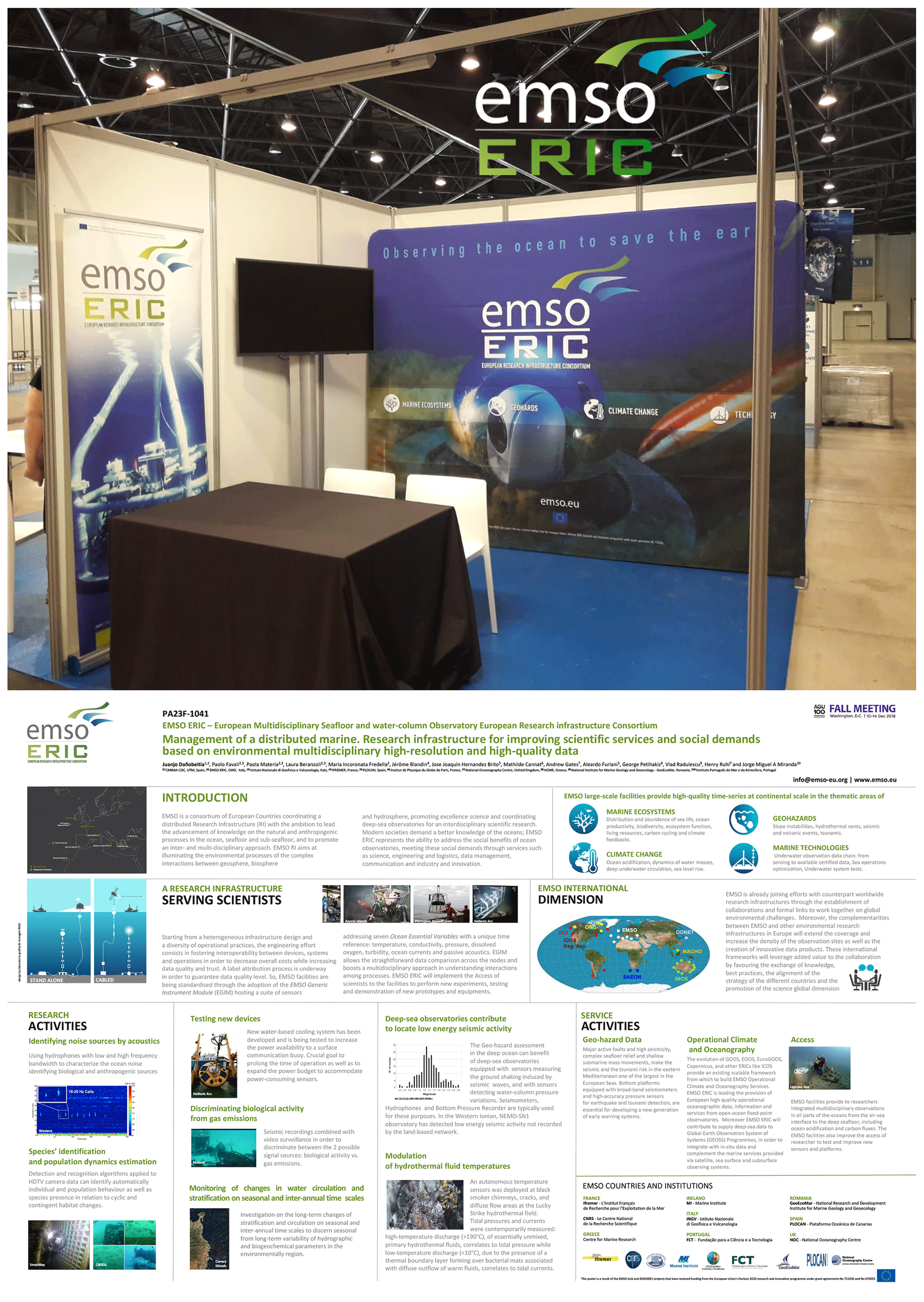
Figure 4The EMSO ERIC logo and its modifications in some associated products (congress stands, signage and posters). © Laboratorio Grafica e Immagini; INGV.
The main contribution of the Laboratorio to the construction of the brand of this very important infrastructure was a textual intervention. The abbreviation of ERIC was introduced to an already existing logo. For this text, we adopted the same colour nuances used in the gestural element of the EMSO logo. This solution allowed us to link the different parts with a simple but extremely effective interpolation. There existed a significant risk of untying among the various components, which would have certainly weakened the resulting artwork. A whole series of products have therefore been designed and manufactured under the new brand of EMSO ERIC (Fig. 4; Dañobeitia, et al., 2019).
4.3 TSUMAPS NEAM project
Tsunami risk assessments and warning systems need Probabilistic Tsunami Hazard Assessment (PTHA) as input and reference. The TSUMAPS NEAM project (http://www.tsumaps-neam.eu, last access: 5 September 2020) developed the first homogeneous long-term PTHA for earthquake-induced tsunamis that was unavailable for the coastlines of the NEAM region (northeastern Atlantic, the Mediterranean and connected seas) until just a few years ago. TSUMAPS NEAM is also promoting an informed process of outreach, guideline definition, and capacity-building through dedicated initiatives. The development of standardized PTHA products (hazard and probability curves, maps, documentation, and web tools for their analysis) is the first step for also including tsunamis in multi-hazard risk assessments.
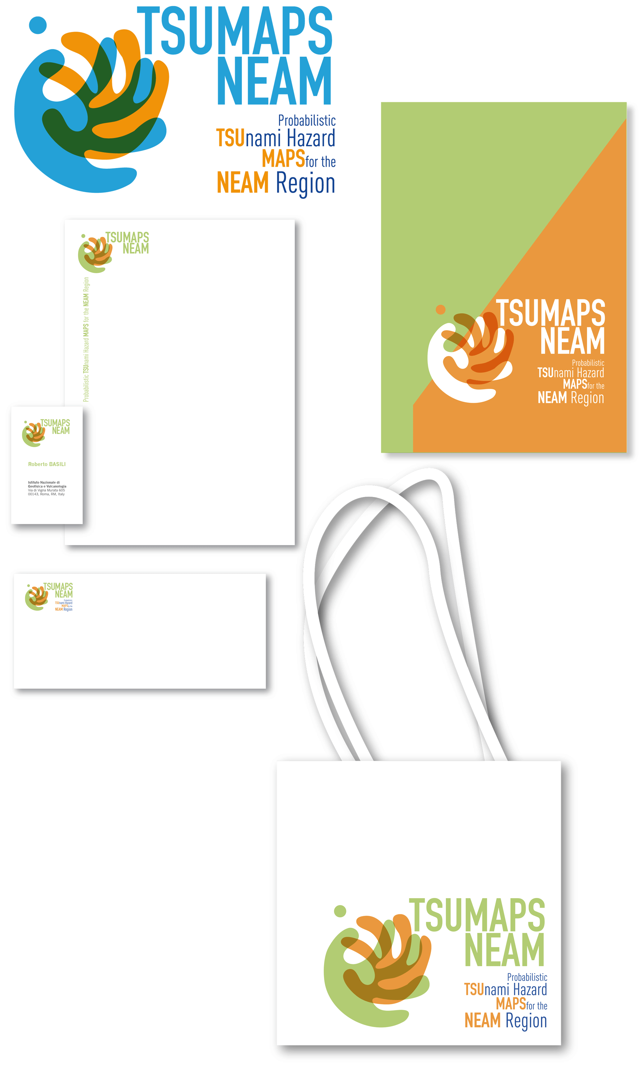
Figure 5The coordinated image of the TSUMAPS NEAM project. © Laboratorio Grafica e Immagini; INGV.
In designing the logo of the project, we focused on a limited number of specific elements, deliberately moving away from the classic graphic representation of a tsunami, i.e. the wave. We believe that focusing on different elements allowed us to achieve a more original and therefore highly recognizable creation. The stylization of the hands to signify the help that the scientists may give to the investigation and forecast of tsunami serves this specific goal. The choice of colours was focused on how to separate anthropic from natural elements; therefore, orange was associated with human elements, while blue with was used for natural elements. The fusion of the two colours in the intertwining of the hands, which is meant to represent the scientific cooperation, gives life to an overlap that increases the desired effect (Fig. 5).
4.4 International Association for Promoting Geoethics (IAPG)
The International Association for Promoting Geoethics (IAPG; https://www.geoethics.org/, last access: 5 September 2020) is a multidisciplinary scientific platform that was created to foster awareness and promote discussions about geoethics issues, i.e. about questions of and ethics related to the geosciences. IAPG promotes geoethics through international collaborations with several associations and institutions. All of its activities have been supported by the Laboratorio for many years.
The inception of geoethics indeed represented a breakthrough in geosciences. For this reason, its graphic identity had to be based on a strong, easily recognizable image; thus, we started our design work with the logo, which would then form the basis for all products of the new brand. We focused on the interaction between human activities and the Earth system. The use of circular elements and their concentricity gave us the possibility to create a substantially spherical solution with a core in which patterns and textures were concentrated to represent social diversity, thus representing a stylized point of intersection between sociology, philosophy, economy and geosciences.
Over time, the combination of these concepts has given rise to a number of different products (Fig. 6).
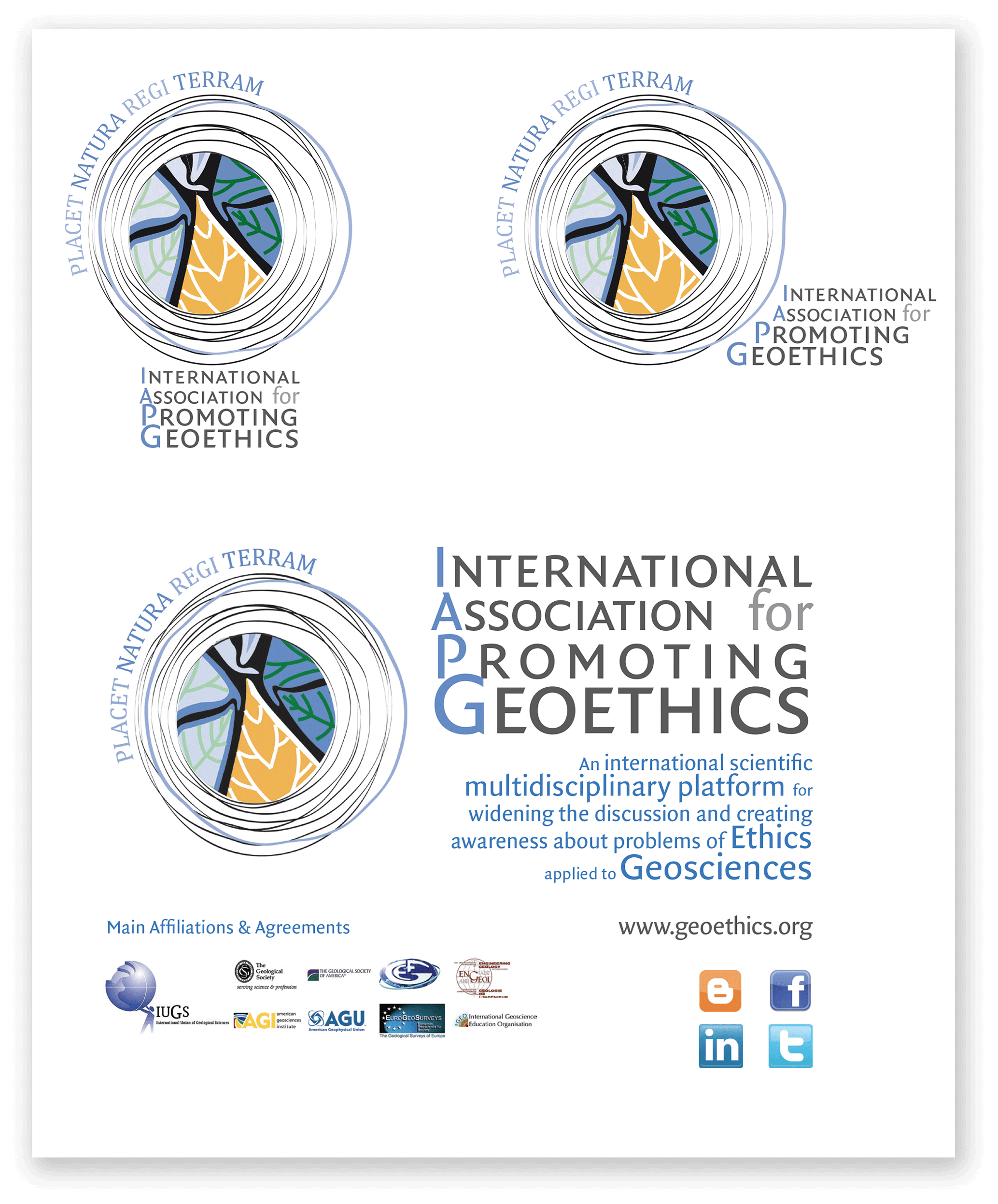
Figure 6Some achievements of the IAPG. © Laboratorio Grafica e Immagini; INGV.
4.5 Accelerating Global science In Tsunami HAzard and Risk analysis (AGITHAR)
AGITHAR (http://www.agithar.uni-hamburg.de, last access: 5 September 2020) is a network created to promote, improve and standardize tsunami research. We therefore concentrated on a graphical reinterpretation of a tsunami wave, combining colours, shades and textures with the goal of playing down the idea of danger, which is dealt with by introducing different colours both for the lettering and for other graphics. The proposal is easily expandable, given the size of the box that contains all graphic elements, and can therefore be used in standard web pages and in a wide range of applications, such as those shown in the coordinated image (Fig. 7).
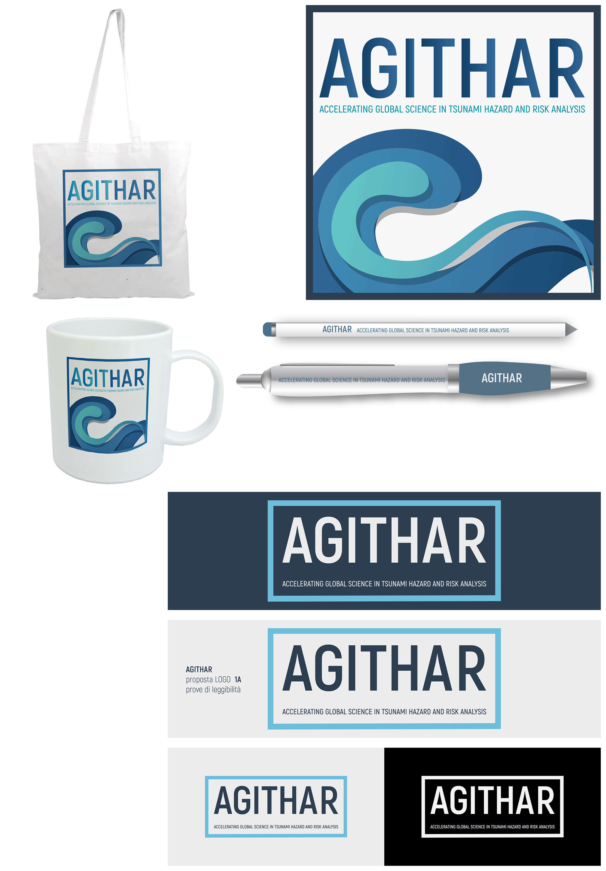
Figure 7The solution chosen for the AGITHAR logo and for some associated merchandise. © Laboratorio Grafica e Immagini; INGV.
4.6 Forum for International cooperation among Environmental Research Infrastructures (FIERI)
The Forum for International cooperation among Environmental Research Infrastructures (FIERI) is an international, open platform for improving global, coordinated and long-term cooperation between research infrastructures and networks in the environmental domain. In creating the logo, we planned to stress the connection aspect, which is a sort of synapse that connects to the Earth, forming a sort of global network. As for the colours, we focused on a very green, modern and bright idea, which also guided the choice of the lettering (Fig. 8).

Figure 8The solution chosen for the FIERI logo. © Laboratorio Grafica e Immagini; INGV.
4.7 SaveMedCoasts
SaveMedCoasts (http://www.savemedcoasts.eu, last access: 5 September 2020) aims to respond to the need for reducing human and material losses potentially arising from natural disasters along the coastal zones of the Mediterranean Sea. This region is experiencing a fast rise in sea level as a result of climate changes, coastal land subsidence, tsunamis and storm surge impacts. The focus of the project is on all coastal zones that may suffer from sea level rise. Its main objective is to promote the awareness of different stakeholders concerning the potential effects of these phenomena.
Having this background in mind, we adopted a combination of wave icons and anthropic elements in the design of the project logo, which we strongly stylized and differentiated by using colour. For the lettering, we used a rather squared sans serif font and accompanied it in the leaflet with a more versatile font from another family.
The Laboratorio has created many products for this project. In this respect, the diversification of the logo was fundamental. Finding the most suitable solution easily allowed us to speed up the identification of the new brand by the respective scientific community (Fig. 9).
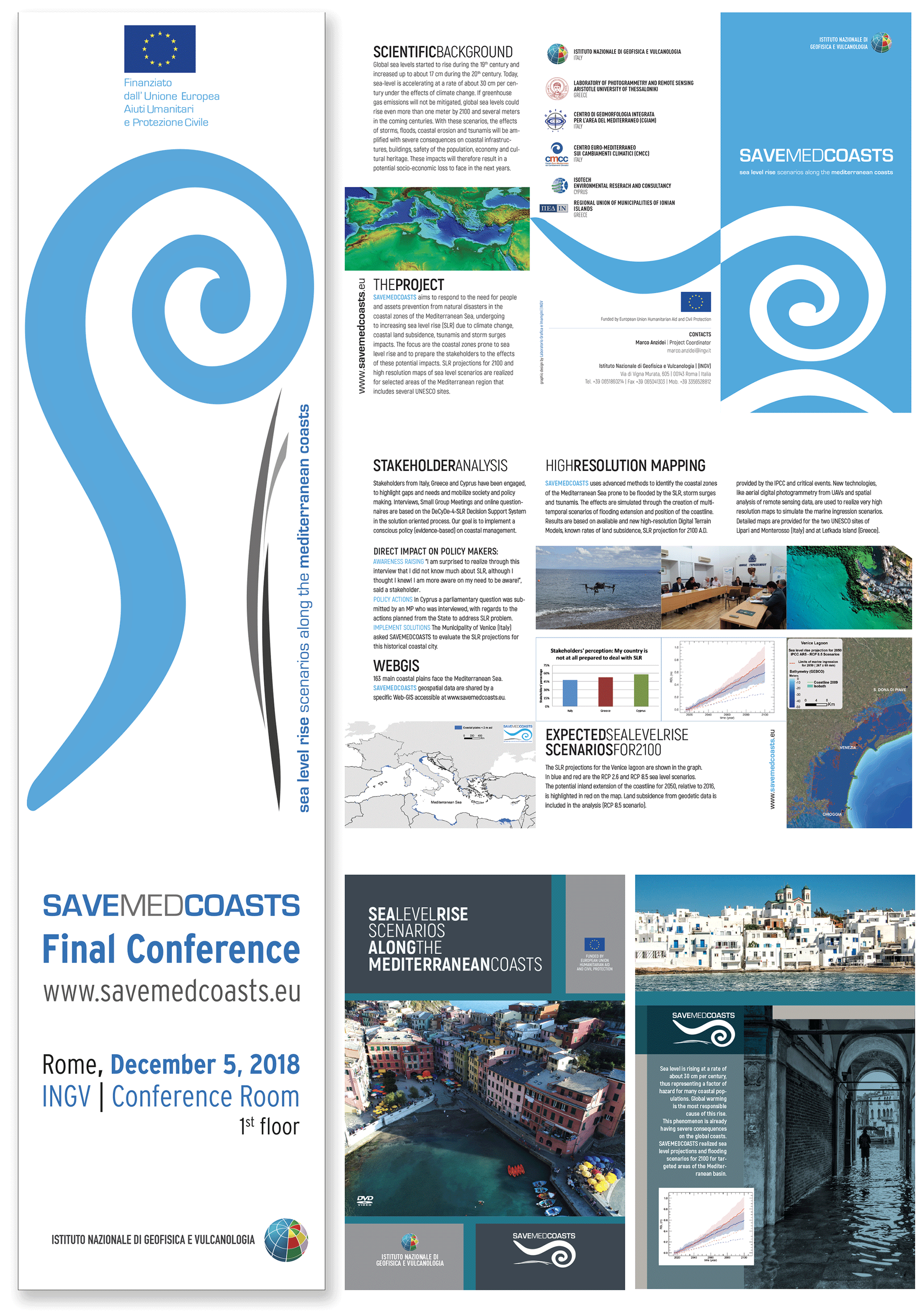
Figure 9Products created for the SaveMedCoasts project. © Laboratorio Grafica e Immagini; INGV.
Scienza Insieme
The Scienza Insieme project (https://www.scienzainsieme.it/, last access: 9 December 2020) was meant to build a portal to be shared by a number of national research bodies and universities, with the aim of creating a long-lasting tool for advertising scientific dissemination events. Therefore, we have chosen to adopt pictographic elements that are evocative of both science and sharing.
The symbol of infinity is a very ancient and very commonly used, and its birth is explained in many different ways, all related to the ideas of quantity, time and space. The symbol of the inverted eight – associated with alchemy, hermeticism and gnosticism – as a variant of the ouroborus, the snake or dragon that eats its tail, represents the theory of eternal return and the cyclical nature of all things. It is attributable to all that can be represented through a cycle which, after reaching its end, starts again from the beginning and continues to infinity. It was first found in an ancient Egyptian funeral text written in the pharaoh Tutankhamen's tomb.
Its origin in Roman times is attributable to the use of CI letters, Roman numerals indicating a large number.
As a mathematical symbol (∞ – lemniscate), it was first adopted in 1655 to identify a very large number because those two eyelets can be endless paths.
Finally, it may be reminiscent of the analemma, a diagram used in astronomy to show the position of the sun as seen from the same location on Earth at different times of the year. It is a path that always begins and ends at the same point, thus representing the eternal time that is coming and going.
Starting from the study of this symbol in its perfect geometries, we chose to deform one of the two mirror parts to create two communicating sets through which the contents mix to give shape to a new entity in a virtuous and infinite circle of sharing and creation (Fig. 10).
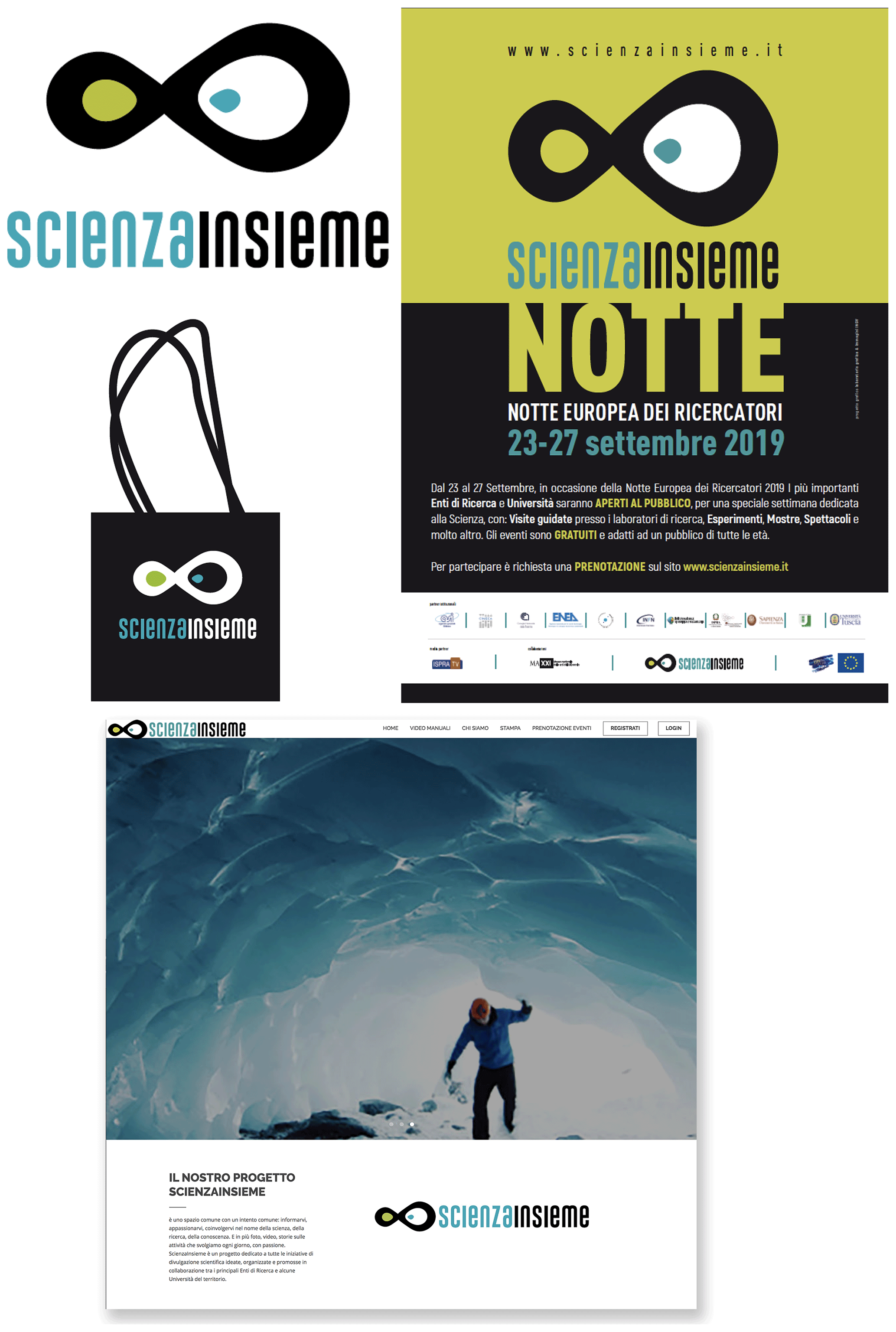
Figure 10Products of the Scienza Insieme project. © Laboratorio Grafica e Immagini; INGV.
6.1 The annual report of the High Pressure–High Temperature laboratory for experimental geophysics and volcanology
In recent decades, the dizzying development of knowledge on material science has made it possible to build tools that are capable of reproducing the conditions that control the dynamics of chemical–physical processes inside the Earth. Among these processes, those relating to seismicity and magmatism–volcanism are of particular economic and societal importance due to the number of victims and the extent of losses they may cause. In this context, INGV developed the laboratory for High Pressure–High Temperature (HPHT lab) for experimental geophysics and volcanology.
The Laboratorio created the editorial graphic project of the annual report of the HPHT lab. The report is aimed, essentially, at an audience of professionals, and is considered an excellent combination of graphic design for disseminating geoscience research knowledge, including its forefront results (Fig. 11).

Figure 11The most recent issues of the annual report of INGV's HPHT lab. © Laboratorio Grafica e Immagini; INGV.
6.2 School calendars
A significant part of the work of the Laboratorio is focused on the achievement of scientific dissemination through different projects and media. For example, we recently celebrated the 10th anniversary of a very successful initiative, namely the publication of a yearly calendar dedicated to the primary schools, that was designed to support and integrate the outreach activities conducted for over 15 years in the school environment (D'Addezio, 2020). The graphic design was aimed at producing an object that would gather all 10 calendars under a common heading of “The Planet Earth” or 10 years of the Earth as seen by the children. (Fig. 12).
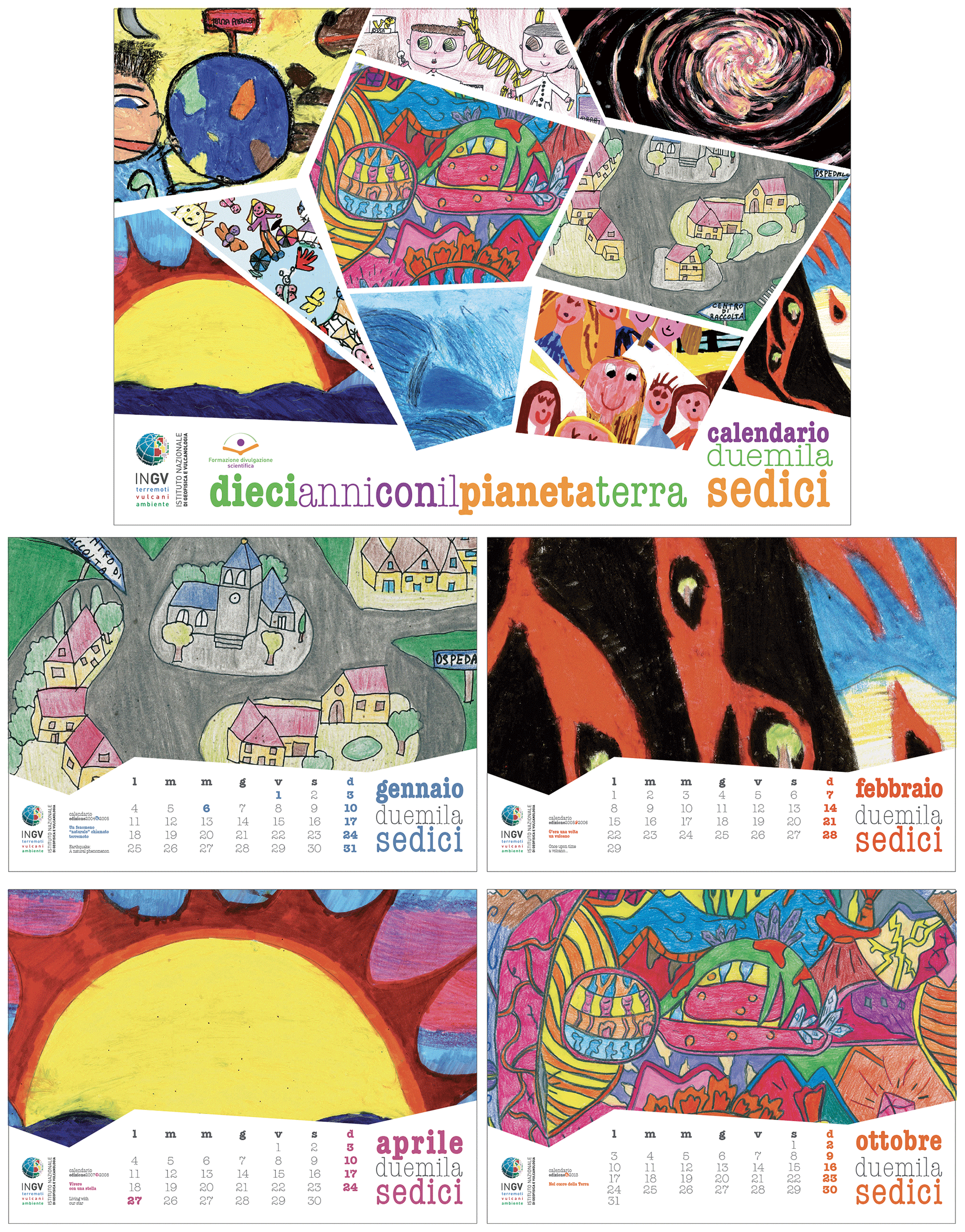
Figure 12Covers and modifications of the 2016 calendar's monthly agenda. © Laboratorio Grafica e Immagini; INGV.
Over the past few years, much attention has also been devoted to the production of scientific games or edu-games, which is an efficient combination of educational content and playful communicative aspects, designed with the aim of letting children and youngsters learn while having fun.
Among these projects, Escape Volcano, Mareopoli, Catch the Plate and Geo trivial stand out for the interest and success they generated. In the following is a brief summary of these three edu-games.
7.1 Escape Volcano
The game was designed to transfer basic information on volcanoes and their eruption styles and on the associated environmental and earthquake risks (Di Nezza et al., 2020; Misiti et al., 2019). The game is formed by a plastic 1.6 × 2.0 m board, which represents a volcano with its magmatic chamber. Small chambers, 10 in total, are located along the conduit up to a crater. The goal of the game is to reach the crater before the volcano starts erupting by passing different tests. Four tokens, representing small volcanoes, are located in the magmatic chamber. The game requires a minimum of two and a maximum of four competing teams. To move from one chamber to the next, one the players must roll a die. The sides of the dice report the tests that players have to pass. The game has been designed and built with the cooperation of some high school students in the frame of the Italian Ministry of Education's “Alternanza Scuola-Lavoro” project.
The design and construction phase involved the analysis of the idea developed by the students, a study of the target audience and the evaluation of problems possibly arising from the actual production of the game. We also considered the practicality of its use, striving to make it easy to handle, easily printable and reproducible by children with little expense.
The centrepiece of the game is a large format board, designed to allow at least 20–25 players to participate simultaneously. As it is not a self-explanatory game, it is necessary to emphasize its visual aspects so as to enhance emotional impact on the participants. Therefore, we have chosen to homogeneously stylize the whole set, from the game's board to its various components including cards, the 3D pieces along with their assembly boards, the dice and the rules, using pastel colours and playful graphics that suit the taste of the youth target audience.
The sinuous forms we used to represent the volcano refer directly to classical iconography; however, they are deprived of the didactic aspect and of any scientific reference but are aimed at highlighting the playful character of the instrument. We have chosen to characterize the various parts of the game through icons, deliberately alluding to social media ones to seek a familiar connection in the visual baggage of today's children, which would make the involvement in the activity even more fluid. Even the typographic choices have been oriented in this sense. The use of a calligraphic font (Princess Ivy) in the main titles of all game components strongly connotes the aspect of the game and is dictated by the need to create a dominant visual element conveying a sense of dynamism, freedom but also lightness. The main trait of a calligraphic font is precisely to show grace and to exhibit very elaborate and pronounced ascendants descendants, thus recalling handwriting and creating a more artistic and emotional perspective in the viewer. This, however, is done at the expense of readability, which we supported through explanatory texts written with a simpler font (Rotis serif). We assigned great importance also to the use of the colour black, aiming to make the entire game appear more adults in the eyes of pre-teens to avoid making them feel as though they are being treated as young children. Hence, a very childish appearance could indeed have created this preconception in adolescent participants, thus reducing the effectiveness of the message and their ability to appropriate the information (Fig. 13).
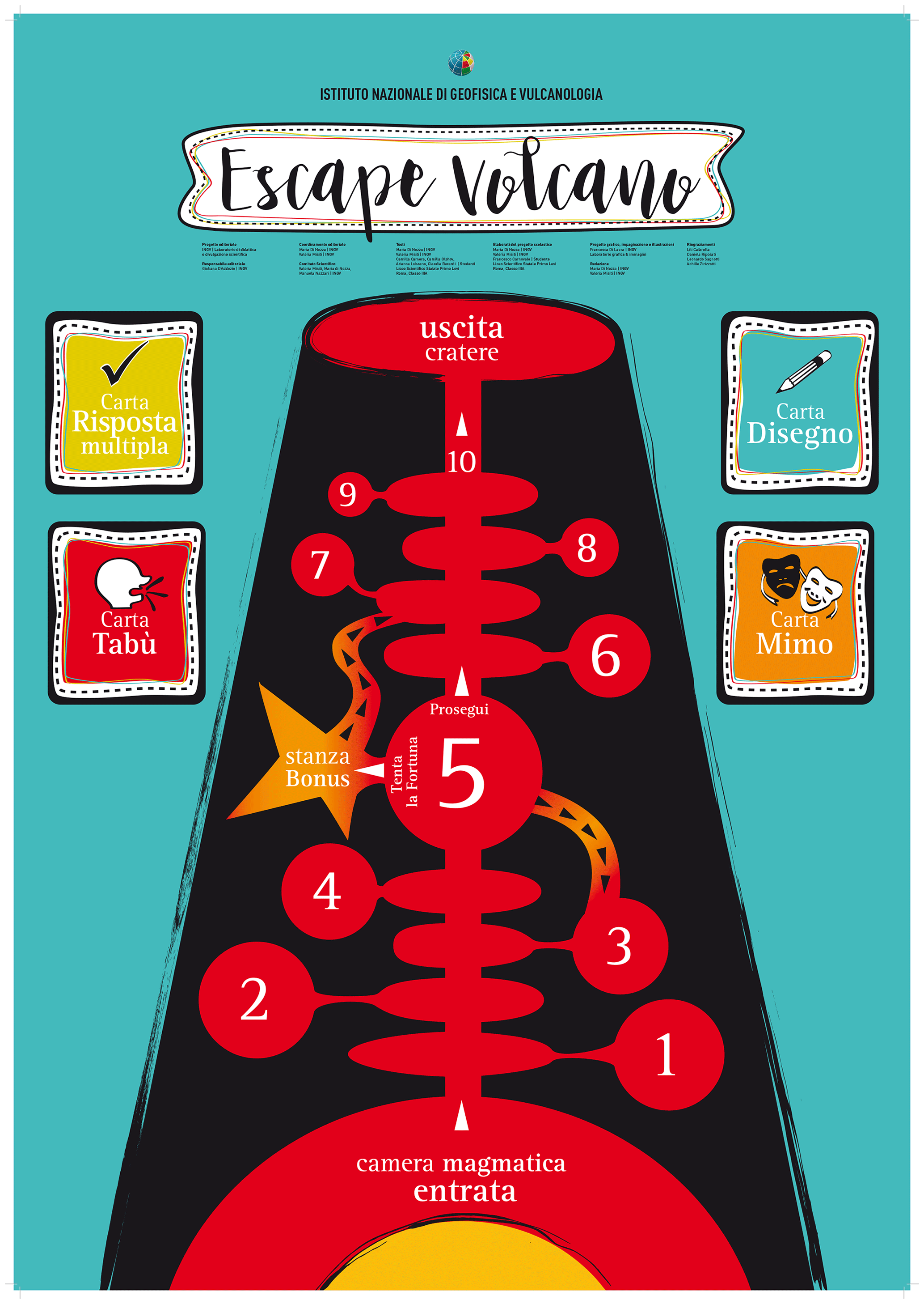
Figure 13The billboard of the Escape Volcano game. © Laboratorio Grafica e Immagini; INGV.
Over the past few years, the game was successfully presented at the following different Italian events:
-
L'Aquila (Abruzzi) in the frame of Sharper 2019, a large science dissemination event for the European Research Night funded by the EU. A total of three laboratories were performed in 3 h, totaling about 200 participants ranging in age between 6 and 18 years
-
A special event for teachers organized in the frame of the Visit Museum Grand Tour project held in Rome in 2018 (about 100 participants)
-
Open Day 2019 at INGV, with seven laboratories and about 200 participants
-
National Geographic Science Festival 2019 in Rome, with 63 laboratories in total (the duration of the event was 7 d) and about 1600 participants
-
Isola di Einstein 2019, held in the Umbria region, which is an international event involving researchers from all around the world, with about 150 participants.
On the occasion of the Open Day 2019 at INGV, we collected 59 questionnaires completed by participants ranging in age between 9 and 11 years. The questionnaire investigated the general activities impact, including the Escape Volcano game. A total of 93 % of respondents found the game very interesting. The game was very easy to understand, very helpful and very well organized for 63 %, 74 % and 71 % of participants, respectively. Only one participant found the experience difficult to understand.
7.2 Mareopoli
The game was inspired by the famous board game of Monopoly. It was assembled in two formats, namely a bigger version, to be used by groups in recreational–scientific laboratories, and a smaller version, to be used as a gift for participants and as a take-home message (Locritani et al., 2017).
The game scientifically describes the phenomenon of tides, along with a summary of historical theories on their origin from the times of Ancient Greece to the end of the 18th century (Taramaschi, 2018). For centuries, many scholars tried to understand and interpret this phenomenon. The game quotes Aristotle and Eratosthenes among the oldest who attempted to explain them but also other eminent 17th century scientists, such as Galileo Galilei, up to the physicists who put forward modern theories, such as Newton and Laplace. Finally, the game provides scientific information on interdisciplinary issues related to the tides, including their use as a source of renewable energy and the problem of protecting the ecosystems and their biodiversity.
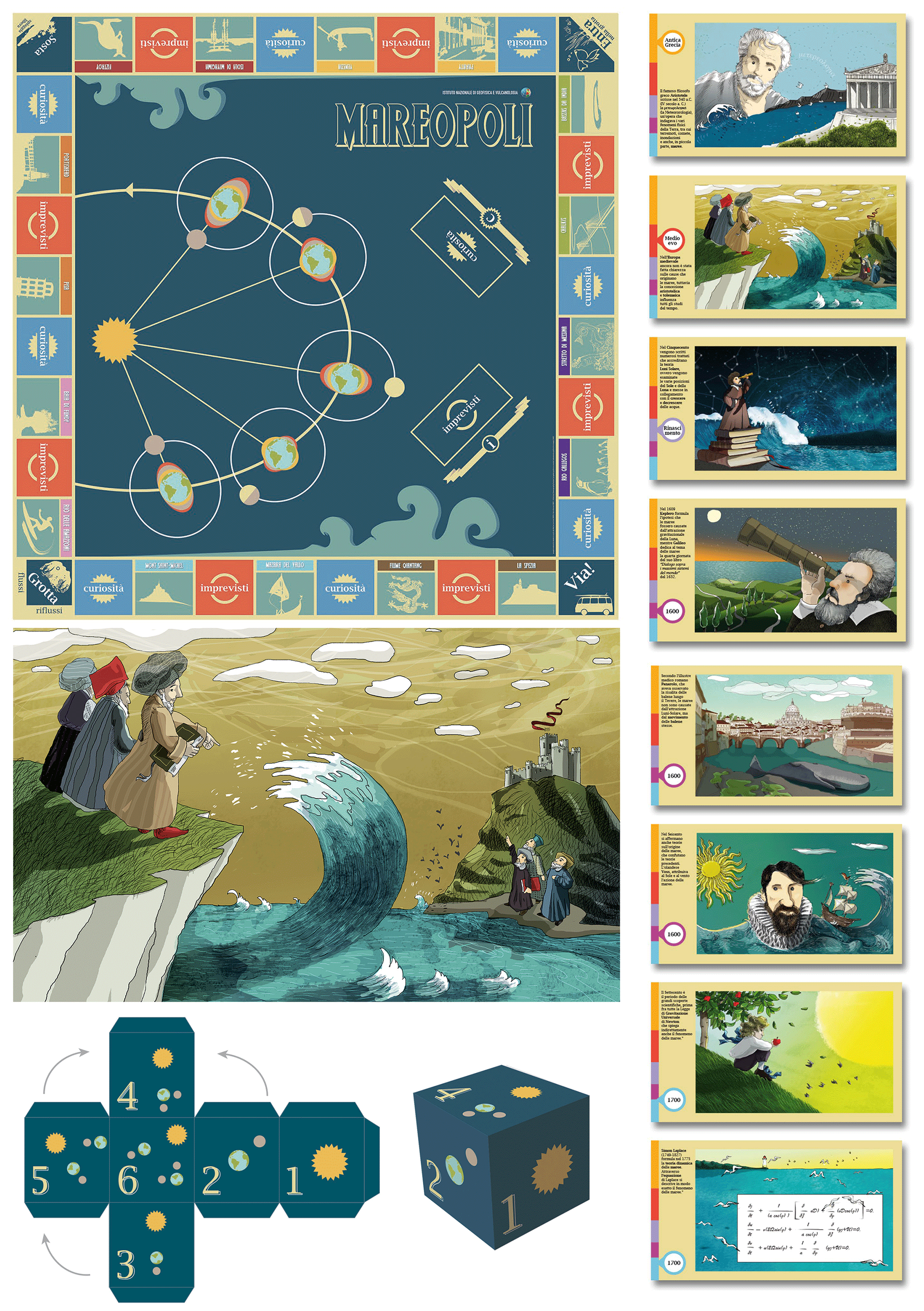
Figure 14The Mareopoli game – the board, playing cards, dice and one of the illustrations created by the Laboratory. © Laboratorio Grafica e Immagini; INGV.
Mareopoli is the result of a continuous interaction between researchers and graphic designers; working together made scientific concepts simpler to understand and allowed them to be translated into direct and captivating images. The most important historic and scientific topics have been simplified into the fundamental concepts underlying them, while maintaining a common conceptual and stylistic approach. Most of the drawings are 2D, although some shading is used to introduce a sense of background, perspective or motion. Nevertheless, we attempted to keep the drawings as simple, plain and clear as possible in order to convey definite ideas more effectively. All illustrations were made in the Laboratorio with painting techniques (Fig. 14).
7.3 Acchiappa la Placca (Catch the Plate)
This game is as simple as it is addictive. Children and adolescents in the age range of 11 to 16 years will always be able to play with ease under the guidance of an instructor.
First, all participants divide themselves up into teams made up of a minimum of two players. The team with the youngest player will start by rolling the die. Each roll determines which card or token must be drawn and, consequently, the actions to be carried out. The following three cards are available to the players:
-
Earthquake card
-
Volcano card
-
Tectonic plates card
The objective of the game is to obtain the highest score by placing the largest number of tectonic plates, earthquakes and volcanoes on the board. The game is thought to explain how the earth moves and what the Earth's crust is made of.
7.3.1 Earthquake card
A card with an earthquake's epicentre is drawn. The goal is to guess where the epicentre should be placed, based on questions written on the card. Placing it correctly yields three points, but if the team requires an extra clue to guess then it only receives two points (if the answer is correct). Players can also give their turn to the competing team, who, by answering correctly, will receive one point.
7.3.2 Volcano card
A volcano made from DAS (a synthetic modelling paste similar to clay; FILA – Fabbrica Italiana Lapis ed Affini) is distributed. The goal is to guess where to place the volcano based on the application shown on the card. Placing it correctly yields three points, but if the team requires an extra clue to guess then it receives only two points (if the answer is correct). Players can also give their turn to the competing team, who, by answering correctly, will receive one point.
7.3.3 Tectonic plates card
There are a total of 15 major tectonic plates. Players will have to draw a plate from a basket and place it on the board correctly. If the team misses the plate then it is put back into play. Guessing the plate correctly immediately yields three points (Fig. 15).
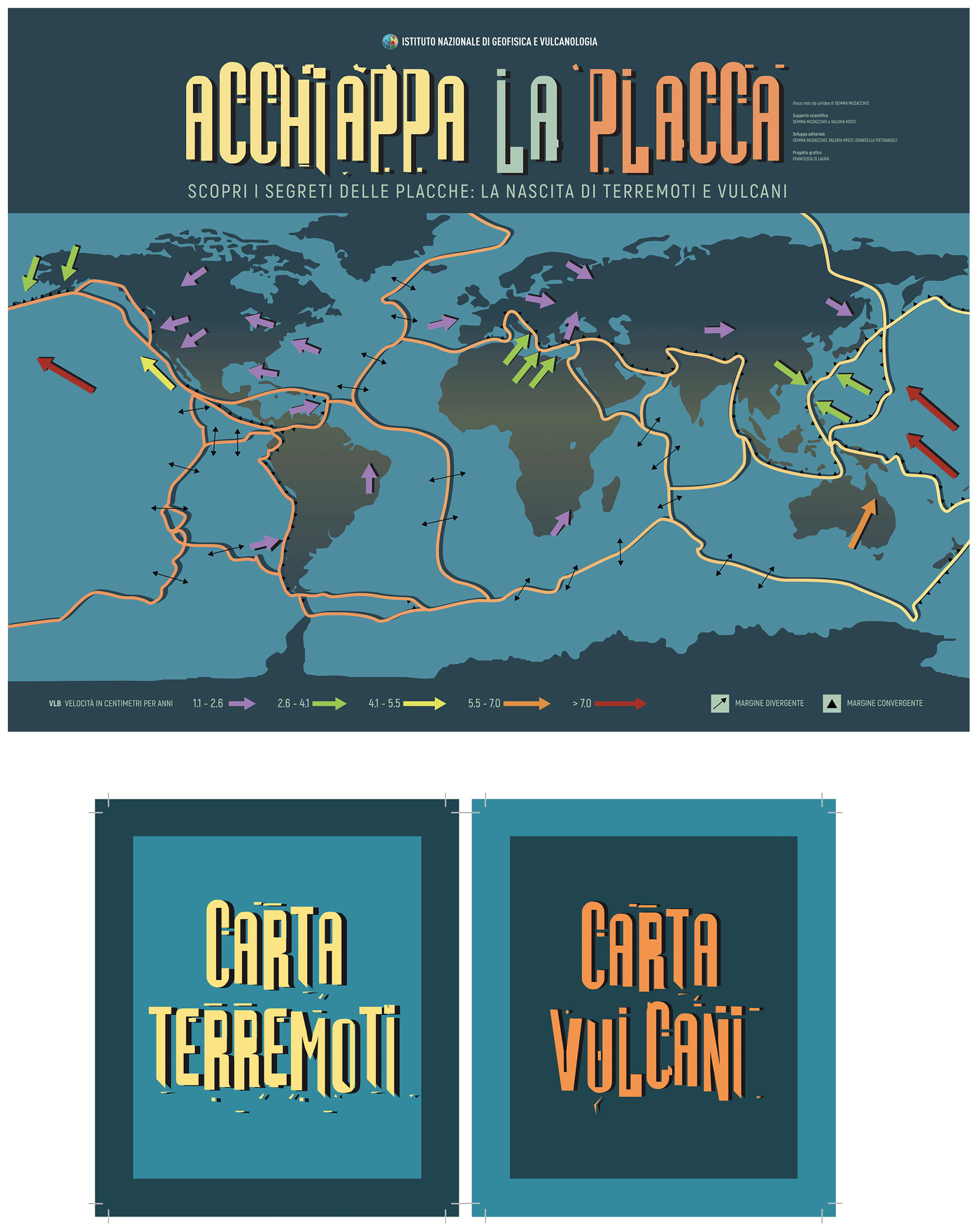
Figure 15The board and cards of the Catch the Plate game. © Laboratorio Grafica e Immagini; INGV.
Acchiappa la Placca is a new game that has been tested less extensively than Escape Volcano, but it can be easily downloaded from the new educational platform of the INGV website. Two versions can be currently downloaded in Italian and English. The game was tested during the Isola di Einstein event held in the Umbria region in September 2019, with an audience of about 30 people of different ages.
7.4 Geo trivial
The latest product created by the Laboratorio within the realm of edu-games is Geo trivial. We all know that games have the power to ignite imagination and to place one in someone else's shoes or situation, often forcing one into making decisions from perspectives other than one's own. This makes them potentially powerful tools for communicating through their use in outreach, research dissemination and education at all levels and also as a method for training practitioners, decision-makers and the general public to build environmental resilience.
In creating Geo trivial, we essentially revisited the classic Trivial Pursuit, thus producing a real scientific game and also a tool for learning more about the amazing world of geosciences while having fun. This new game belongs to a INGV editorial project (Games in Geosciences) dedicated to education and outreach (see Fig. 16; note that this activity is still in progress).
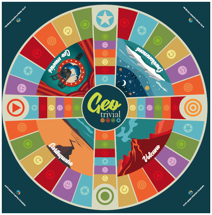
Figure 16The Geo trivial game. © Laboratorio Grafica e Immagini; INGV.
The game was presented at the virtual European Geosciences Union congress and, because of the immediate interest by the researchers, we decided to load it on the new educational platform of the INGV. Due to Covid-19, we have not yet had the possibility to test the game in a school or during other events, but we are ready to do so as soon as it is possible to do so.
8.1 Interactive exhibitions
8.1.1 Il pianeta dei cambiamenti; la tettonica delle placche – una teoria rivoluzionaria (The planet of changes; plate tectonics – a revolutionary theory), Festival della Scienza di Genova 2018
Celebrating the 50th anniversary of plate tectonics theory, one of the most important scientific acquisitions of the 20th century, this exhibition aimed to show its fundamental steps, along with the discoveries and intuitions that built its intellectual and disciplinary credibility. Its enunciation followed a golden age for the discoveries in the Earth sciences, helped the scientific community to accept the basic ideas underlying the drift of the continents and laid the foundations for a change in our perception of the dynamics of our planet. By bringing together results from various disciplines, the theory has unveiled many aspects of how the Earth works, transforming the Earth sciences forever.
Based on this background, the study of the logo has focused on the Earth and its complexity. The geometric elements may remind one of a puzzle, something that is continuously formed and destroyed just like the Earth, which is a planet that is always on the move.
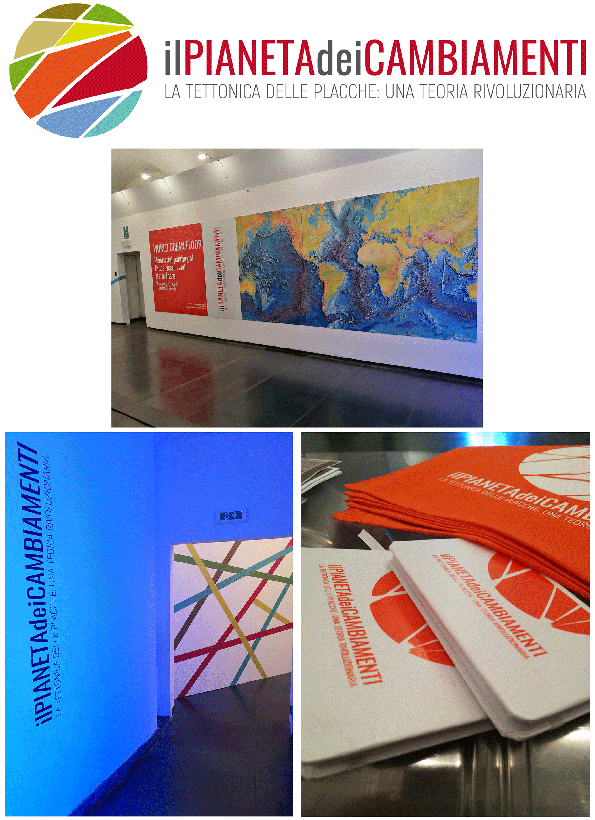
Figure 17Details of the layout of the exhibition of Il pianeta dei cambiamenti; la tettonica delle placche – una teoria rivoluzionaria, presented at the 2018 edition of the Genova Science Festival in Palazzo Ducale (Genova, Italy). © Laboratorio Grafica e Immagini; INGV.
The exhibition was set up at the prestigious premises of Palazzo Ducale (doge's palace) in Genova, which, precisely because of its uniqueness and beauty, allowed us to set up a display which had a great impact (Fig. 17). Over the 8 d of being open, the exhibition welcomed the 2505 visitors with a composition of light and colours, the key elements in our interpretation, which accompanied the public throughout the journey. Indeed, the exhibition was remarkably successful, as highlighted in the guestbook comments, some of which underline the excellence of the graphic design (D'Addezio, 2019).
The exhibition has an editorial follow-up in the form of an exhibition catalogue, which is a real book that tells a story of changes, that has recently been released. On the one hand, it shows the changes of our planet, which is a living and constantly evolving environment. On the other hand, these are changes in the way of considering, seeing and explaining our planet and that have, for over 2000 years of history, guided humans in understanding the mechanisms that govern the evolution of the Earth. Figures 17 and 18 show the exhibition logo and some associated materials (panels, gadgets, etc.) plus photos of the exhibition and a visual summary of the catalogue.
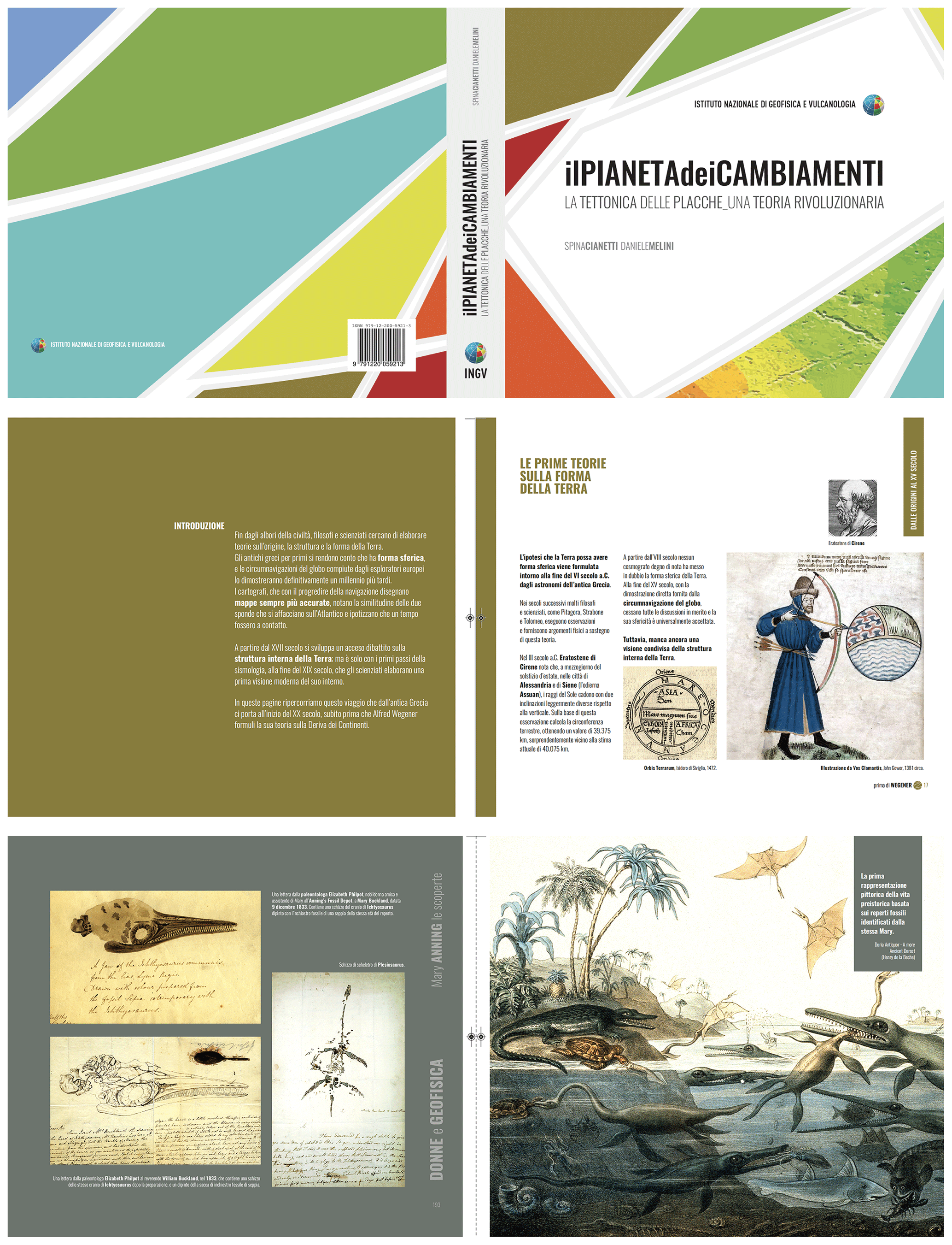
Figure 18Selected pages of the exhibition catalogue of the Il pianeta dei cambiamenti; la tettonica delle placche, una teoria rivoluzionaria presented at the 2018 edition of the Genova Science Festival. © Laboratorio Grafica e Immagini; INGV.
8.1.2 Terremoti – attenti agli elementi! Dettagli che salvano la vita (Earthquakes – beware of the elements! Details that save lives); Festival della Scienza di Genova 2019
This exhibition was created by the Laboratorio on the occasion of the Festival della Scienza di Genova 2019 and, in 10 d of being open, welcomed 1066 visitors. The exhibition is now being shown throughout Italy with a very busy schedule (Grottaminarda, Varese, Milano, and L'Aquila, etc.). Its aim is to illustrate good practices to help prepare for earthquakes and increase citizens' awareness of the continuous evolution of the Earth and of the environment.
In the frame of an interactive journey, visitors discover how the different elements that make up a building react to earthquake shocks and the potential role of the ground on which our houses are built.
Our graphic project started from the choice of a sort of vintage style that would result in a modern, but not too minimalist, appearance. Our goal was to create a communication style that is familiar and intimate, rather than cold, institutional and authoritarian, so that the message could be conveyed in an empathetic and welcoming fashion and so that the main concepts could be perceived more willingly.

Figure 19Excerpts from the exhibition of Attenti agli elementi, presented at the 2019 edition of the Genova Science Festival (Commenda da Prè; Genova, Italy). © Laboratorio Grafica e Immagini; INGV.
The dominant colour is orange, which was chosen as a sort of communicative compromise; unlike red, which is generally evocative of an emergency, orange is associated with cheerfulness, sociability, vitality and renewal. It therefore seemed perfect for this popular exhibition in which dynamism is synonymous with awareness and action. The icon of the house is the dominant element and, together with the crack in the ground and the swaying lamp, is now part of the collective imagination related to earthquake risk. The ultimate objective of our visual project was to produce a playful visual communication that, together with the negative aspects of natural risk, also conveyed the importance of being aware of the fragility of the structures around us and of the rules of behaviour, which can save lives; in fact, these rules are the focus of the exhibition.
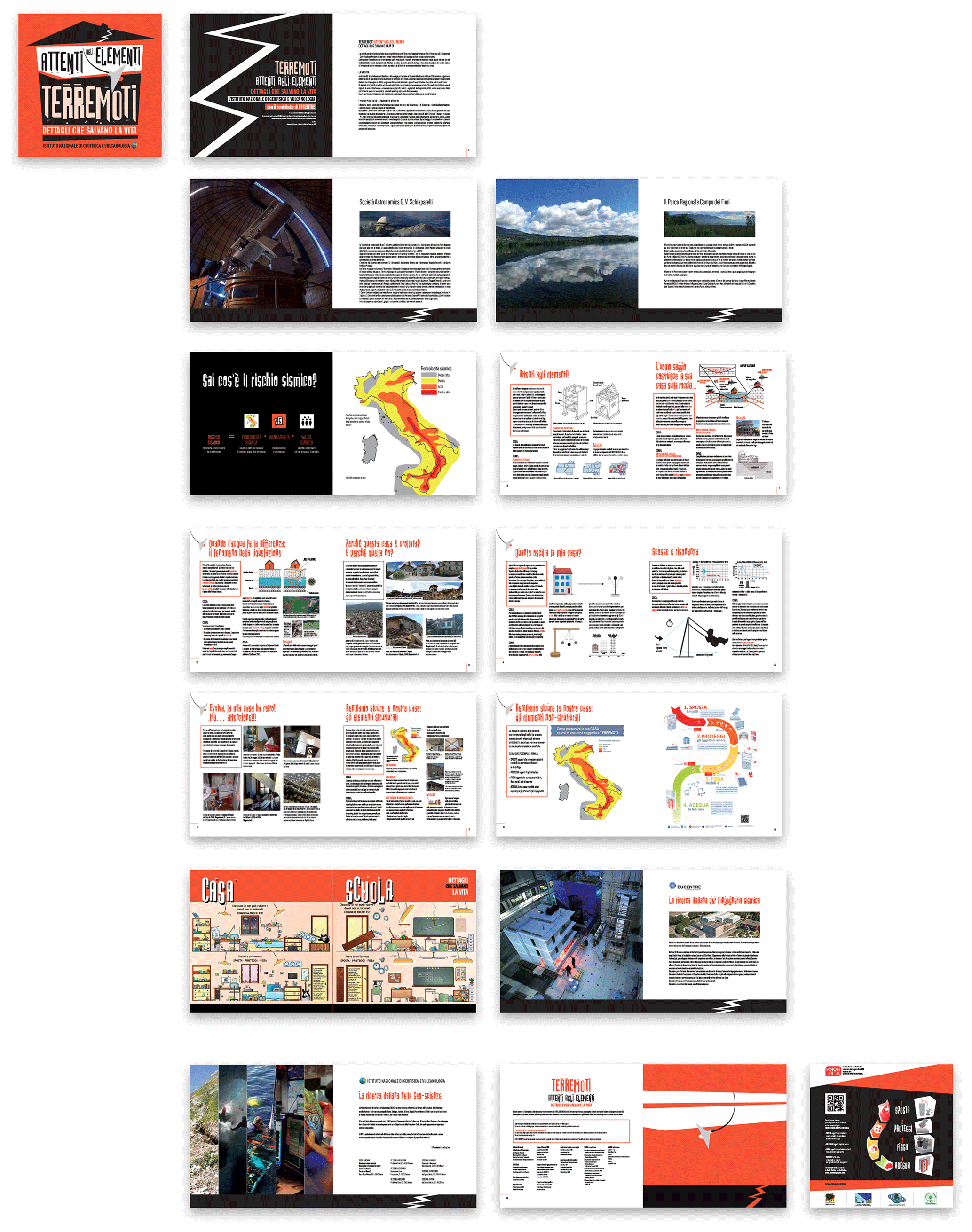
Figure 20Booklet prepared for the exhibition of Attenti agli elementi. © Laboratorio Grafica e Immagini; INGV.
Figures 19 and 20 show the main products associated with this project, along with the exhibition booklet and some photos of the set-up.
8.1.3 New Space Economy forum
INGV recently participated in the first New Space Economy (NSE) European Expoforum – Italian edition (Rome, December 2019), which is a point of reference for all companies that operate in the space sector but also, and above all, for all those companies that populate the new space market including universities, research centres, small and medium-sized enterprises (SMEs) and innovative enterprises.
We have chosen to characterize our exhibition space by focusing strongly on a single visual element, namely an image of a volcanic eruption from space. This central element was then differentiated on the scientific products, flyers and merchandise created specifically for this event (Figs. 21 and 22).
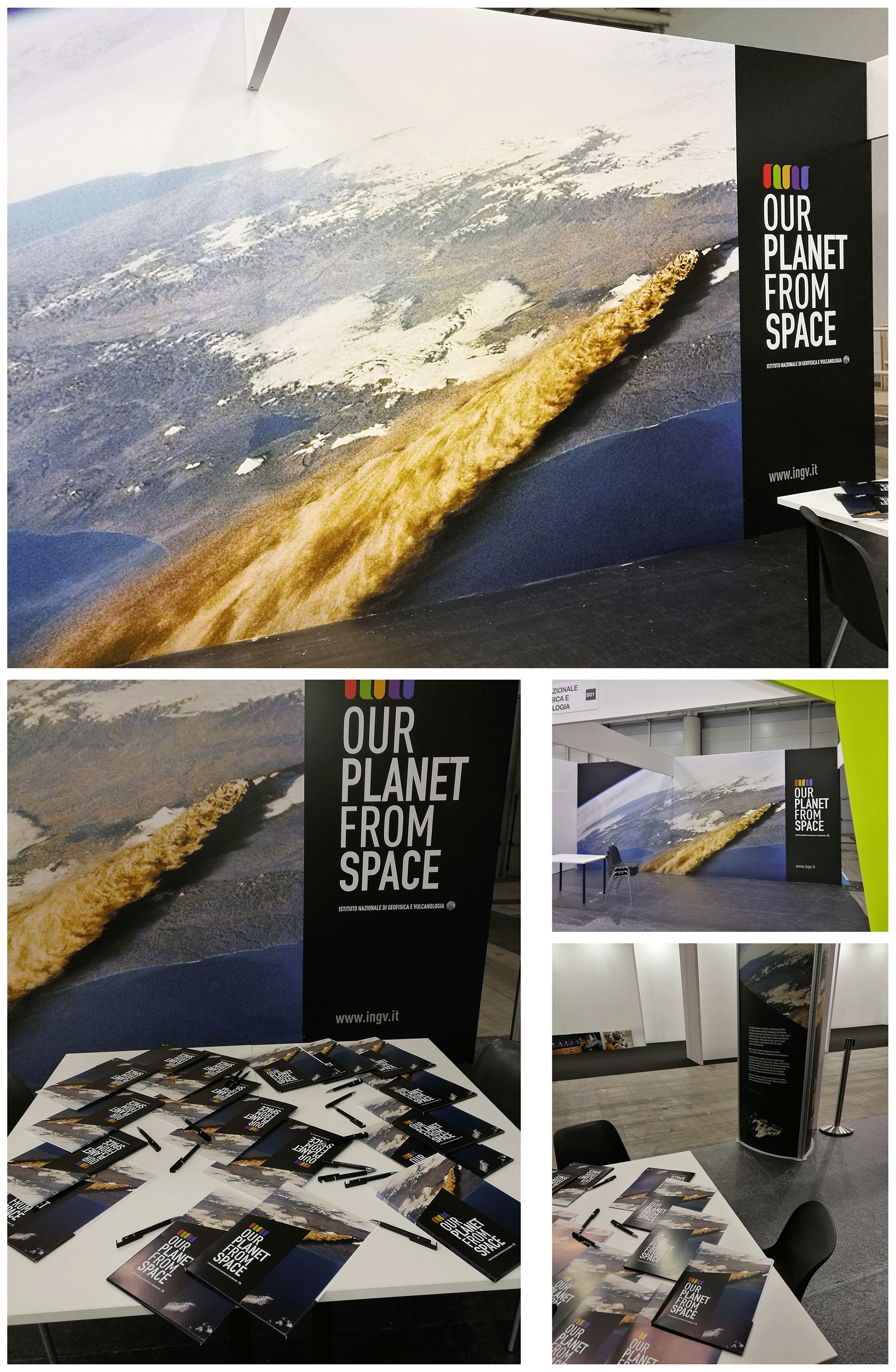
Figure 21The INGV participation at the New Space Economy forum (December 2019; Rome, Italy). © Laboratorio Grafica e Immagini; INGV.
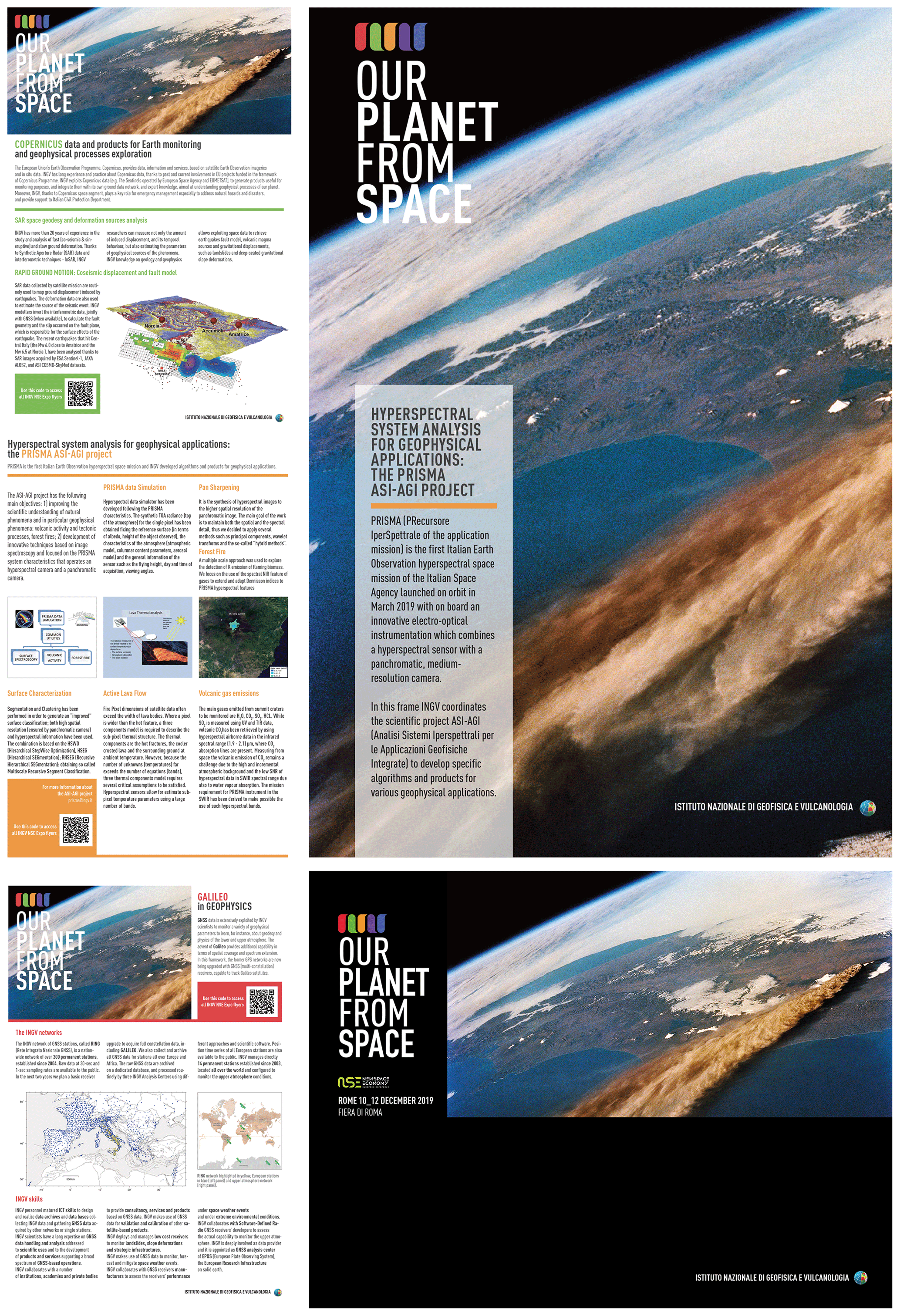
Figure 22Materials created for the INGV participation in the New Space Economy forum (December 2019; Rome, Italy). © Laboratorio Grafica e Immagini; INGV.
Visual culture has become a prominent part of the cultural identity of the 21st century, and consequently, it has become also a fundamental tool for communicating science. Regrettably, so far visual material has generally been treated as an add-on instead of being an integrated part of the whole, and little has been done in the way of identifying target audiences and refining specific visual elements for each of them (Rodríguez et al., 2015; Khoury et al., 2019).
Standing on the shoulders of INGV, one of the largest scientific institutions worldwide, we strived to overturn this course of things. This work represents, for us, a first synthesis that relates to and describes the interaction and the synergy between graphic designers and researchers in a common research work. Our experience demonstrates that science communication becomes much more effective when it is supported by visual communication, i.e. when it incorporates elements of the theory and practice of the discipline of design. In this respect, the INGV experience that we presented in this paper highlights the enormous potential of a living interaction among scientists, graphic designers and all the elements comprising visual communication. Over the years, our Laboratorio has developed into a fundamental component in the dissemination of scientific information for the benefit of the general public and in any didactic context.
No data sets were used in this article.
DR is the coordinator of the Laboratorio Grafica e Immagini (Graphics and Images Laboratory) of INGV. She contributed to this work by doing research on the visual aspects of all activities presented and on their content, with the aim of creating a homogeneous and usable product. She also did most of the writing.
GD'A is the coordinator of the Laboratorio Attività con le Scuole (Schools Activity Laboratory) of INGV. She cooperates closely with the Laboratorio Grafica e Immagini and contributed to this work by doing research on the interaction of graphic design in scientific dissemination and writing part of the text.
FDL is a fundamental component of the Laboratorio. She contributed to the general approach to the activities presented and to the writing.
VM is a volcanologist who provided scientific support for all the edu-games created by the Laboratorio.
PB is a new entry to the Laboratorio. She contributed to drafting the paper with her presence and her valuable advice and helped with the general review.
The authors declare that they have no conflict of interest.
This article is part of the special issue “Five years of Earth sciences and art at the EGU (2015–2019)”. It is a result of the EGU General Assembly 2016, Vienna, Austria, 17–22 April 2016.
The authors wish to thank all colleagues who supported and sponsored their activities over the years. Their continuing support has made it possible to achieve the results shown here. We are especially indebted to Angela Chesi and Sabrina Palone, two colleagues who shared this journey with us for quite a few years. We also thank Gianluca Valensise for the constructive revision which significantly improved the paper.
This paper was edited by Francesco Mugnai and reviewed by Jacco Konijn and one anonymous referee.
D'Addezio, G.: Il libro dei commenti di mostre scientifiche temporanee: analisi e prospettive, in: Studi empirici di educazione museale, edited by: Poce, A., Edizioni Scientifiche Italiane, Napoli, Italy, ISBN 978-88-495-4063-5, 2019.
D'Addezio, G.: 10 years with planet Earth essence in the primary school children drawings, Geosci. Commun. Discuss., https://doi.org/10.5194/gc-2020-10, in review, 2020.
D'Addezio G., Rubbia G., and Marsili A.: The experience of ScienzAperta, a week of scientific information and dissemination, Eng. Geol. Soc. Terr., 7, 103–107, 2014.
D'Addezio, G., Giordani, A., Valle, V., and Riposati D.: 100 years after the Marsica earthquake: contribute of outreach activities, EGU General Assembly 2015, 12–17 April 2015, Vienna, Austria, Geoph. Res. Abs., 17, 2015.
Dañobeitia, J. J., Bardaji, R., Basset, A., Beranzoli, L., Berry, A., Blandin, J., Cannat, M., Carval, T., Coppola, L., Del Rio Fernandez, J., Delory, E., Embriaco, D., Favali, P., Fredella, M.I., González Aranda, J. M., Gillooly, M., Giuntini, A., Gourcuff, C., Hartman, S. , Iudicone, D., Kutsch, W., Lanteri, N., Llínas, O., Magnifico, G., Marinaro, G., Materia, P., Miranda, M., Petihakis, G., Pfeil, B., Piera, J., Pouliquen, S., Radulescu, V., Rodero, I., Ruhl, H., and Sarradin, P. M.: A European Marine Research Infrastructure Strategy for an Integrated and Sustainable Ocean Observation System, OceanObs'19 – An Ocean of Opportunity, 16–20 September 2019, Honolulu, Hawaii, 2019.
Di Nezza, M., Misiti, V., and Di Laura, F.: Escape Volcano: un nuovo gioco geo-scientifico, Miscellanea, 5, 1–34, ISSN 2939-6651, 2020.
Khoury, C. K., Kisel, Y., Kantar, M., Barber, E., Ricciardi, V., Klirs, C., Kucera, L., Mehrabi, Z., Jhonson, N., Kabin, S., Valiño, A., Nowakowski, K., Bartomeus, I., Ramankutty, N., Miller A., Schipanski, M., Gore, A. M., and Novy, A.: Science–graphic art partnerships to increase research impact, Commun. Biol., 2, 295, https://doi.org/10.1038/s42003-019-0516-1, 2019.
Locritani, M., Garvani, S., Di Laura, F., Merlino, S., and Talamoni, R.: Giocando verso uno sviluppo sostenibile: il contributo della sede INGV di Porto Venere nella realizzazione di giochi didattico-scientifici, Miscellanea, 39, 1–26, ISSN 2039-6651, 2017.
Misiti, V., Di Nezza, M., Di Laura, F., Cafarella, L., and D'Addezio, G.: ESCAPE VOLCANO: a new game on volcanic hazards, EGU General Assembly 2019, 1–2 April 2019, Vienna, Austria, Geoph. Res. Abs., 21, 2019.
National Science Foundation: A guide for proposal writing, available at: https://www.nsf.gov/pubs/2004/nsf04016/start.htm (last access: 5 September 2020), 2004.
Rodríguez, E., Fabiola, C., and Davis, L. S.: Improving Visual Communication of Science Through the Incorporation of Graphic Design Theories and Practices Into Science Communication, Sci. Comm., 37, 140–148, https://doi.org/10.1177/1075547014562914, 2015.
Rubbia, G., D'Addezio, G., Marsili, A., and Carosi, A.: Science and scientists from the children point of view, an overlook from drawings, Geol. Soc. London, Spec. Publ., 419, 161–170, https://doi.org/10.1144/SP419.11, 2015.
Taramaschi, L.: La visione oceanografica nella storia della scienza dalle origini al XIX secolo, Caracol, Palermo, Italy, 216 pp., ISBN 978-88-98546-90-9, 2018.
Tufte, E. R.: The Visual Display of Quantitative Information, Graphics Press, Cheshire, CT, USA, 1–197, 1983.
- Abstract
- Introduction
- The partnership between graphic design and scientific research
- The INGV style
- Corporate identity of research projects: case histories
- Web products relating to the Earth sciences and their dissemination to the general public
- Editorial products: the interaction between graphic design and scientific production for science and scientific dissemination
- Edu-games
- Graphic design and scientific research
- Discussion
- Data availability
- Author contributions
- Competing interests
- Special issue statement
- Acknowledgements
- Review statement
- References