the Creative Commons Attribution 4.0 License.
the Creative Commons Attribution 4.0 License.
 | 01 Oct 2025
Visualising historical changes in air pollution with the Air Quality Stripes
Kirsty J. Pringle
Richard Rigby
Steven T. Turnock
Carly L. Reddington
Meruyert Shayakhmetova
Malcolm Illingworth
Denis Barclay
Neil Chue Hong
Ed Hawkins
Douglas S. Hamilton
Ethan Brain
This paper introduces the Air Quality Stripes, a data visualisation project which presents historical changes in outdoor particulate matter air pollution (PM2.5) concentrations across major cities worldwide. Inspired by the popular Warming Stripes image showing trends in surface temperature, the Air Quality Stripes aims to make complex information about air quality trends understandable and engaging for a broad audience. A historical PM2.5 dataset (1850–2022) was created by integrating satellite observations with model simulations (with a bias correction step to ensure a smooth time series and address known model biases). Images were produced in collaboration with a visual design specialist and revised after informal feedback from potential audiences. The images show that trends in PM2.5 are varied across the globe; recently there have been significant improvements in air quality in much of Europe and North America but worsening air quality in parts of Asia, Africa, and South America. By showcasing historical data in easy to interpret images, the project aims to inspire dialogue among individuals, communities, and policymakers about proactive strategies to combat air pollution.
- Article
(1351 KB) - Full-text XML
- BibTeX
- EndNote


Air pollution poses a major public health risk, contributing to 4.7 million premature deaths in 2021, 89 % of which occurred in low- and middle-income countries (Institute for Health Metrics and Evaluation, 2021; Brauer et al., 2024; World Health Organization, 2021a). Despite strong evidence of its health impacts, improving public understanding is vital to drive policy changes, to drive individual actions, and address the social and economic inequalities linked to poor air quality. The Air Quality Stripes aims to raise public awareness and understanding of outdoor air pollution. The images show the change in air quality (PM2.5) through time, from the Industrial Revolution to near present day, in cities around the world. We focus on the air pollutant PM2.5 because its health impact surpasses that of other pollutants due to its ability to penetrate vital organs and disrupt physiological processes (Schraufnagel et al., 2019a).
The project was inspired by the hugely popular Warming Stripes project (https://showyourstripes.info/, last access: 17 September 2025), led by Ed Hawkins, which shows the net change in annual mean global mean temperatures as a distinctive series of blue, white, and red stripes (Hawkins et al., 2025). The Warming Stripes has very successfully translated complex scientific data into an easily digestible format that resonates with a wide audience (e.g. The Guardian, 2021; BBC Future, 2023). The success of the images has inspired other projects including the Biodiversity Stripes (https://biodiversitystripes.info/global, last access: 17 September 2025, Richardson, 2023) and the Ocean Acidification Stripes (https://oceanacidificationstripes.info/, last access: 17 September 2025).
1.1 Particulate matter air pollution
Air pollution encompasses various harmful substances (e.g. NO2, O3, metals, SO2), but this study focuses on fine particulate matter (PM2.5), composed of airborne particles smaller than 2.5 µm. Exposure to PM2.5 is strongly linked to adverse health effects, including asthma, lung cancer, and heart disease (Schraufnagel et al., 2019b; World Health Organization, 2021c; Wan Mahiyuddin et al., 2023). Over 99 % of the world's population resides in areas where PM2.5 levels exceed the World Health Organization's (WHO) air quality guideline value of 5 µg m−3 (World Health Organization, 2021a), but concentrations vary significantly around the globe.
The concentration of PM2.5 at any given location is governed by the balance between the magnitude of source terms (including direct emissions, secondary formation, and transport from other regions) and removal processes (such as deposition and atmospheric dispersion). Sources of PM2.5 are diverse and include combustion from vehicles, residential cooking and heating, industry, power generation, and agriculture, as well as secondary aerosol formation from gaseous precursors like SO2, NOx, and VOCs. Natural and semi-natural sources – such as mineral dust, sea salt, volcanic emissions, and black carbon from wildfires – can also contribute substantially to PM2.5 levels (Reddington et al., 2014; Zhang et al., 2016; Graham et al., 2021; Pai et al., 2022). Meteorological conditions strongly modulate both source and removal terms. Temperature inversions, for instance, can suppress vertical mixing and trap pollutants near the surface, resulting in acute pollution episodes. Cities situated in valleys or at the foot of mountain ranges can experience higher concentrations due to restricted air movement (limiting the dispersion of pollutants), while some coastal cities are influenced by strong onshore winds that transport pollutants away (Pillai et al., 2002; Dall'Osto et al., 2010). Furthermore, PM2.5 also displays quite significant seasonal trends due to seasonal changes in meteorology and emission patterns. PM2.5 has an atmospheric lifetime of approximately a few weeks, allowing pollution to be transported to nearby cities and countries, causing trans-boundary air pollution issues (Zhang et al., 2017; Chen et al., 2022). At the same time, it means that PM2.5 concentrations can respond relatively quickly – on the order of days to weeks – to effective emissions controls and clean air legislation (e.g. Silver et al., 2020), making policy interventions both impactful and measurable over short timescales.
2.1 Combined model and satellite data
Satellite observations and computer model simulations were combined to generate a historical PM2.5 time series from 1850 to 2022. Post-2000 data come from a publicly available product integrating satellite and ground-based observations into a gridded global dataset at 0.1° resolution (Van Donkelaar et al., 2021). For pre-2000 years, historical trends rely on Earth system model simulations (Turnock et al., 2020; Sellar et al., 2020). These simulations are part of the Coupled Model Intercomparison Project (CMIP6), where over 30 models provided historical climate simulations for 1850–2014 (Eyring et al., 2016), supporting the Intergovernmental Panel on Climate Change (Arias et al., 2021). All CMIP6 models use the Community Emissions Data System (CEDS) for anthropogenic and wildfire emissions (Hoesly et al., 2018; van Marle et al., 2017), while natural emissions (dust, sea spray) are model-calculated and vary between models. Only some CMIP6 models include interactive particulate matter and chemical processes; we used PM2.5 data from one of these models: UKESM1 (UK Earth System Model, version 1, Sellar et al., 2020). This model uses a two-moment aerosol microphysics scheme for the main types of particulate matter (sulfate, black carbon, organic carbon, sea salt) and a sectional (bin) scheme for mineral dust (Mulcahy et al., 2020). At present, UKESM1 does not treat nitrate aerosol. Model simulations were at N96 spatial resolution (1.875° longitude × 1.25° latitude). This model has been widely used for air quality studies (Reddington et al., 2023; Turnock et al., 2020, 2023; Allen et al., 2021; Butt et al., 2017). CMIP6 data are freely available (Earth System Grid Federation, 2024).
Modelling global air pollutant concentrations is challenging, and models are continually refined through comparisons with observational data to improve the accuracy of physical and chemical process representations. Previous studies have shown that CMIP6 multimodel simulations tend to underestimate PM2.5 concentrations relative to observations (Turnock et al., 2020). To address this issue and ensure continuity between model output and satellite data, a bias correction approach is applied. Specifically, for each city, a 3-year mean (2000–2002) of satellite-derived PM2.5 is compared to a 3-year mean of modelled concentrations for the same period. The ratio between these means is used to adjust the model values throughout the historical simulation period (1850–2000), correcting for bias. This method is in line with approaches used in previous research (Turnock et al., 2023; Reddington et al., 2023). More information on bias correction techniques is available in Staehle et al. (2024). The average bias correction factor for all cities is 2.65 (SD = 1.6), indicating a general underestimate by the model compared to satellite-derived observations. There was found to be low sensitivity to the averaging period chosen (e.g. 10-year average gave a overall bias correction factor of 2.7). Plots showing the model values, satellite-derived values, and bias for each city are publicly available (Pringle, 2024). Due to the scarcity of historical PM2.5 observations, evaluating the accuracy of this approximation is challenging. Observations of PM2.5 did not become routine until after the 1990s; prior to that some measurements of “soot” exist, which can give some indirect indication of PM2.5 concentrations, but even these observations are sparse and do not have good temporal or geographical coverage. The concentration data pre-1998 are therefore unconstrained by measurements. However, this method ensures that the historical trend in PM2.5 is guided by model simulations (informed by the emissions inventory), while absolute values are aligned with more recent satellite-derived observations with global coverage and higher resolution.
Urban concentrations of PM2.5 are most relevant to public health as a large fraction of the world's population live in cities, so for the visualisations, PM2.5 concentrations were extracted at the location of major cities around the world. An initial set of images for around 170 cities in over 100 countries was created. To allow for different preferences, four different styles of image were created for each city. Figure 1 shows the four images for a single example city (London, UK) and Figure 2 shows a single image for four different cities, but with additional annotations.
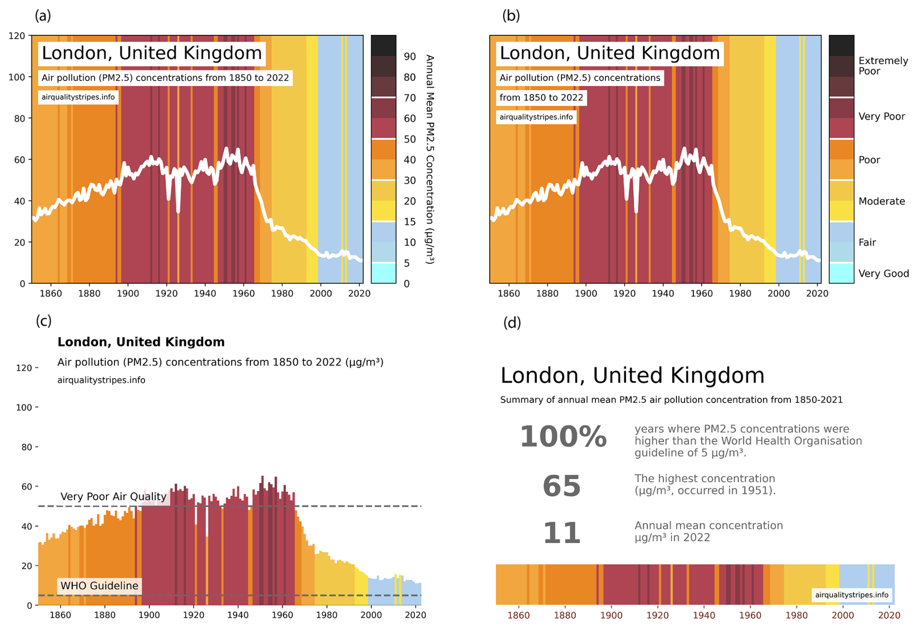
Figure 1The four styles of image created for each city using London (UK) as an example: (a) annual mean with absolute values, (b) annual mean PM2.5 concentrations with indicative descriptions, (c) annual mean bar plot, and (d) summary statistics. Images for the other cities are available on the project website: https://airqualitystripes.info/ (last access: 17 September 2025).
3.1 The colour of pollution
The Warming Stripes benefits from an intuitive colour scale (blue is cool, red is warm), which reduces the cognitive load for viewers and makes the plots easy to understand. For air pollution, creating such an intuitive colour palette is more challenging. To bridge the gap between colour and its cognitive associations, it was therefore essential to take into account some of the principles of colour theory. A key aspect of colour theory is understanding the psychological associations between a specific colour, its wider representation in a sociocultural environment, and its representation within the spread of digital media (Christiansen, 2022). For air pollution, creating a simple to understand colour palette is a challenging task due to the often abstract connections between the term “air pollution” and any specific colour. To address this, multimedia designer Ethan Brain (co-author) analysed colour themes from 200 images collected from a Google image search for “air pollution”. By taking web visuals with the tag “air pollution” and using these images as datasets, visual patterns in popular representation could be formally analysed. As one might expect, polluted images were dominated by reds, browns, and greys and clean images by blues. The images were then analysed using a custom sorting and colour grouping tool to identify the dominant colour theme. Then, to hone in on images that best represented air pollution, the initial set of images was filtered only to include results that matched the dominant colours, eliminating outliers and ensuring consistency across the dataset. Dominant colour themes were then extracted from this filtered set, and the resulting colours were hand-selected and optimised for web and print colour spaces. Finally, the colours were organised to create a palette that represents increasing values. In the resulting palette the lightest blue represents the cleanest value of concentrations of less than 5 µg m−3. Cities with years in this colour meet the World Health Organization air quality guideline (World Health Organization, 2021b); all other colours show an exceedance of the guideline value.
3.2 Refining the images
The Warming Stripes image notably presents the data without the axes and labels typically associated with scientific data representations, instead opting for a clear, compelling visual that bridges art and science. The Air Quality Stripes images differ in one key way: while the Warming Stripes (and the Biodiversity Stripes) primarily aims to highlight a single, consistent global trend – warming temperatures or biodiversity loss – the changes in PM2.5 concentration are more complex and spatially variable. Some regions experience increased concentrations, while others see reductions. It would be challenging to create a single overall image without obscuring these important trends.
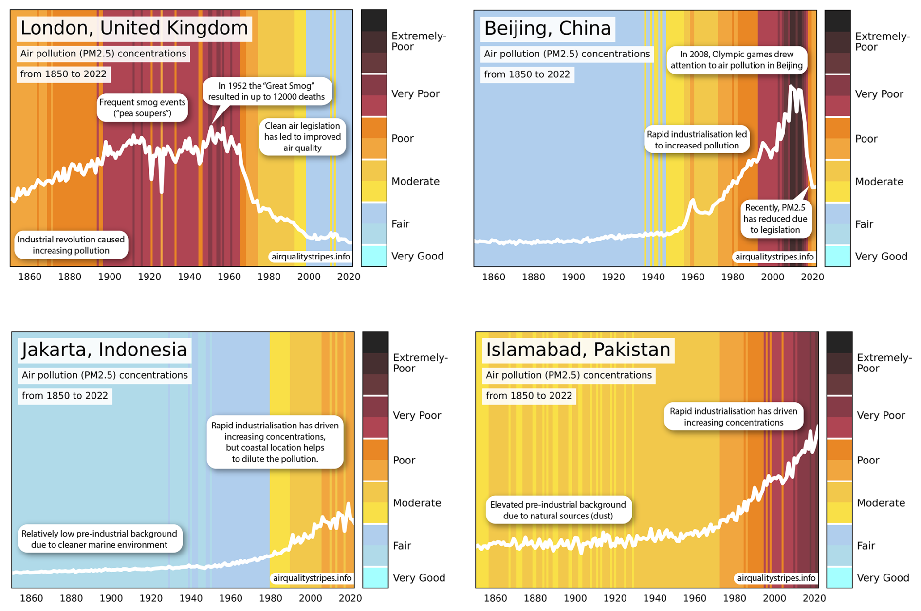
Figure 2Example images for different cities annotated to highlight causes of the change in PM2.5 which are used on the landing page of the project website.
However, the project aimed to create accessible and engaging images for a wide audience. To achieve this, different versions of draft images were shown to 15 to 20 individuals, including colleagues (air quality researchers, public engagement specialists, and researchers in different fields), friends, and family, during an informal testing phase. Feedback was gathered on aspects such as clarity, visual appeal, colour interpretation, and perceived message. Images with and without (1) a trend line, (2) axes labels, and (3) colour bar labels were tested. The trend line was found to be useful in guiding the eye and reducing the effort required to understand the data. Given the varied regional trends, axes and colour bar labels were deemed essential for clarity. Some individuals expressed uncertainty about interpreting the data, asking questions like, “If concentrations are 10 µg m−3, what does that mean? Is it good or bad?”. To address this, plots were updated with indicative labels (“Very Good”, “Fair”, “Moderate”, “Poor”, “Very Poor” and “Extremely Poor”). While similar labels are commonly used (e.g. European Environment Agency, 2023), they typically reference daily, not annual, mean values. Instead, the WHO guideline of 5 µg m−3 was used for the “Very Good” category, and other categories were estimated by extrapolating from daily indicative levels. To enable direct visual comparison, the mapping from PM2.5 concentration to the indicative label is the same for every city; for more details see Pringle (2025). White breakpoints were added to the colour bar to highlight the separation between these categories. Finally, a landing page was added to the website with images from four cities, annotated to highlight events that affected PM2.5 concentrations
4.1 Air pollution trends
The images show that PM2.5 levels have reduced in many cities. Concentrations in much of Europe and North America have been declining since the 1960s, and very rapid reductions have been achieved in China in the past decade. This offers real hope for public health; PM2.5 concentrations can respond rapidly to effective air quality legislation, and many cities have made great strides in reducing these levels. London has lower PM2.5 concentrations today than it has had at any point in the past 150 years! Unfortunately, many cities in central and southern Asia face worsening air pollution. There is an urgent need to address these increasing PM2.5 concentrations, as huge numbers of people experience high concentrations on a daily basis. The images also show the dominance of natural of PM2.5. Regions with high dust and wildfire emissions (e.g. India, Pakistan, and much of northern Africa) may struggle to achieve the WHO recommendations, even with very stringent emission controls (Pai et al., 2022).
It is important to note that these images do not show what is driving the changes in air quality. While some of the progress seen in the Global North has been achieved through local measures such as clean air zones, reductions in coal burning, and stricter air quality legislation, other improvements have occurred through the outsourcing of heavily polluting industries to the Global South. This dynamic has shifted some of the pollution burden from wealthier to poorer regions, contributing to persistent or worsening air quality and health issues in parts of the Global South (Nansai et al., 2020). This disparity underscores environmental and social justice concerns, as communities in lower-income regions disproportionately bear the health and environmental impacts of industrial pollution generated for the benefit of wealthier economies.
4.2 Learnings from development of the images
Through the process of creating and refining these images, several valuable insights were gained:
-
Collaboration with visual experts. Partnering with visual design specialists helped in the development of compelling and accessible graphics. Their expertise in colour theory helped create a final product that was visually appealing and intuitive.
-
Informal feedback and review stage. Feedback from colleagues, friends, and family was invaluable. While this project used informal connections, many visualisation efforts could benefit from a structured feedback process to ensure accessibility and clarity for diverse audiences. Any further development of these images or associated works will involve a formal structured review process which will take feedback from a diverse range of stakeholders
-
City-specific focus. Creating data for individual cities made the images relatable and grounded. This approach allows the viewer to connect with the information on a more personal level.
-
Selected annotations. Narrative annotations on a subset of images made the data more relatable, providing context and highlighting significant points. They also helped viewers better understand the overall structure of the images.
The Air Quality Stripes project has received significant media attention (Fuller, 2024; Hunter, 2024; Turns, 2024; McQuaid et al., 2024), highlighting the power of visual data to engage and inform the public. Future efforts will aim to deepen this engagement by using these images to facilitate discussions about lived experiences with air pollution worldwide, through methods such as workshops, storytelling, or other participatory approaches.
The data used to create the Air Quality Stripes are available at https://doi.org/10.5281/zenodo.14360345 (Pringle and McQuaid, 2024), as is the visualisation code used (https://doi.org/10.5281/zenodo.14393148, Pringle and Rigby, 2024).
JM and KP led the project with scientific guidance from CR and ST, software support from RR and MI, and visualisation guidance from DH, EB, EH, MS, and DB.
At least one of the (co-)authors is a member of the editorial board of Geoscience Communication. The peer-review process was guided by an independent editor, and the authors also have no other competing interests to declare.
This article does not include any studies involving human or animal subjects. Air Pollution Stripes builds on a previously established tool – Global Warming Stripes – and was therefore evaluated informally and anonymously, as clearly stated in the paper. Due to this, ethical review was not required.
Publisher's note: Copernicus Publications remains neutral with regard to jurisdictional claims made in the text, published maps, institutional affiliations, or any other geographical representation in this paper. While Copernicus Publications makes every effort to include appropriate place names, the final responsibility lies with the authors.
Kirsty J. Pringle, Denis Barclay, and Neil Chue Hong were supported by UKRI grants EP/S021779/1 and AH/Z000114/1 for the Software Sustainability Institute. James B. McQuaid was supported by the Natural Environment Research Council (NE/T010401/1). Kirsty J. Pringle and Malcolm Illingworth are grateful for two internal grants from EPCC, University of Edinburgh. Ed Hawkins is supported by the National Centre for Atmospheric Science and the Ireland–UK Co-Centre for Climate + Biodiversity + Water. Meruyert Shayakhmetova was supported through Access to Industry's Access to Data program. The contributions of Steven T. Turnock were funded by the Met Office Climate Science for Service Partnership (CSSP) China project under the International Science Partnerships Fund (ISPF). This work used JASMIN, the UK's collaborative data analysis environment (https://www.jasmin.ac.uk, last access: 17 September 2025, Lawrence et al., 2013).
This research has been supported by the UK Research and Innovation (grant nos. EP/S021779/1, NE/T010401/1, and AH/Z000114/1).
This paper was edited by Mathew Stiller-Reeve and Kirsten v. Elverfeldt and reviewed by three anonymous referees.
Allen, R. J., Horowitz, L. W., Naik, V., Oshima, N., O'Connor, F. M., Turnock, S., Shim, S., Sager, P. L., van Noije, T., Tsigaridis, K., Bauer, S. E., Sentman, L. T., John, J. G., Broderick, C., Deushi, M., Folberth, G. A., Fujimori, S., and Collins, W. J.: Significant climate benefits from near-term climate forcer mitigation in spite of aerosol reductions, Environm. Res. Lett., 16, 034010, https://doi.org/10.1088/1748-9326/abe06b, 2021. a
Arias, P., Bellouin, N., Coppola, E., Jones, R., Krinner, G., Marotzke, J., Naik, V., Palmer, M., Plattner, G.-K., Rogelj, J., Rojas, M., Sillmann, J., Storelvmo, T., Thorne, P., Trewin, B., Achuta Rao, K., Adhikary, B., Allan, R., Armour, K., Bala, G., Barimalala, R., Berger, S., Canadell, J., Cassou, C., Cherchi, A., Collins, W., Collins, W., Connors, S., Corti, S., Cruz, F., Dentener, F., Dereczynski, C., Di Luca, A., Diongue Niang, A., Doblas-Reyes, F., Dosio, A., Douville, H., Engelbrecht, F., Eyring, V., Fischer, E., Forster, P., Fox-Kemper, B., Fuglestvedt, J., Fyfe, J., Gillett, N., Goldfarb, L., Gorodetskaya, I., Gutierrez, J., Hamdi, R., Hawkins, E., Hewitt, H., Hope, P., Islam, A., Jones, C., Kaufman, D., Kopp, R., Kosaka, Y., Kossin, J., Krakovska, S., Lee, J.-Y., Li, J., Mauritsen, T., Maycock, T., Meinshausen, M., Min, S.-K., Monteiro, P., Ngo-Duc, T., Otto, F., Pinto, I., Pirani, A., Raghavan, K., Ranasinghe, R., Ruane, A., Ruiz, L., Sallée, J.-B., Samset, B., Sathyendranath, S., Seneviratne, S., Sörensson, A., Szopa, S., Takayabu, I., Tréguier, A.-M., van den Hurk, B., Vautard, R., von Schuckmann, K., Zaehle, S., Zhang, X., and Zickfeld, K.: Technical Summary, Cambridge University Press, Cambridge, UK and New York, NY, USA, 33–144, https://doi.org/10.1017/9781009157896.002, 2021. a
BBC Future: The coloured stripes that explain climate change, https://www.bbc.com/future/article/20231206-the-coloured-stripes-that-explain-climate-change (last access: 21 November 2024), 2023. a
Brauer, M., Roth, G. A., Aravkin, A. Y., et al.: Global burden and strength of evidence for 88 risk factors in 204 countries and 811 subnational locations, 1990–2021: a systematic analysis for the Global Burden of Disease Study 2021, The Lancet, 403, 2162–2203, 2024. a
Butt, E. W., Turnock, S. T., Rigby, R., Reddington, C. L., Yoshioka, M., Johnson, J. S., Regayre, L. A., Pringle, K. J., Mann, G. W., and Spracklen, D. V.: Global and regional trends in particulate air pollution and attributable health burden over the past 50 years, Environ. Res. Lett., 12, 104017, https://doi.org/10.1088/1748-9326/aa87be, 2017. a
Chen, L., Lin, J., Martin, R., Du, M., Weng, H., Kong, H., Ni, R., Meng, J., Chang, Y., Zhang, L., and van Donkelaar, A.: Inequality in historical transboundary anthropogenic PM2.5 health impacts, Sci. Bull., 67, 437–444, https://doi.org/10.1016/j.scib.2021.11.007, 2022. a
Christiansen, J.: Building Science Graphics: An Illustrated Guide to Communicating Science through Diagrams and Visualizations, CRC Press, ISBN 9781032106748, 2022. a
Dall'Osto, M., Ceburnis, D., Martucci, G., Bialek, J., Dupuy, R., Jennings, S. G., Berresheim, H., Wenger, J., Healy, R., Facchini, M. C., Rinaldi, M., Giulianelli, L., Finessi, E., Worsnop, D., Ehn, M., Mikkilä, J., Kulmala, M., and O'Dowd, C. D.: Aerosol properties associated with air masses arriving into the North East Atlantic during the 2008 Mace Head EUCAARI intensive observing period: an overview, Atmos. Chem. Phys., 10, 8413–8435, https://doi.org/10.5194/acp-10-8413-2010, 2010. a
Earth System Grid Federation: Earth System Grid Federation (ESGF), Github [data set], https://esgf.github.io/index.html (last access: 5 November 2024), 2024. a
European Environment Agency: European Air Quality Index, https://airindex.eea.europa.eu/AQI/index.html (last access: 25 October 2023), 2023. a
Eyring, V., Bony, S., Meehl, G. A., Senior, C. A., Stevens, B., Stouffer, R. J., and Taylor, K. E.: Overview of the Coupled Model Intercomparison Project Phase 6 (CMIP6) experimental design and organization, Geosci. Model Dev., 9, 1937–1958, https://doi.org/10.5194/gmd-9-1937-2016, 2016. a
Fuller, G.: Can climate stripes change the way we think about air pollution?, The Guardian, https://www.theguardian.com/environment/article/2024/aug/23/can-climate-stripes-change-the-way-we-think-about-air-pollution (last access: 5 November 2024), 2024. a
Graham, A. M., Pringle, K. J., Pope, R. J., Arnold, S. R., Conibear, L. A., Burns, H., Rigby, R., Borchers-Arriagada, N., Butt, E. W., Kiely, L., Reddington, C., Spracklen, D. V., Woodhouse, M. T., Knote, C., and McQuaid, J. B.: Impact of the 2019/2020 Australian megafires on air quality and health, GeoHealth, 5, e2021GH000454, https://doi.org/10.1029/2021GH000454, 2021. a
Hoesly, R. M., Smith, S. J., Feng, L., Klimont, Z., Janssens-Maenhout, G., Pitkanen, T., Seibert, J. J., Vu, L., Andres, R. J., Bolt, R. M., Bond, T. C., Dawidowski, L., Kholod, N., Kurokawa, J.-I., Li, M., Liu, L., Lu, Z., Moura, M. C. P., O'Rourke, P. R., and Zhang, Q.: Historical (1750–2014) anthropogenic emissions of reactive gases and aerosols from the Community Emissions Data System (CEDS), Geosci. Model Dev., 11, 369–408, https://doi.org/10.5194/gmd-11-369-2018, 2018. a
Hunter, W.: Charts reveal deadly pollution in cities, Daily Mail, https://www.dailymail.co.uk/sciencetech/article-13772213/charts-reveal-deadly-pollution-cities.html (last access: 5 November 2024), 2024. a
Institute for Health Metrics and Evaluation: GBD Results Tool, Institute for Health Metrics and Evaluation, https://vizhub.healthdata.org/gbd-results/ (last access: 18 November 2024), 2021. a
Hawkins, E., Williams, R. G., Young, P. J., Berardelli, J., Burgess, S. N., Highwood, E., Randel, W., Roussenov, V., Smith, D., and Woods Placky, B.: Warming Stripes Spark Climate Conversations: From the Ocean to the Stratosphere, Bull. Amer. Meteor. Soc., 106, E964–E970, https://doi.org/10.1175/BAMS-D-24-0212.1, 2025.
Lawrence, B. N., Bennett, V. L., Churchill, J., Juckes, M., Kershaw, P., Pascoe, S., Pepler, S., Pritchard, M., and Stephens, A.: Storing and manipulating environmental big data with JASMIN, in: Proceedings of the IEEE Big Data Conference, San Francisco, CA, USA, 6–9 October 2013, https://centaur.reading.ac.uk/34567/, 2013. a
McQuaid, J., Pringle, K., and Illingworth, S.: These colourful diagrams show how air quality has changed in over 100 countries around the world since 1850, The Conversation, https://theconversation.com/these-colourful-diagrams-show-how-air-quality-has-changed (last access: 5 November 2024), 2024. a
Mulcahy, J. P., Johnson, C., Jones, C. G., Povey, A. C., Scott, C. E., Sellar, A., Turnock, S. T., Woodhouse, M. T., Abraham, N. L., Andrews, M. B., Bellouin, N., Browse, J., Carslaw, K. S., Dalvi, M., Folberth, G. A., Glover, M., Grosvenor, D. P., Hardacre, C., Hill, R., Johnson, B., Jones, A., Kipling, Z., Mann, G., Mollard, J., O'Connor, F. M., Palmiéri, J., Reddington, C., Rumbold, S. T., Richardson, M., Schutgens, N. A. J., Stier, P., Stringer, M., Tang, Y., Walton, J., Woodward, S., and Yool, A.: Description and evaluation of aerosol in UKESM1 and HadGEM3-GC3.1 CMIP6 historical simulations, Geosci. Model Dev., 13, 6383–6423, https://doi.org/10.5194/gmd-13-6383-2020, 2020. a
Nansai, K., Tohno, S., Chatani, S., Kanemoto, K., Kurogi, M., Fujii, Y., Kagawa, S., Kondo, Y., Nagashima, F., Takayanagi, W., and Lenzen, M.: Affluent countries inflict inequitable mortality and economic loss on Asia via PM2.5 emissions, Environ. Int., 134, 105238, https://doi.org/10.1016/j.envint.2019.105238, 2020. a
Pai, S. J., Carter, T. S., Heald, C. L., and Kroll, J. H.: Updated World Health Organization Air Quality Guidelines Highlight the Importance of Non-anthropogenic PM2.5, Environ. Sci. Technol. Lett., 9, 501–506, https://doi.org/10.1021/acs.estlett.2c00203, 2022. a, b
Pillai, P. S., Suresh Babu, S., and Krishna Moorthy, K.: A study of PM, PM10 and PM2.5 concentration at a tropical coastal station, Atmos. Res., 61, 149–167, https://doi.org/10.1016/S0169-8095(01)00136-3, 2002. a
Pringle, K.: Air Quality Stripes: Comparison of Model and Satellite Values, Zenodo [code], https://doi.org/10.5281/zenodo.14392693, 2024. a
Pringle, K.: Air Quality Stripes: Mapping Annual Mean PM2.5 Values to Indicative Labels, Zenodo [data set], https://doi.org/10.5281/zenodo.15363039, 2025. a
Pringle, K. and McQuaid, J.: Air Quality Stripes (V1pt6), Zenodo [data set], https://doi.org/10.5281/zenodo.14360345, 2024. a
Pringle, K. and Rigby, R.: Air Quality Stripes: Code used to create images (V1pt6_b), Zenodo [code], https://doi.org/10.5281/zenodo.14393148, 2024. a
Reddington, C. L., Yoshioka, M., Balasubramanian, R., Ridley, D., Toh, Y. Y., Arnold, S. R., and Spracklen, D. V.: Contribution of vegetation and peat fires to particulate air pollution in South-east Asia, Environ. Res. Lett., 9, 094006, https://doi.org/10.1088/1748-9326/9/9/094006, 2014. a
Reddington, C. L., Turnock, S. T., Conibear, L., Forster, P. M., Lowe, J. A., Berrang Ford, L., Weaver, C., van Bavel, B., Dong, H., Alizadeh, M. R., and Arnold, S. R.: Inequalities in air pollution exposure and attributable mortality in a low carbon future, Earth's Future, 11, e2023EF003697, https://doi.org/10.1029/2023EF003697, 2023. a, b
Richardson, M.: GC Insights: Nature stripes for raising engagement with biodiversity loss, Geosci. Commun., 6, 11–14, https://doi.org/10.5194/gc-6-11-2023, 2023. a
Schraufnagel, D. E., Balmes, J. R., Cowl, C. T., De Matteis, S., Jung, S. H., Mortimer, K., Perez-Padilla, R., Rice, M. B., Riojas-Rodriguez, H., Sood, A., Thurston, G. D., To, T., Vanker, A., and Wuebbles, D. J.: Air Pollution and Noncommunicable Diseases: A Review by the Forum of International Respiratory Societies' Environmental Committee, Part 2: Air Pollution and Organ Systems, Chest, 155, 417–426, https://doi.org/10.1016/j.chest.2018.10.041, 2019a. a
Schraufnagel, D. E., Balmes, J. R., Cowl, C. T., De Matteis, S., Jung, S. H., Mortimer, K., Perez-Padilla, R., Rice, M. B., Riojas-Rodriguez, H., Sood, A., Thurston, G. D., To, T., Vanker, A., and Wuebbles, D. J.: Air Pollution and Noncommunicable Diseases: A Review by the Forum of International Respiratory Societies' Environmental Committee, Part 1: The Damaging Effects of Air Pollution, Chest, 155, 409–416, https://doi.org/10.1016/j.chest.2018.10.042, 2019b. a
Sellar, A. A., Walton, J., Jones, C. G., Wood, R., Abraham, N. L., Andrejczuk, M., Andrews, M. B., Andrews, T., Archibald, A. T., de Mora, L., Dyson, H., Elkington, M., Ellis, R., Florek, P., Good, P., Gohar, L., Haddad, S., Hardiman, S. C., Hogan, E., Iwi, A., Jones, C. D., Johnson, B., Kelley, D. I., Kettleborough, J., Knight, J. R., Köhler, M. O., Kuhlbrodt, T., Liddicoat, S., Linova-Pavlova, I., Mizielinski, M. S., Morgenstern, O., Mulcahy, J., Neininger, E., O'Connor, F. M., Petrie, R., Ridley, J., Rioual, J.-C., Roberts, M., Robertson, E., Rumbold, S., Seddon, J., Shepherd, H., Shim, S., Stephens, A., Teixiera, J. C., Tang, Y., Williams, J., Wiltshire, A., and Griffiths, P. T.: Implementation of U.K. Earth System Models for CMIP6, J. Adv. Model. Earth Syst., 12, e2019MS001946, https://doi.org/10.1029/2019MS001946, 2020. a, b
Silver, B., Conibear, L., Reddington, C. L., Knote, C., Arnold, S. R., and Spracklen, D. V.: Pollutant emission reductions deliver decreased PM2.5-caused mortality across China during 2015–2017, Atmos. Chem. Phys., 20, 11683–11695, https://doi.org/10.5194/acp-20-11683-2020, 2020. a
Staehle, C., Rieder, H. E., Fiore, A. M., and Schnell, J. L.: Technical note: An assessment of the performance of statistical bias correction techniques for global chemistry–climate model surface ozone fields, Atmos. Chem. Phys., 24, 5953–5969, https://doi.org/10.5194/acp-24-5953-2024, 2024. a
The Guardian: The statement shirts making climate data fashionable at COP26, https://www.theguardian.com/environment/2021/nov/05/the-statement-shirts-making-climate-data-fashionable-at-cop26 (last access: 21 November 2024), 2021. a
Turnock, S. T., Allen, R. J., Andrews, M., Bauer, S. E., Deushi, M., Emmons, L., Good, P., Horowitz, L., John, J. G., Michou, M., Nabat, P., Naik, V., Neubauer, D., O'Connor, F. M., Olivié, D., Oshima, N., Schulz, M., Sellar, A., Shim, S., Takemura, T., Tilmes, S., Tsigaridis, K., Wu, T., and Zhang, J.: Historical and future changes in air pollutants from CMIP6 models, Atmos. Chem. Phys., 20, 14547–14579, https://doi.org/10.5194/acp-20-14547-2020, 2020. a, b, c
Turnock, S. T., Reddington, C. L., West, J. J., and O'Connor, F. M.: The air pollution human health burden in different future scenarios that involve the mitigation of near-term climate forcers, climate and land-use, GeoHealth, 7, e2023GH000812, https://doi.org/10.1029/2023GH000812, 2023. a, b
Turns, A.: The new climate stripes: how creativity can inspire environmental action, The Conversation, https://theconversation.com/the-new-climate-stripes-how-creativity-can-inspire (last access: 5 November 2024), 2024. a
Van Donkelaar, A., Hammer, M. S., Bindle, L., Brauer, M., Brook, J. R., Garay, M. J., Hsu, N. C., Kalashnikova, O. V., Kahn, R. A., Lee, C., Levy, R. C., Lyapustin, A., Sayer, A. M., and Martin, R. V.: Monthly Global Estimates of Fine Particulate Matter and Their Uncertainty, Environ. Sci. Technol., 55, 15287–15300, https://doi.org/10.1021/acs.est.1c05309, 2021. a
van Marle, M. J. E., Kloster, S., Magi, B. I., Marlon, J. R., Daniau, A.-L., Field, R. D., Arneth, A., Forrest, M., Hantson, S., Kehrwald, N. M., Knorr, W., Lasslop, G., Li, F., Mangeon, S., Yue, C., Kaiser, J. W., and van der Werf, G. R.: Historic global biomass burning emissions for CMIP6 (BB4CMIP) based on merging satellite observations with proxies and fire models (1750–2015), Geosci. Model Dev., 10, 3329–3357, https://doi.org/10.5194/gmd-10-3329-2017, 2017. a
Wan Mahiyuddin, W. R., Ismail, R., Mohammad Sham, N., Ahmad, N. I., and Nik Hassan, N. M. N.: Cardiovascular and Respiratory Health Effects of Fine Particulate Matters (PM2.5): A Review on Time Series Studies, Atmosphere, 14, 856, https://doi.org/10.3390/atmos14050856, 2023. a
World Health Organization: Ambient (outdoor) air quality and health, https://www.who.int/news-room/fact-sheets/detail/ambient-(outdoor)-air-quality-and-health (last access: 25 October 2024), 2021a. a, b
World Health Organization: WHO Global Air Quality Guidelines. Particulate Matter (PM2.5 and PM10), Ozone, Nitrogen Dioxide, Sulfur Dioxide and Carbon Monoxide, licence: CC BY-NC-SA 3.0 IGO, https://www.who.int/publications/i/item/9789240034228 (last access: 21 November 2024), 2021b. a
World Health Organization: Review of evidence on health aspects of air pollution: REVIHAAP project: technical report, Tech. rep., World Health Organization, Regional Office for Europe, https://iris.who.int/handle/10665/341712 (last access: 17 September 2025), 2021c. a
Zhang, Q., Jiang, X., Tong, D., Davis, S. J., Zhao, H., Geng, G., Feng, T., Zheng, B., Lu, Z., Streets, D. G., Ni, R., Brauer, M., van Donkelaar, A., Martin, R. V., Huo, H., Liu, Z., Pan, D., Kan, H., Yan, Y., Lin, J., He, K., & Guan, D. : Transboundary health impacts of transported global air pollution and international trade, Nature, 543, 705–709, https://doi.org/10.1038/nature21712, 2017. a
Zhang, X., Zhao, L., Tong, D. Q., Wu, G., Dan, M., and Teng, B.: A Systematic Review of Global Desert Dust and Associated Human Health Effects, Atmosphere, 7, 158, https://doi.org/10.3390/atmos7120158, 2016. a